Truck Fall Prevention Logo Redesign
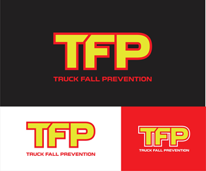
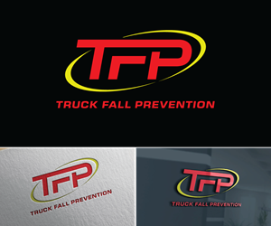
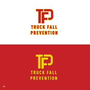
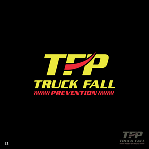
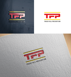
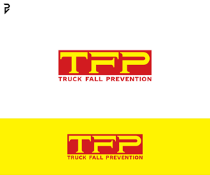
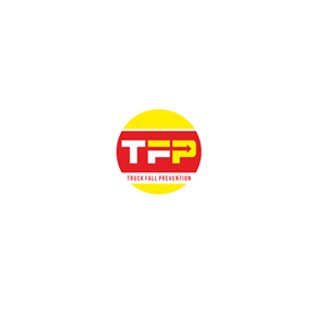
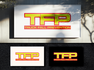
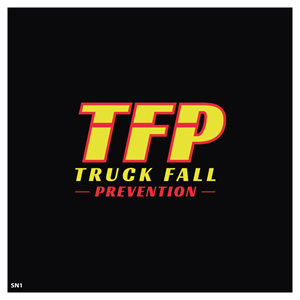
Our logo should consist of “TFP” as the primary mark, with “Truck Fall Prevention” spelled out in full directly below it. TFP is always the dominant visual element. needed a logo design and received 187 Masculine, Conservative, Industrial Safety logo designs from 87 designers
Designs
Designers
Budget


1 - 20 of 187 logo designs submissions
This is what Our logo should consist of “TFP” as the primary mark, with “Truck Fall Prevention” spelled out in full directly below it. TFP is always the dominant visual element. was looking for in their logo design
Our logo should be intentionally simple and permanently structured to reinforce recognition and credibility:
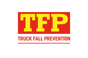
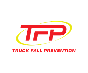
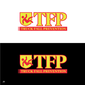
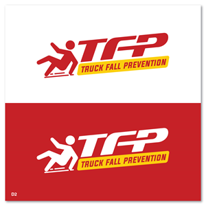
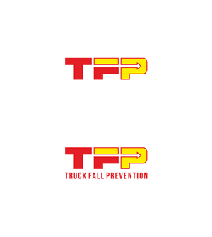
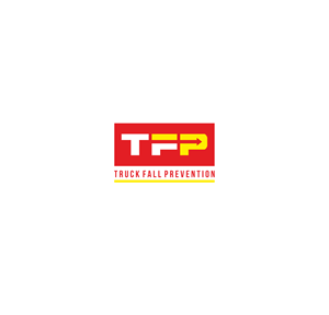
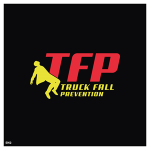
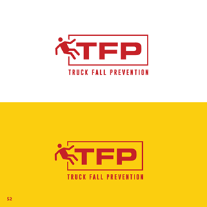
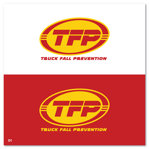
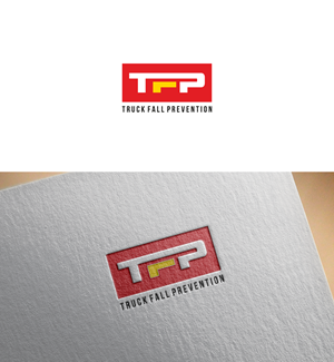
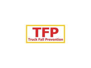
• The logo consists of “TFP” as the primary mark, with “Truck Fall Prevention” spelled out in full directly below it
• TFP is always the dominant visual element
• “Truck Fall Prevention” must always appear below TFP, never beside it and never abbreviated
• TFP may function as a shorthand mark only after the full name has been clearly established
• The falling person symbol is not part of the logo and remains a separate, supporting icon
• When used, the icon must carry approximately equal visual weight to the combined text block—never oversized, decorative, or dominant
This structure ensures immediate identification while preserving authority and clarity in high risk, industrial environments.
The color palette is intentionally limited, safety forward, and industrial—prioritizing recognition, contrast, and functional visibility.
Core …
Read more