BloomGuard Brand Identity Suite
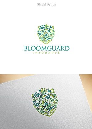
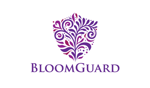
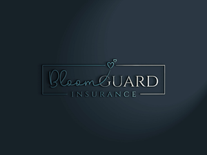
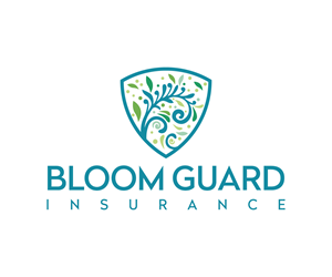
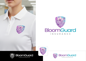
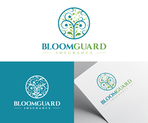
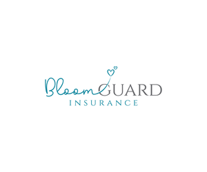
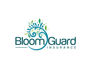
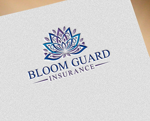
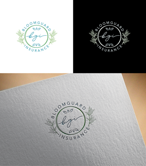
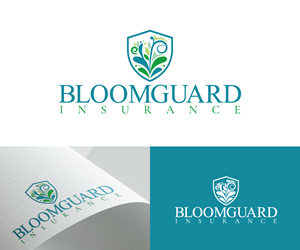
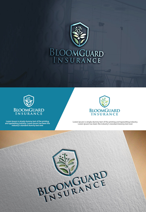
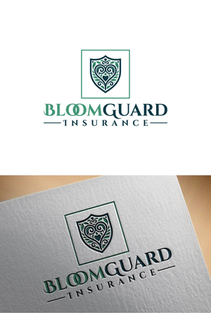
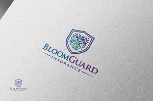
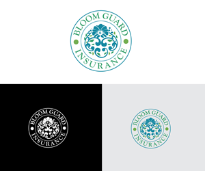
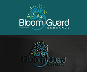
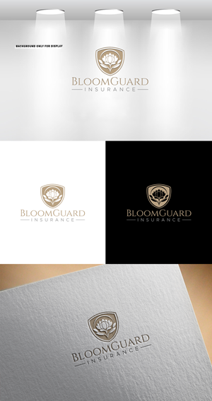
Primary logo text BloomGuard Insurance Secondary or alternate versions may include BloomGuard Typography should feel modern, clean, and refined with subtle character. Nothing overly sharp or rigid. needed a logo design and received 205 Feminine, Conservative, insurance logo designs from 98 designers
Designs
Designers
Budget


1 - 20 of 205 logo designs submissions
This is what Primary logo text BloomGuard Insurance Secondary or alternate versions may include BloomGuard Typography should feel modern, clean, and refined with subtle character. Nothing overly sharp or rigid. was looking for in their logo design
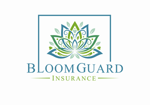
BloomGuard Insurance is a boutique insurance agency that blends protection with growth. The brand should feel elevated, modern, and trustworthy with a soft, refined aesthetic. Nothing corporate or harsh. Nothing cutesy. The visual identity needs to communicate strength wrapped in calm.
BloomGuard is designed to appeal to small businesses and entrepreneurs, especially those who value a polished, feminine leaning style without being explicitly gendered. Think refined, botanical, warm, and intentional.
Core Feel
Protective
Elegant
Grounded
Professional
Quietly confident
Approachable but premium
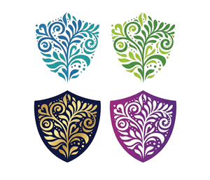
Visual Style
Botanical inspired illustrations
Textured elements that feel organic, not flat or cartoonish
A circle or rounded form that represents protection and wholeness
A blooming flower that looks realistic, delicate, and high quality
No harsh geometric shapes
No gold metallics
A blush focused palette. Not…
Read more