Safer Coromandel, New Zealand logo upgrade
Safer Coromandel needed a logo design and received 56 Bold, Playful, Charity, safety logo designs from 30 designers
Designs
Designers
Budget
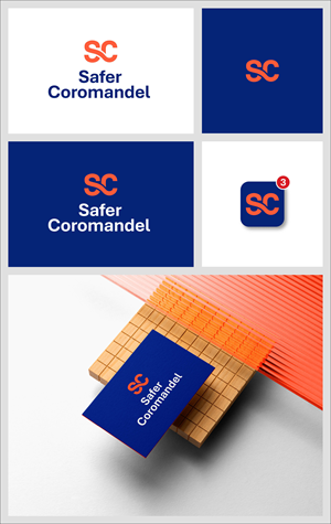


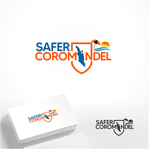


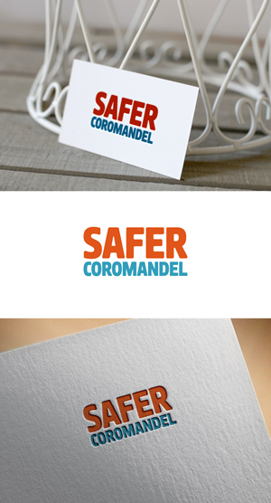

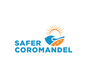

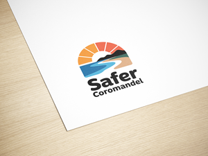
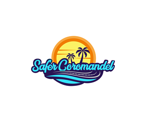

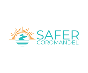
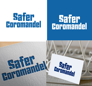

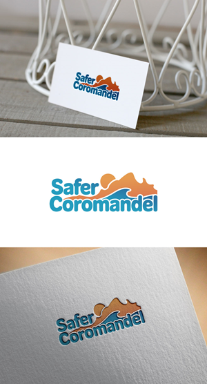


1 - 20 of 56 logo designs submissions
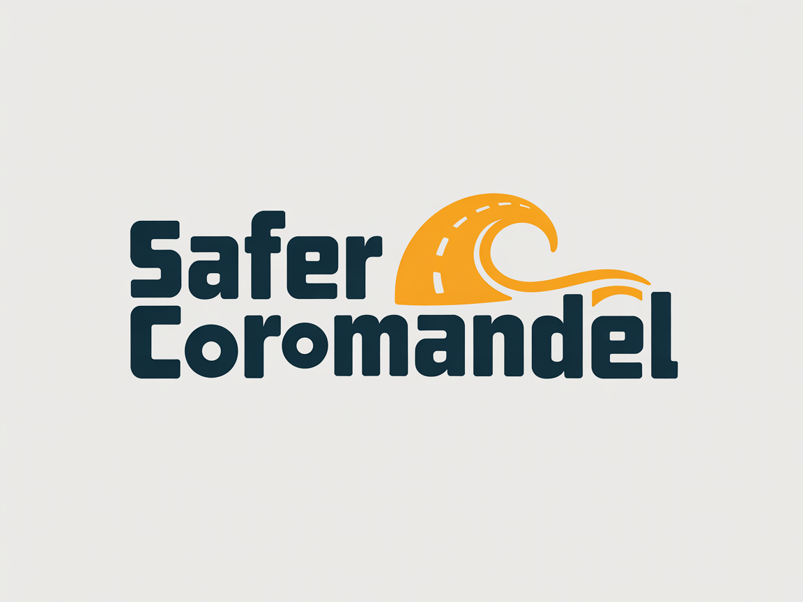
This is what Safer Coromandel was looking for in their logo design
Safer Coromandel is a public service service campaign to keep the Coromandel Peninsula safer during the summer months. It's combined project between Thames Coromandel District Council, other district councils, and safety organisations such as Fire Emergency NZ, St John, Police, Surf Life Saving NZ, ACC, and other organisations in the Coromandel.
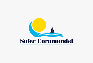
The logo needs to be bold and capture summer and the unique Coromandel Peninsula area. Probably using orange and blue colours. It needs to capture summer, the area, and be bold and fun. The area is famous for beautiful beaches like Hot Water Beach, Cathedral Cove, winding roads and it's a place where other New Zealanders come to relax for the summer. The one we currently have we don't like as it seems outdated - the old logo is attached.
It's about staying safe at the beach, out partying over summer, on our roads and in all ways. The Coromandel Peninsula is a tourist hot spot in the summer months with the population at lea…
Read more