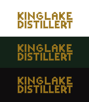
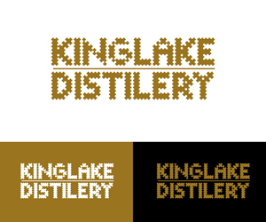
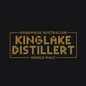
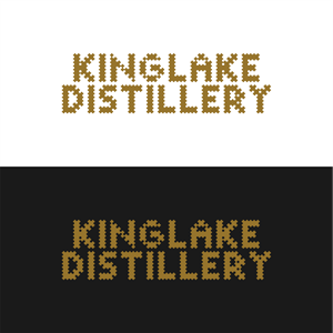
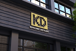
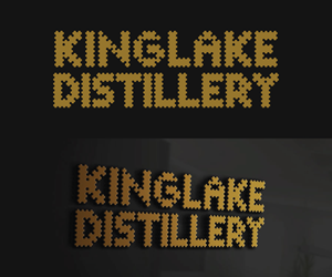
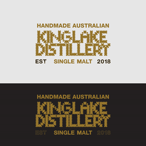
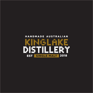
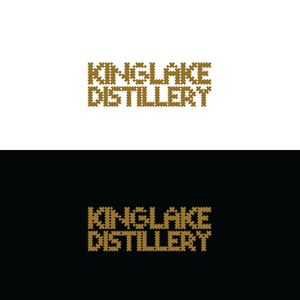
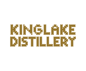
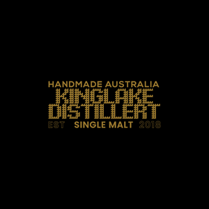
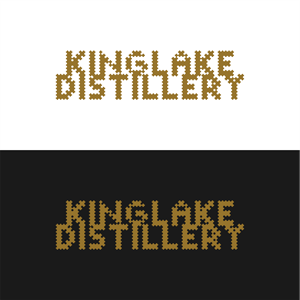
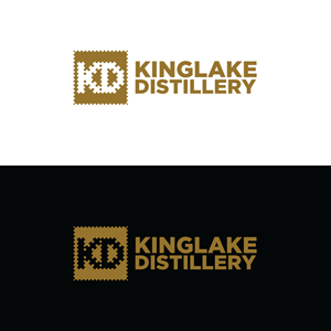
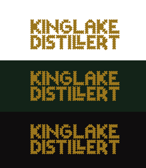
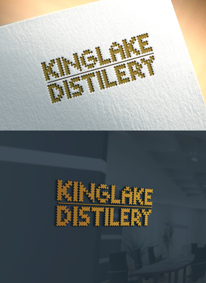
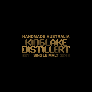
Logo Redesign - Same Font but more legible
Same needed a logo design and received 55 Elegant, Playful logo designs from 36 designers
55
Designs
36
Designers
$150
Budget


1 - 20 of 55 logo designs submissions
This is what Same was looking for in their logo design
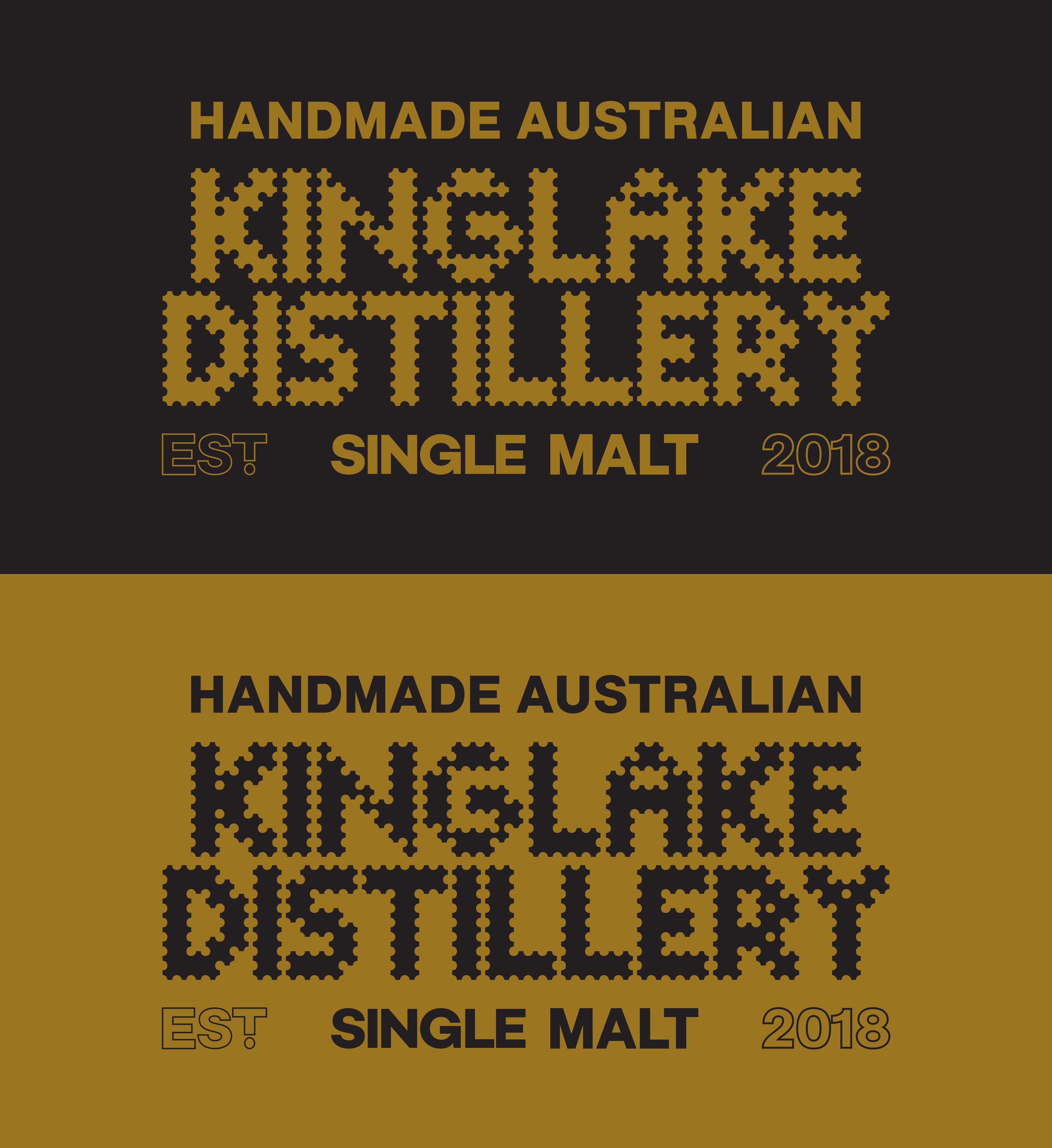
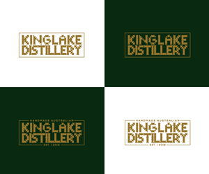
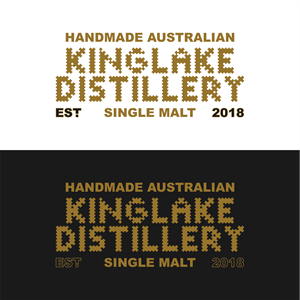
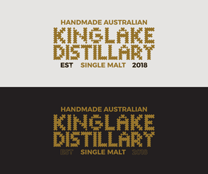
We love our Logo and it was specifically designed to look completely different from all other whisky brands. To suggest corrugated iron, gold and the Aussie 'build it yourself mentality'. We have been told it is hard to read though and would like a slight redesign whilst maintaining recognisability and essence. - MUST USE EXACTLY SAME FONT. All that is required is slight re-work for legibility. Read more