Logo Redesign - Same Font but more legible
Winner
Want to win a job like this?
This customer received 87 logo designs from 60 designers. They chose this logo design from Slobodan Bublik as the winning design.
Join for free Find Design Jobs-
 A$150
A$150
-
 87 designs
-
 60 designers
Logo Design Brief
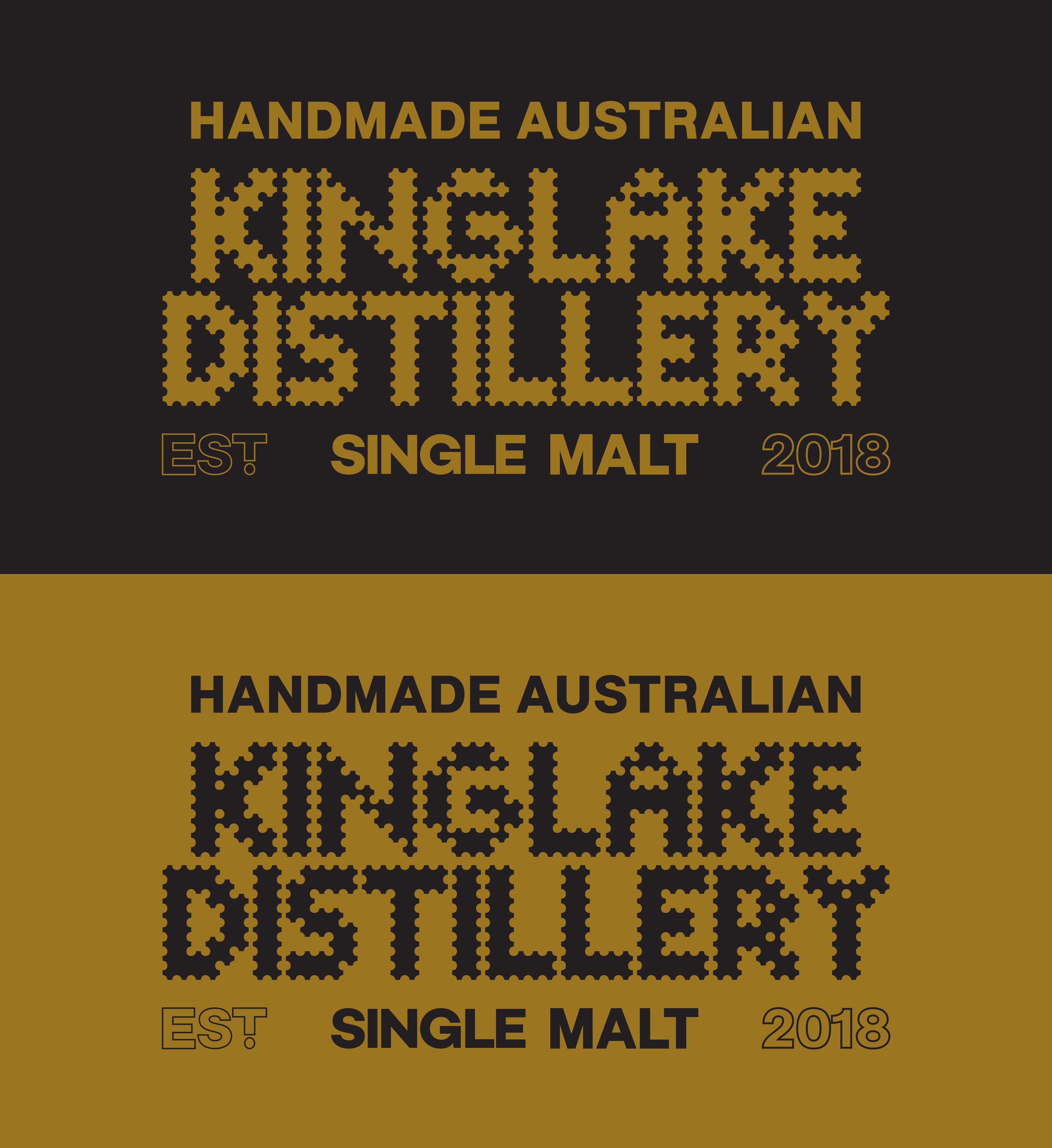
We love our Logo and it was specifically designed to look completely different from all other whisky brands. To suggest corrugated iron, gold and the Aussie 'build it yourself mentality'. We have been told it is hard to read though and would like a slight redesign whilst maintaining recognisability and essence. - MUST USE EXACTLY SAME FONT. All that is required is slight re-work for legibility.
Logo Text
Same
Look and feel
Each slider illustrates characteristics of the customer's brand and the style your logo design should communicate.
Elegant
Bold
Playful
Serious
Traditional
Modern
Personable
Professional
Feminine
Masculine
Colorful
Conservative
Economical
Upmarket
Files
Download all files - 1.8 MBTTF
postcode
Wednesday, July 16, 2025
PNG
Gold Label No BackGround
Wednesday, July 16, 2025
JPG
KD_LOCKUP_FA-10
Wednesday, July 16, 2025
PNG
Untitled-1
Wednesday, July 16, 2025
Payments
1st place
A$150