iOS 7 App Icons for helping pain patients
Want to win a job like this?
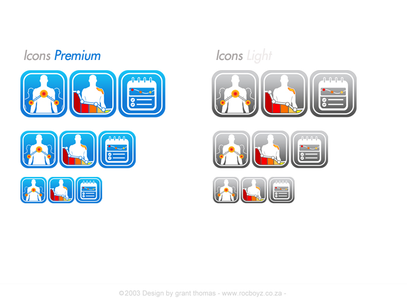
This customer received 101 icon designs from 17 designers. They chose this icon design from Grebo as the winning design.
Join for free Find Design Jobs- Guaranteed
-
 €315
€315
-
 101 designs
-
 17 designers
Icon Design Brief
Create two app icons for our applications.
Each icon should come in two slightly different versions: a free “lite” and a “premium” (this means 4 icons in total).
Last but not least: The icons should conform to the new iOS 7 style. However, Android users should not feel appalled while looking at them (ideally we can use the same icons for iOS and Android).
*About the Applications:*
1. CatchMyPain is the name of the first and already existing application. It is an electronic pain diary. Patients suffering from chronic pain can draw the location of their pain with different colors (according to the intensity) on the model of human body and add additional information, e.g. when does the pain occur, how it feels like, what their level of happiness is, etc. When they have made several such entries, the development of their pain is shown in a graph: they see, when it gets better, when it gets worse, how they feel about it, etc.
Pain diaries are commonly used for pain patients, because it helps to understand the pain, identify possible trigger factors, and find out what might help to ease the pain. The advantage of CatchMyPain, being an electronic pain diary, is that an overview/course of the pain history is automatically generated based on the single diary entries. The data can easily be shared with physicians or family members. The diary helps the doctor to see the effect of his prescribed treatments and to make modifications if necessary ("Disease Management").
Best go and play around with it a bit, so you understand the concept: Download the CatchMyPain iPad or Android tablet app (iPhone version has less features and no graph yet) or use the web application at http://my.catchmypain.com (Chrome and Safari only). Moreover, see the CathMyPain website: www.catchmypain.com
2. The second application is a medication tracker, which is currently in development. Patients will be able to track their medications incl. the dosage, effects, side effects, a reminder, etc. Any patient can use the medication tracker, it is not focused only on pain patients.
*About the Icons:*
Keep it *simple*, symbolic, memorable. We want to convey that we are *responsible* and trustworthy, yet *modern* and progressive. It should connect to the *medical world* without being boring or dated and at the same time have something slightly playful (as the application itself is).
As you will see, we already have an icon for the CatchMyPain app. You can try to adapt it to the new iOS7 style or come up with something completely different.
We have a product video (http://www.youtube.com/watch?v=-566jR-uF0A) explaining CatchMyPain. Maybe you mange to come up with icon designs which match the style in the video (but this is not a must!).
Key messages and elements regarding the icons:
1. CatchMyPain:
- pain
- creating pain drawings
- getting an overview of your pain story (graphs!)
- the patient and the doctor/therapist gain new insights thanks to the diary
2. Medication Tracker:
- medical drugs (pills, injections, bottles, etc.)
- effects, side effects
- reminders
- statistics, overview
*About the “Lite” and “Premium” version:*
Add an element to the icons of the "lite" version without conveying that it is cheap and an element to the "premium" versions that communicates that it is better or offers more, but does not appear to be expensive.
*General:*
Learn more about us and see our product web page at www.catchmypain.com and the web page of our start-up at www.sanovation.com. You don't have to conform to the design you find there. We will probably change these designs later on – possibly with the designer winning this competition.
*Size and Format:*
*Each* app icon submitted must be provided in *all* of the following sizes, as required by Apple:
60 x 60 pixels,
120 x 120 pixels
512 x 512 pixels
1024 x 1024 pixels
Although the icons are displayed with rounded corners on the iPhone and iPad, the icons submitted to Apple must *not* have rounded corners. In other words, the app icons must be square.
The image files need to be provided in png format.
*Tipp:*
We are looking for an icon that can be translated into a logo later on. And the logo again will be used as an inspiration for the website...
Updates
We decided to adjust the brief a bit and to narrow the scope of work.
Added Tuesday, October 22, 2013
Project Deadline Extended
Reason: We decided to adjust the brief a bit and to narrow the scope of work. In order for you to have the option to focus your effort on these adjusted requirements, we extended the deadline.
We are looking forward to see your (new) ideas!
Added Tuesday, October 22, 2013
We would like to share with you which icons we like most so far. This might help to emphasis what we are looking for and help make (last) improvements or new suggestions.
Added Monday, October 28, 2013
Project Deadline Extended
Reason: We made a voting poll but the feedback was not very clear cut. We need more time therefore to make our decision. Meanwhile we will give feedbacks to the designs based on the comments we got. Thank you for your understanding.
Added Wednesday, October 30, 2013
Dear designers,
Added Monday, November 04, 2013
Project Deadline Extended
Added Wednesday, November 06, 2013
Target Market(s)
Chronic pain patients with an interest to use technology in connection with their medical condition. Age 20-60, main target group: 30-45.
Industry/Entity Type
Electronic
Look and feel
Each slider illustrates characteristics of the customer's brand and the style your logo design should communicate.
Elegant
Bold
Playful
Serious
Traditional
Modern
Personable
Professional
Feminine
Masculine
Colorful
Conservative
Economical
Upmarket
Requirements
Should not have
- Text in the Icon – if something, then only a single letter