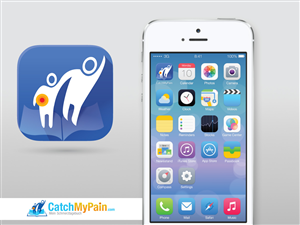
iOS 7 App Icons for helping pain patients
A business in Switzerland needed a icon design and received 55 Modern, Economical, Electronic icon designs from 10 designers
Designs
Designers
Budget


1 - 20 of 55 icon designs submissions
This is what a business in Switzerland was looking for in their icon design
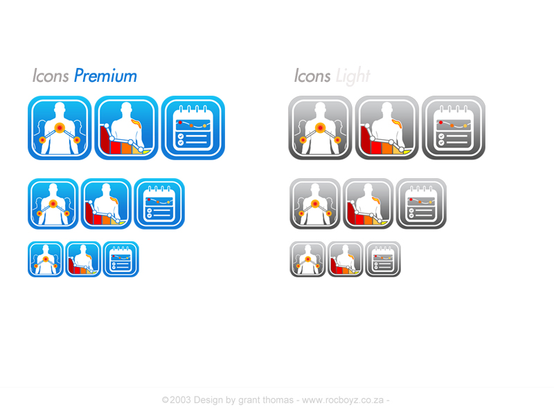
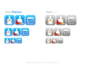
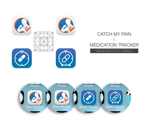
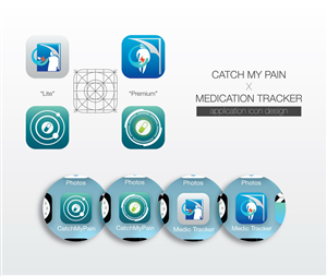
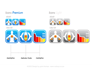
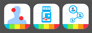
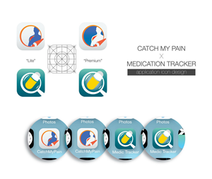
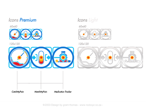
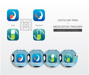
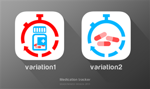
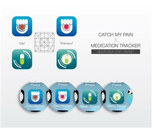
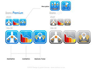
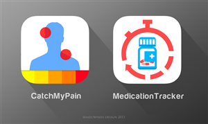
Create two app icons for our applications.
Each icon should come in two slightly different versions: a free “lite” and a “premium” (this means 4 icons in total).
Last but not least: The icons should conform to the new iOS 7 style. However, Android users should not feel appalled while looking at them (ideally we can use the same icons for iOS and Android).
*About the Applications:*
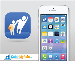
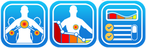
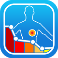
1. CatchMyPain is the name of the first and already existing application. It is an electronic pain diary. Patients suffering from chronic pain can draw the location of their pain with different colors (according to the intensity) on the model of human body and add additional information, e.g. when does the pain occur, how it feels like, what their level of happiness is, etc. When they have made several such entries, the development of their pain is shown in a graph: they see, when it gets better, when it gets worse, how they feel about it, etc.
Pain diaries are commonly used for p…
Read more