Brisbane City Pops Orchestra logo
Brisbane City Pops Orchestra needed a logo design and received 46 Playful, Modern, Community logo designs from 11 designers
Designs
Designers
Budget


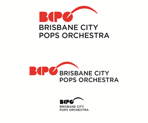


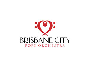
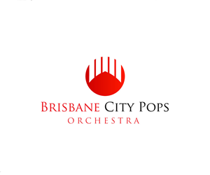

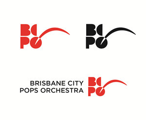


1 - 20 of 46 logo designs submissions
This is what Brisbane City Pops Orchestra was looking for in their logo design
We would like to get a source a logo to go with a recent name change. We were previously known as the St Lucia Orchestra (www.slo.org.au). Our old logo with our old name can be seen on the top left hand of our website. We have since rebranded ourselves as the "Brisbane City Pops Orchestra"
Established in 1973, we are a high-standard community orchestra based in and around Brisbane. Our main audience demographic are retirees and families. Would prefer a logo that uses some of our old colour scheme (red, white, black). For the red please use #cc0f16
The logo should be easily easily recognisable and flexible enough to be incorporated into our website, flyers and other print materials.
Happy to hear suggestions and ideas.
Read more