Logo Design Project
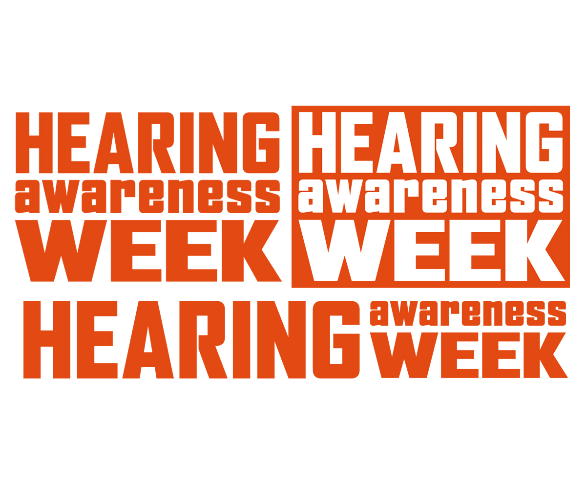
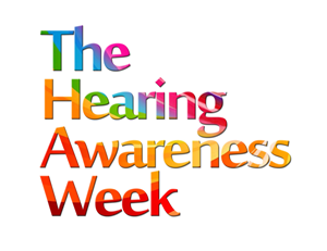
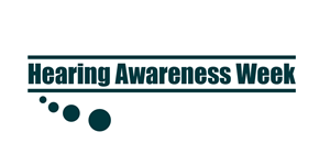
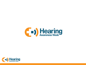
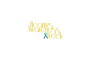
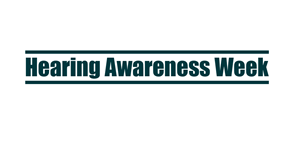
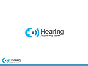
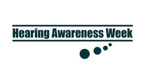
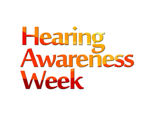
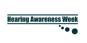
Hearing Awareness Week needed a logo design and received 11 Modern, Personable, Events logo designs from 6 designers
Designs
Designers
Budget


-
 Previous page
- You're on page 1
- Page 1 of 1
-
 Next page
1 - 11 of 11 logo designs submissions
This is what Hearing Awareness Week was looking for in their logo design
www.hearingawarenessweek.org.au
The Hearing Awareness Week (Australia) logo needs to be re-designed. The current version is looking dated, takes up too much space and the ear icon is dubious.
We are looking for a logo that don't necessarily feature any stylized ear imagery.
Potentially the logo could consist of only the words `Hearing awareness week' with no addition elements.
Ideally the logo will have a vertical version that fits into a square(ish) shape and a horizontal version. A reversed version is useful too.
The Hearing Awareness Week brand serves to promote events hosted by various Deafness and hearing health groups around the country.
Historically the logo has featured a dark orange and headline text has also been this colour. We are not committed to this or any other colour for the logo or other branding.
Read more