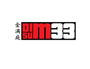
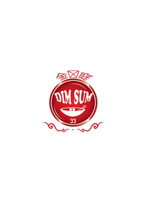
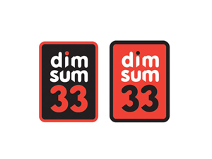
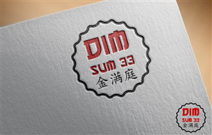
Chinese Restaurant Logo Dim Sum 33
金满庭 Dim Sum 33 needed a logo design and received 36 Professional, Bold, Restaurant logo designs from 14 designers
Designs
Designers
Budget


1 - 20 of 36 logo designs submissions
This is what 金满庭 Dim Sum 33 was looking for in their logo design
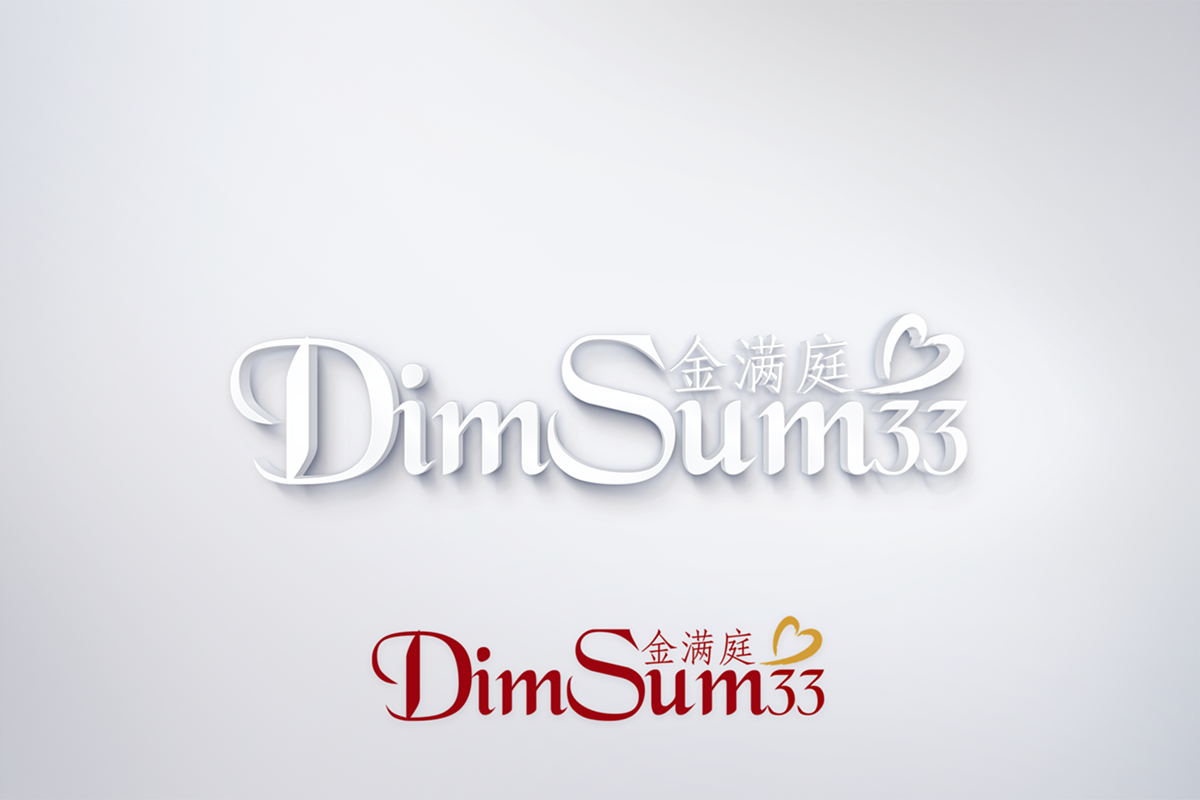
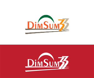
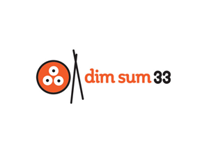
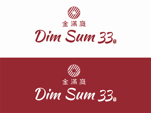
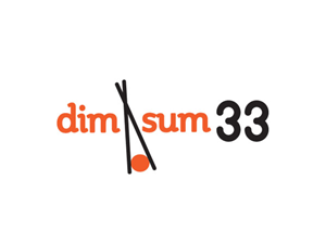
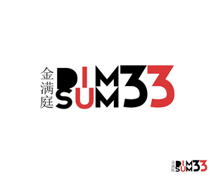
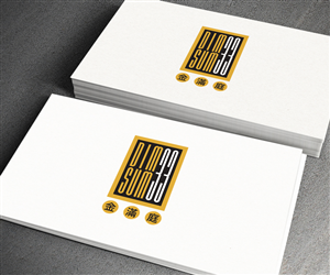
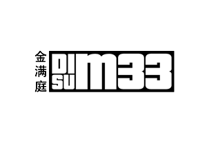
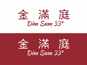
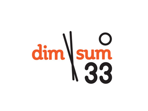
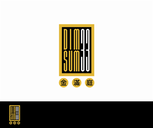
Hi, our restaurant Dim Sum 33 (???). Dim Sum literally means "Point" or "Dot" "Heart" in chinese. It's a type of chinese food. So as far as the logo, we prefer modern simple and elegant, since we are not a cheap take-out place.
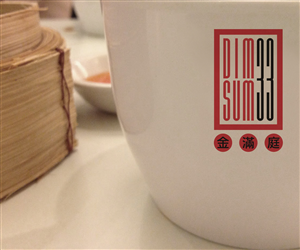
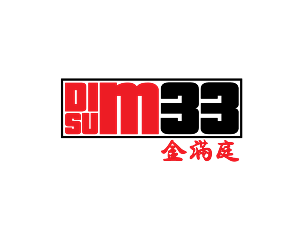
For the words Dim Sum, we've noticed a lot times people put it on top of one another, optional. Add 33 next to it, below, above.
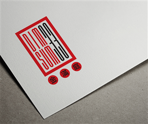
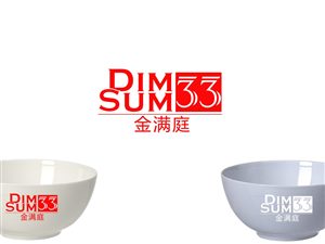
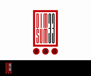
Color: I've uploaded Coffee World picture, our Back is that Dark Red color, so our Name must be different.
???
The focus will be on the English name, not the chinese name of our restuarant.
If you are able to incorporate the Chinese name also, that'd be perfect. If not, it's also okay because our market/neighborhood is mostly none asians. Found the characters from Google translate, "Gold Full and the second character of Family"
Read more