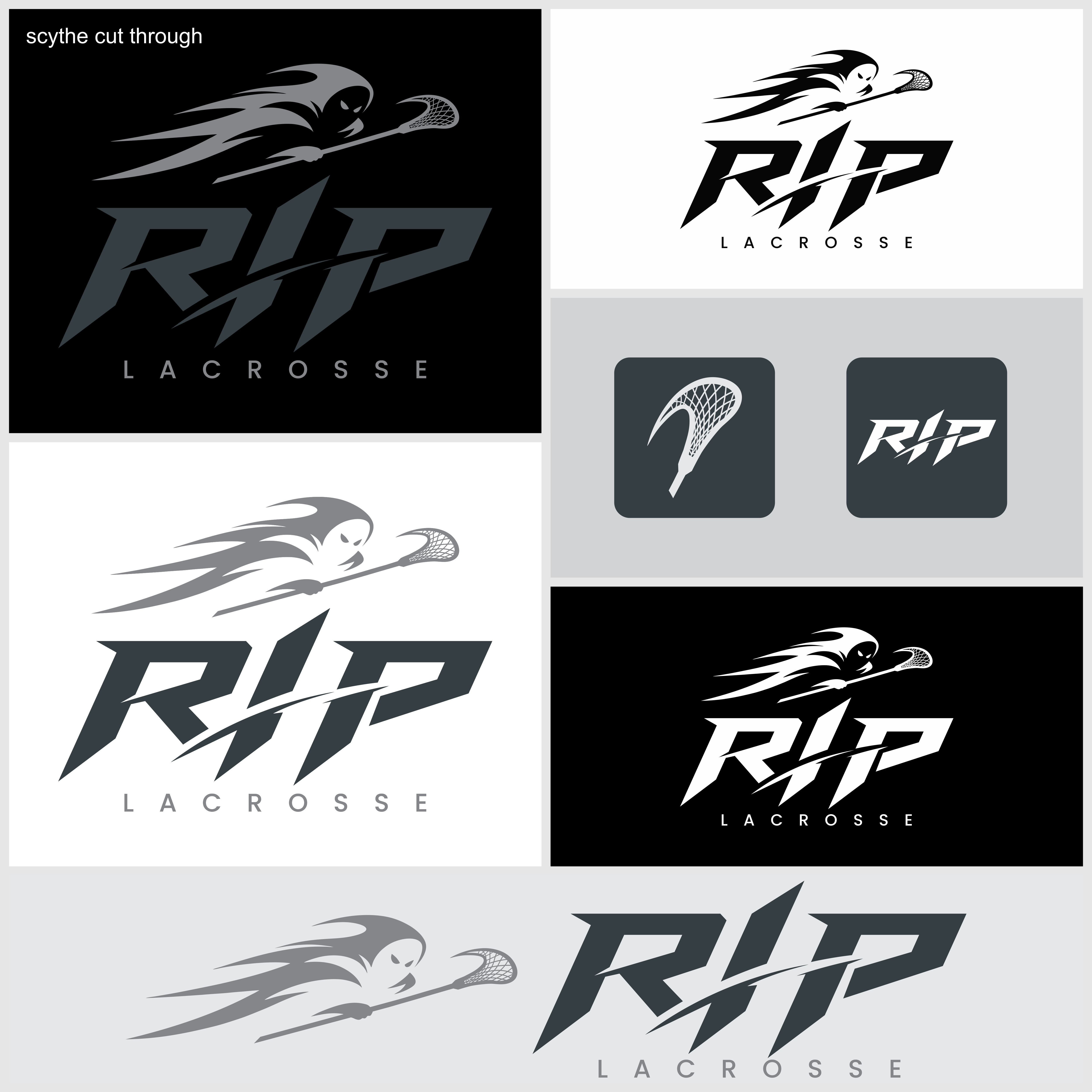
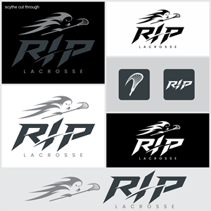
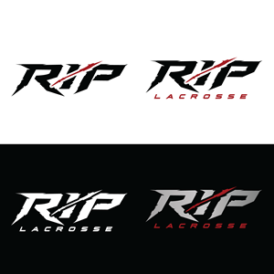
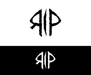
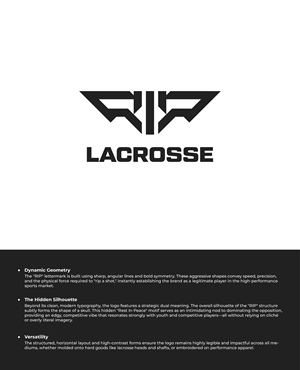
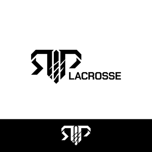
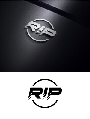
RIP Lacrosse Logo
RIP needed a logo design and received 222 Masculine, Bold logo designs from 111 designers
Designs
Designers
Budget


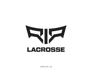

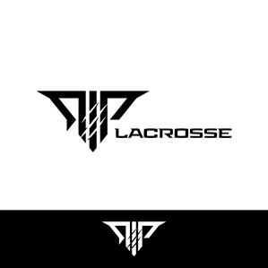


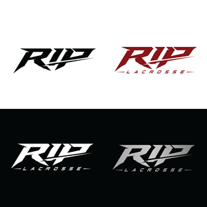

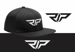


1 - 20 of 222 logo designs submissions
This is what RIP was looking for in their logo design
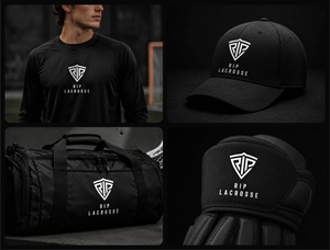
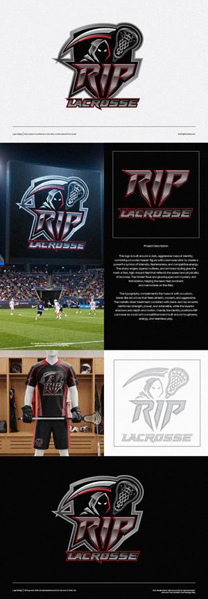
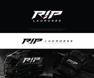
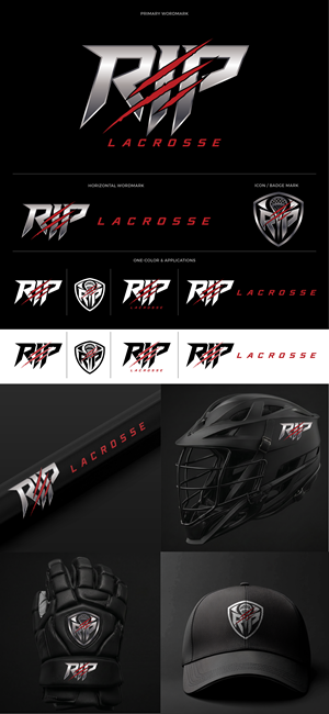
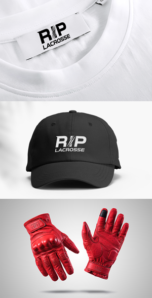
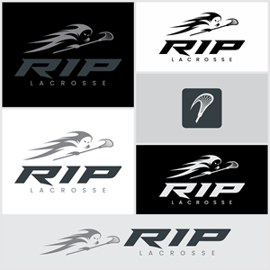
RIP Lacrosse is a lacrosse equipment and apparel brand focused on youth and competitive players. The brand may be used across lacrosse gloves, arm pads, shoulder pads, sticks, shafts, heads, apparel, bags, hats, and team gear.
The term RIP could be construed to mean "Rip a shot" or shoot hard - or it could mean Rest In Peace for your opponents.
Brand Personality
The logo should feel:
* Strong
* Dark
* Competitive
* Aggressive
* Dominant
* Relentless
* Modern
* Athletic
* Premium
The brand should have an intense edge, but it should still feel like a legitimate sports equipment company — not a Halloween brand, motorcycle club, death-metal band, or cartoon mascot.
### Visual Direction
I am looking for a dark, powerful logo system that could compete visually with modern lacrosse, hockey, football, and combat-sports brands.
Possible design directions include:
* Sharp, angular wo…
Read more