Knightwell Recruitment – Logo Design Brief
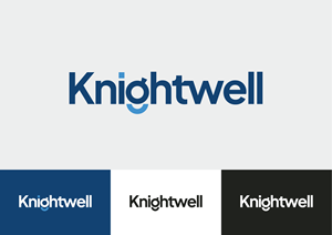
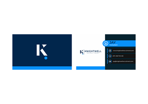
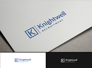
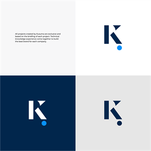
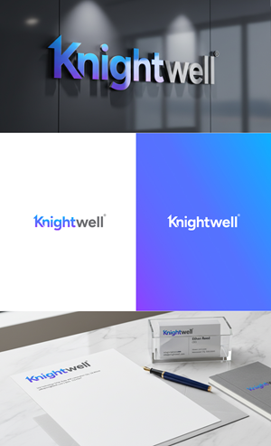
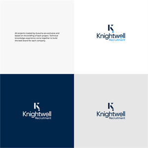
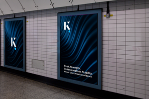
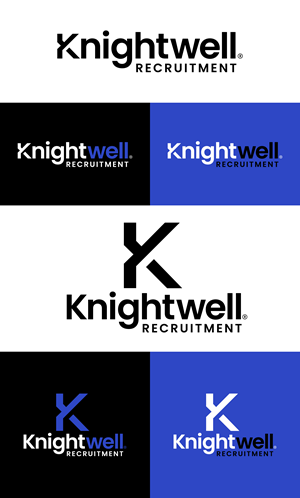
Knightwell needed a logo design and received 107 Professional, Upmarket, Recruitment Agency logo designs from 31 designers
Designs
Designers
Budget


1 - 20 of 107 logo designs submissions
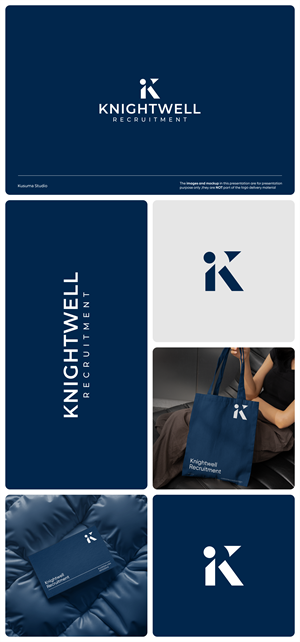
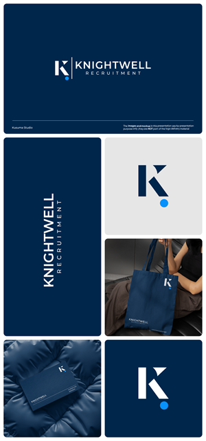
This is what Knightwell was looking for in their logo design
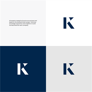
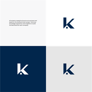
We are looking for a font-based or watermark-style logo that feels strong, corporate, and highly professional. No playful elements.
The logo must work across multiple sectors, so it should feel universal, clean and timeless – similar to brands like Robert Walters, Michael Page, Hays, Page Personnel, are good examples.
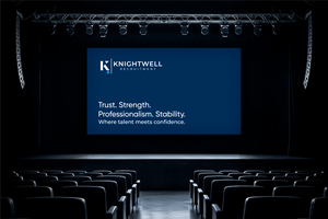
We want the brand to communicate:
1: Trust
2: Strength
3: Professionalism
4: Stability & Confidence
5: Premium but minimal
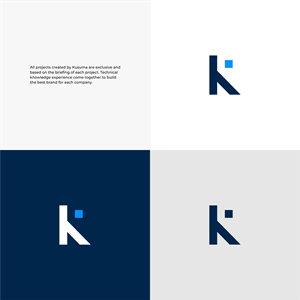
No cartoon, mascot, or overly decorative icons. If an icon is used, it should be subtle, geometric or monogram-based (e.g., K / KR watermark).
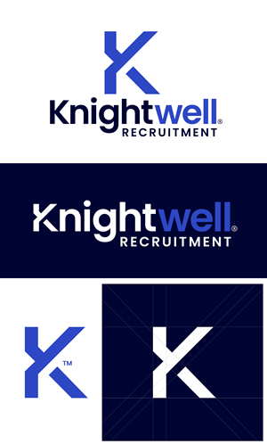
Logo Style
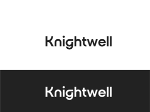
- Font-based (primary preference)
- Clean, modern typography
- Bold but not heavy
- Avoid rounded playful fonts – keep it sharp and corporate
- Minimalistic and scalable.
Read more