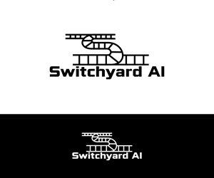
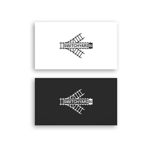
Train Switchyard themed minimalist Tech Company Logo
Switchyard AI needed a logo design and received 78 Bold, Traditional, Healthcare logo designs from 34 designers
Designs
Designers
Budget


1 - 20 of 78 logo designs submissions
This is what Switchyard AI was looking for in their logo design
Switchyard AI — Logo Direction
==============================
Core idea
---------
An aerial view of a railroad switchyard: tracks converge, diverge, and re-route. The mark should feel like a minimal, almost hand-drawn schematic—industrial, honest, and a bit imperfect—while conveying AI-driven orchestration (directing data/docs to the right place, right time). Avoid anything overly glossy or corporate.
Symbol (primary mark)
---------------------
- Form: A simple hub-and-tracks motif: 1–2 main “rails” enter, 3–5 rails peel off via soft turnouts. Think of a switch (turnout) diagram seen from above.
- Line treatment:
- Double-line rails with occasional, very sparse ties (e.g., a short cross-tick every 3rd–4th gap). Keep it abstract—no heavy detail.
- Hand-drawn feel: slightly irregular line weight and micro-wobble; arcs that aren’t perfectly circular; not all lines straight.
…
Read more