Mental Health Org making care more accessible and cheaper for all
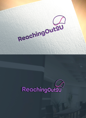
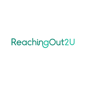
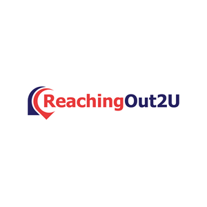
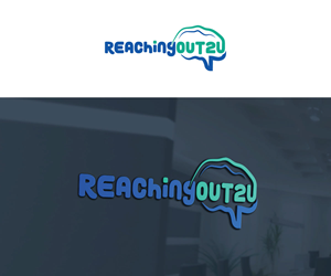
ReachingOut2U needed a logo design and received 28 Colorful, Modern, Healthcare logo designs from 22 designers
Designs
Designers
Budget


1 - 20 of 28 logo designs submissions
This is what ReachingOut2U was looking for in their logo design
This organisation (ReachingOut2U) is a new social enterprise based in Manchester in the UK. They want to make mental health care more accessible and cheaper for everyone, including those referred by the NHS (national health service).
They'll compete with Pace2be and Mind.
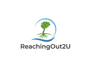
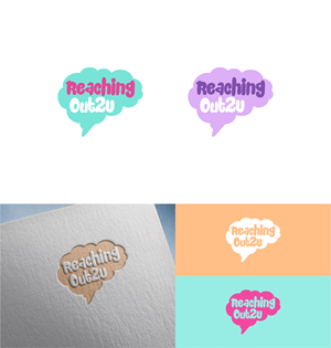
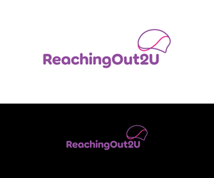
They like the idea of using bubble writing in their wordmark.
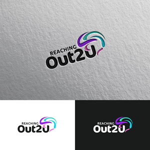
They're open to bright colours in their logo, like purples, pinks, turquoise and blue. NO red!
Brand Style:
They are slightly more feminine.
Slightly more mature.
More modern than classic.
More loud than quiet.
More simple than complex.
More organic than Geometric.
They like wordmarks, simple and clean designs, and tech and digital-inspired combinations.
They don't want anything abstract, too detailed, or anything elegant/classy.
They want to avoid looking cliche (so hands or hearts are off the table)
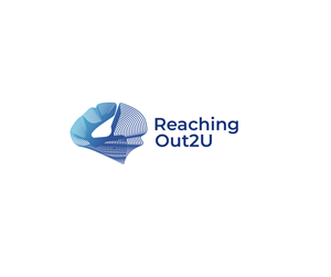
But they like the idea of using a brain as their icon mark.