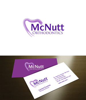
McNutt Orthodontics
McNutt Orthodontics needed a logo design and received 38 Modern, Elegant, Marketing logo designs from 15 designers
Designs
Designers
Budget


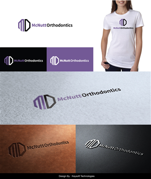

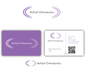

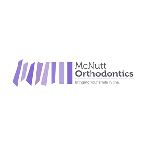
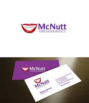

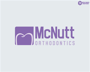
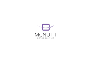

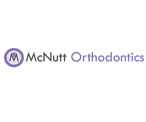


1 - 20 of 38 logo designs submissions
This is what McNutt Orthodontics was looking for in their logo design
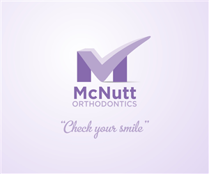
Update to brief on 1-26-13: I have eliminated many designs and wanted to update the brief to better communicate what we want. I do not want any designs that actually have a
cartoon teeth, or symbols that look like teeth, or smiley faces. Designs with shadows and gradients are not desired. Modern crisp fonts are preferable (Times New Roman designs will be eliminated). We have also received designs with a symbol off to the left of the name that appear to look like generic corporate stamp. Hopefully this helps.
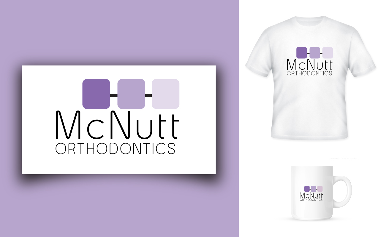
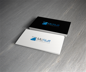
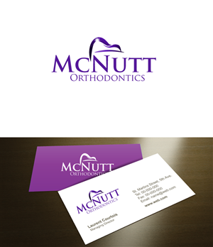
We are looking to re-brand our orthodontic practice with a new logo and keep within a color palette that will compliment our existing website. If you go to our site, www.thetoothmover.com you will see some a range of purple color, silver and black. That is our main marketing color palette. The logo needs to be be easily converted for other uses, such as t-shirt, water-bottles for our patients, banners, etc. That being said, using shadowing and gradients wil…
Read more