An unexplainable thing. But definitely involves a totem pole.
Want to win a job like this?
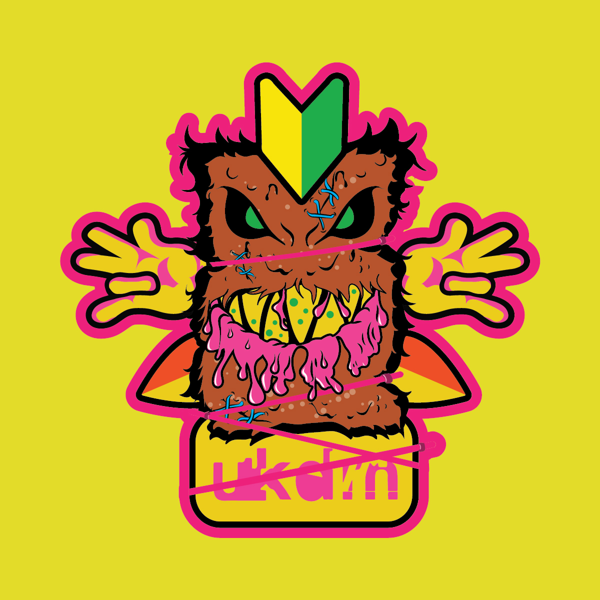
This customer received 8 illustration designs from 4 designers. They chose this illustration design from Paulo Duelli as the winning design.
Join for free Find Design Jobs- Guaranteed
-
 £95
£95
-
 8 designs
-
 4 designers
Illustration Design Brief
I run a Facebook page called UKDMhatesyou. It has its beginnings in the fickle and terrible world of the peculiarities of the Japanese car scene, but is also an outlet for my terrible lowbrow humour and nonsense. You'll need to go there and look at the photo albums to understand it. Or not understand it but get an idea of what it's all about. Think of it as your muse or something. Basically I hook them in thinking it'll be about cars, and then assault them with other things that make 60% of them immediately unlike the page. It's a tricky balancing act to carry off, but you ensure that you're left only with the hardcore weirdos afterwards.
I sell stickers that I make and other useless stuff like lanyards and air fresheners. And am pretty rude to my customers. They seem to like it.
I like to think I can design. But I know that I actually can't. And here's where you come in.
I need some kind of main go-to symbol of my drivel. And I have chosen......a Totem Pole. I like them you see.
I'd like my pole *snigger* to have its basis in the same lurid yellow and pink colours that I have adopted as my own. It'd also be nice to include elements or homages to some of the stickers I've done. Especially the one combining Domokun, the Shocker symbol and the Japanese car badges (see the attached Brief attempting to explain).
I very much enjoy 80s/90s skateboard graphics, specifically that of Graham McEchran who did all the Death Box Skateboards graphics of the 1980s. Along this style would be great, as would also the influence of Spitfire - another skate brand who have a terrific main design that then then riff from and include things like zombies, dripping flesh and great neon colorways. If only for the potential under 5 market.
Please also include neon zip ties holding things together. Don't ask why, just relax safe in the knowledge that you just joined the despicable car tuning scene.
Thanks nice people. You're making a dream come true. Or something.
Reading this back it makes little sense so I'll be blown away if someone actually gets it enough to design something.
Target Market(s)
Young people - 18-35
Look and feel
Each slider illustrates characteristics of the customer's brand and the style your logo design should communicate.
Elegant
Bold
Playful
Serious
Traditional
Modern
Personable
Professional
Feminine
Masculine
Colorful
Conservative
Economical
Upmarket
Requirements
Must have
- Bold colours, lots of neon to really stand out
Nice to have
- Zombie influence.
Should not have
- Anything boring!