Home Page Concept For New Website (SeeMyCounselor)
Want to win a job like this?
This customer received 92 web designs from 6 designers. They chose this web design from Sbss as the winning design.
Join for free Find Design Jobs- Guaranteed
-
 US$250
-
 92 designs
-
 6 designers
Web Design Brief
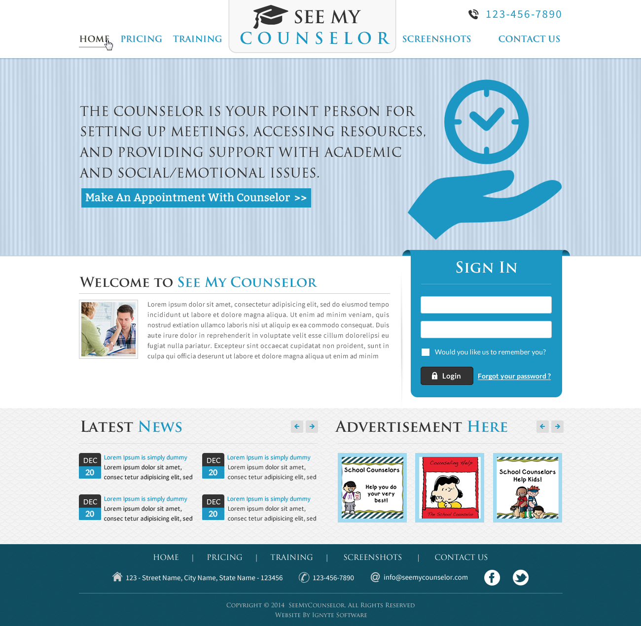
We are creating a new website that allows students to schedule time to see their school counselors (seemycounselor.com). We need a concept for the home page. You will need to create one concept and provide a jpg image for us for review. The homepage needs to have at least a logon section, a Latest News section, a section for 3 Ads all 125x125 and some content for text where we describe the site. A menu will need to contain the following: Home, Pricing, Help and Contact Us.
You will need also need to create a design of the basic interior page template which should have a smaller banner, header, footer etc. This template will be used when we build the actual application and lots of space will be needed in the content area to draw controls such as textboxes, buttons, grids, etc in order to implement the application functionality when we code it.
We have no logo or color scheme so you are free to use your imagination as long as it looks professional.
Once we accept the design, you will need to give us a zip file containing all the artifacts including the .psd files, jpg images, and any fonts used, etc.
Updates
The customer has reviewed all the designs submitted so far and feels like most do not really convey that it is a scheduling site. They want all pictures removed because this will confuse students and students will think that the picture is their actual counselor. So remove the pictures of all the people and add illustrations, graphics, icons of some images that are related to scheduling like calendars, time, watches, etc. Fade images into the banners, or background etc. and be creative.
Remember this site is for multiple schools to signup to use for scheduling their counselors so it needs to convey that function.
Added Saturday, December 20, 2014
I sent this out before but I needed to repeat it for other designers...
The customer has reviewed all the designs submitted so far and feels like most do not really convey that it is a scheduling site. They want all pictures removed because this will confuse students and students will think that the picture is their actual counselor. So remove the pictures of all the people and add illustrations, graphics, icons of some images that are related to scheduling like calendars, time, watches, etc. Fade images into the banners, or background etc. and be creative. Remember this site is for multiple schools to signup to use for scheduling their counselors so it needs to convey that function.
Also several designers did not follow directions that clearly stated the home page had to include a login panel. The users of this system need to be able to login directly from this page. A login panel needs to contain the standard user name, password, login button, forgot my password link or button and maybe a signup link or button....nothing more.
So please review your designs and update them accordingly.
Thanks
Added Monday, December 22, 2014
Industry/Entity Type
School
Font styles to use
Requirements
Should not have
- We don't have a logo or any pre-determined colors. We just need a clean professional design that fits pretty much on one page without a lot of scrolling. For example, the customer does NOT want a site like this..
https://trackingtime.co/
where you scroll for days with large multi-color panels.