Fitness company with re-brand, looking for refinement
Want to win a job like this?
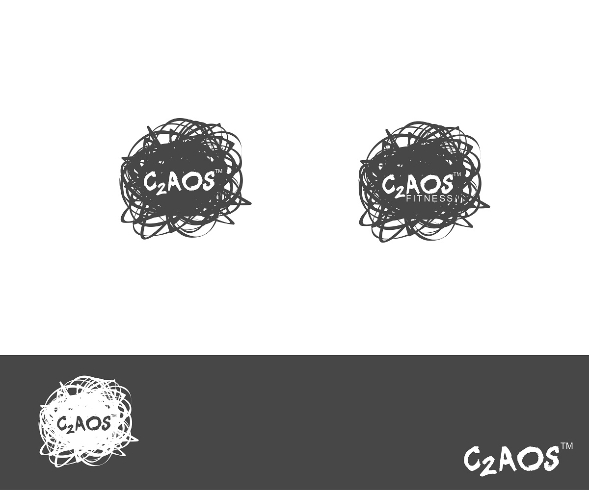
This customer received 124 logo designs from 35 designers. They chose this logo design from DCMadrid as the winning design.
Join for free Find Design Jobs-
 US$320
-
 124 designs
-
 35 designers
Logo Design Brief
We had a previous submitted designs and the feedback from the customer base was that it did not communicate "chaos" or "order in the chaos" which is where the concept is born. The files attached to the project below include a scribble ball where we are looking for C2AOS spelled out (with the 2 being a sub-script) and fitness in smaller writing as a contrast within the ball of "scribble". We would like the scribble a dark carbon grey versus a black. The associated font below (or something that is a scribble, sketch, doodle font) would be a stand-alone C2AOS that would be used in associated marketing and retail applications. The overall brand of the "scribble" communicating the disorder of Chaos but the overlay of the controlled font on the scribble background AND the Controlled letters made up of Scribble.
With this refinement we are looking for new submissions in order to more appropriately communicate the overall concept of the business as we are creating and controlling chaos. C2AOS (subscript of 2) is a chemical formula for the studios that exist within the concept.
Updates
Project Deadline Extended
Reason: Still receiving some updates and distributing via survey for additional feedback
Added Monday, December 01, 2014
Project Deadline Extended
Reason: Change in direction...please see updated brief based on consumer feedback
Added Saturday, December 27, 2014
Designers,
We had significant customer feedback that required a change in direction...please see the updated brief that includes integrating the concept of "chaos" in the design image. We also attached images that will provide additional guidance.
Added Saturday, December 27, 2014
Target Market(s)
Families, mid to high income base, creative and open minded to new concepts, men and women looking for something different from a big box gym OR individuals who are attracted to the 1:1 coaching, people looking to belong to a community and connect with other people
Industry/Entity Type
Marketing
Logo Text
C2AOS
Logo styles of interest
Wordmark Logo
Word or name based logo (text only)
Lettermark Logo
Acronym or letter based logo (text only)
Font styles to use
Other font styles liked:
- sketch, scribble with accompanying font
Colors
Colors selected by the customer to be used in the logo design:
Look and feel
Each slider illustrates characteristics of the customer's brand and the style your logo design should communicate.
Elegant
Bold
Playful
Serious
Traditional
Modern
Personable
Professional
Feminine
Masculine
Colorful
Conservative
Economical
Upmarket
Requirements
Must have
- Unique to break the space; edgy, gender neutral, has to be able to have the C2AOS within the context of a chaotic background with fitness; in addition, the word "C2AOS" in scribble font.
Nice to have
- Simple and Clean
Should not have
- Nothing "metallic" or anything that looks like a car logo or something that is super masculinized versus something that is different and breakout as the interpretation of edgy.