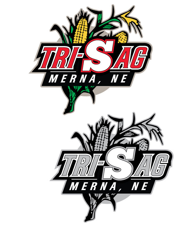
Tri-S Ag
Want to win a job like this?
This customer received 74 logo designs from 31 designers. They chose this logo design from royalroosterdesign as the winning design.
Join for free Find Design Jobs-
 US$400
-
 74 designs
-
 31 designers
Logo Design Brief
We are a farming operation in the center of Nebraska. The partnership consists of my dad, Jerry Safranek; my brother, Kevin Safranek; and myself, Craig Safranek.
We would like a logo to use on hats, business cards, website, and who knows that portrays a modern logo that could possibly incorporate a corn stalk or an ear of corn in the logo possibly.
Something mixing the S and a symbol that implies 3 people.
Updates
Project Deadline Extended
Reason: We would like to extend the deadline as we feel the design is coming around, just have not came up with the design that fits both as a whole design and symbol within the design that will eventually be "the logo" all by itself.
Added Friday, February 15, 2013
Project Deadline Extended
Added Monday, March 18, 2013
Project Deadline Extended
Added Monday, April 01, 2013
Project Deadline Extended
Added Monday, April 01, 2013
Project Deadline Extended
Added Tuesday, April 09, 2013
Industry/Entity Type
Farming
Logo Text
Tri-S Ag
Logo styles of interest
Emblem Logo
Logo enclosed in a shape
Abstract Logo
Conceptual / symbolic (optional text)
Lettermark Logo
Acronym or letter based logo (text only)
Look and feel
Each slider illustrates characteristics of the customer's brand and the style your logo design should communicate.
Elegant
Bold
Playful
Serious
Traditional
Modern
Personable
Professional
Feminine
Masculine
Colorful
Conservative
Economical
Upmarket
Requirements
Must have
- traditionally would like more of a logo to go with red and black
a green corn stalk could be an added feature or incorporated in the logo too.
I would like a main logo, but also a simple logo that can be pulled out for almost a symbol look to it.