Communications consultancy needs corporate logo design
Want to win a job like this?
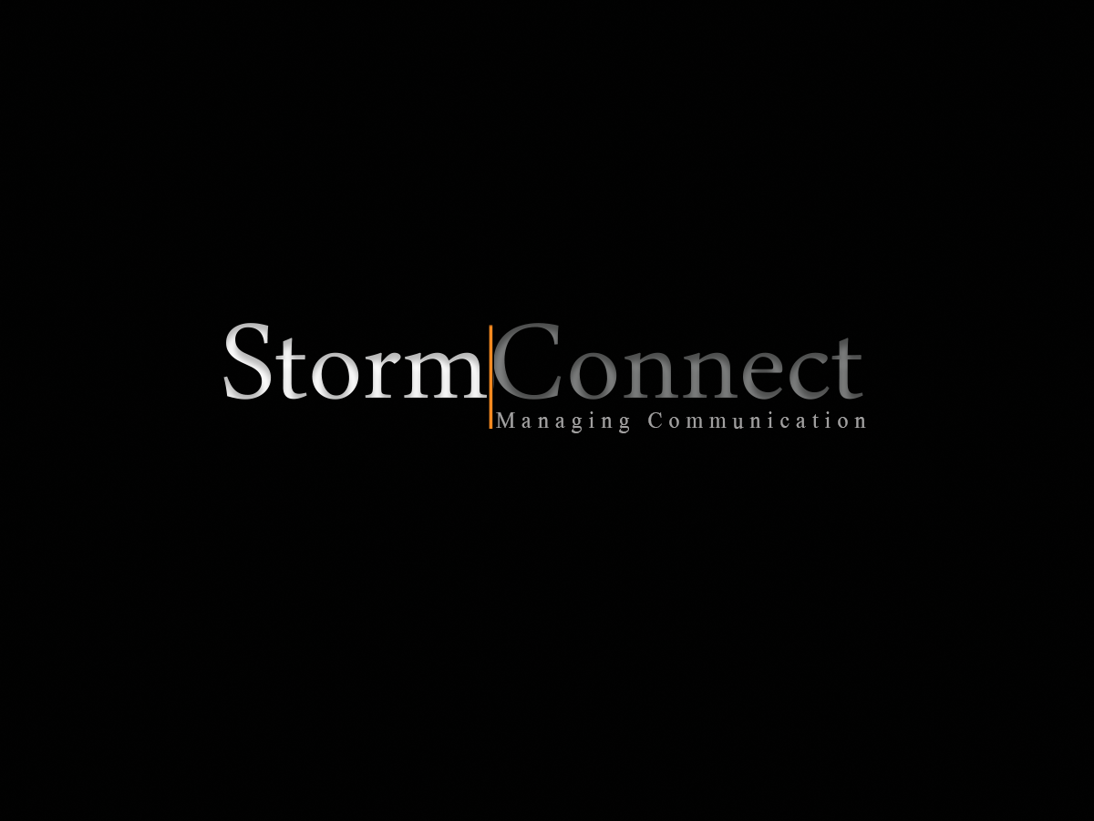
This customer received 329 logo designs from 66 designers. They chose this logo design from MelissandreSamson as the winning design.
Join for free Find Design Jobs-
 €230
€230
-
 329 designs
-
 66 designers
Logo Design Brief
Hi designers!
I have established a consultancy within strategic communnications (management consulting), for which I need a logo - I've seen some of the logos you do in here, and they're great! I'll provide some information in the following:
Name: StormConnect
Service: Strategic communications consulting: various organisations - e.g. SMEs, NGOs and NPOs - are offered an analysis of their current efforts and, on the basis of that, management consulting tailored their unique challenges and needs.
It's a sole proprietorship - for now! - but it's my plan to employ 5-20 persons over the years. Therefore the logo should NOT symbolize a start-up, but communicate a well-established, serious consultancy. Hence, it should also apply to serious companies and organizations - think Maersk Group (both as sender and receiver) ;)
The design should accordingly have a formal, conservative, stylish, corporate, clean look! and ditto colors, eg. black, grey, white etc. Not too bold or dramatic fonds or letters.
But maybe with a little contrast in a color, like the orange dot in the second logo I've uploaded, from KristiansenUlveman, or the &-sign from the third logo 'Ulveman&Partners'. (but I would like to see different suggestions here).
Eventhoug it is two words - Storm (my last name) and Connect - it should be without spacing or a minor (very little) space between the words (but still smaller than the other logo I've uploaded from Melberg Bruhn). Again I'd be happy to see different ideas re. size of the spacing (from no spacing at all to a little space between the two words - or maybe a vertical line between the words(I like this idea myself! - and this line could serve as the contrast color).
I'm not thinking that it has other elements than the StormConnect (and maybe the horizontal line between the words, as mentioned ebove) - but if it makes sense with a little figure or symbol when you're developing a design, I would like to see your ideas.
And as it is with the kristiansen.ulveman-logo, I would like just the text (StormConnect) on a transparent backgroung so it can be applied to every surface or background I like to in the future - different websites, flyers, roll-ups, etc. But I guess we can talk about this, when I have chosen one of your designs, i.e. in the refinement phase. For example I would appreciate both a black and white logo, so it can be used for both dark and light backgrounds (but to secure consistency across the logos, the contrast part (the dot or &-sign in the attachments - or the vertical line as per my suggestion) should be the same colour, whether black og white text).
The tagline could be 'Strategic communication' - but I'll have some additional comments for this in refinement as well.
I do not plan on changing the logo ever - as I think it is more serious keeping a concept and avoid rebranding - and I'm sure that you can deliver an ever-lasting logo for my company! Thanks :).
Updates
Dear designers - I'm SO looking forward to this! I've supplied extensive information and ideas in the creative brief and hope that you understand my thoughts. Very exited to see your proposals! Thank you very much for contributing! /Sebastian
Added Tuesday, October 14, 2014
Dear all - THANK YOU (!) for all your great proposals, so far. Re. the contast color, it doesn't HAVE TO be orange - just a suggestion in my brief. It could be orange, red or blue - but no matter what color you choose, I think it should be a dark tint. Thanks! Good day to all.
Added Wednesday, October 15, 2014
Dear all - this is great. Thank you SO much for the contributions constantly ticking in. If some of you have the time, you're welcome to give suggestions with fonds a little more old-fashioned, just for me to see how it looks. Thanks! The dark orange contrast looks good - but remember that it could also be dark red. Thank you all - and good day!
Added Wednesday, October 15, 2014
Dear designers - this have been a really good day! Thank you for your contributions so far - it's going to be great. I'm trying my best to get back to you all - but if I'm forgetting one, don't hesitate to reach out! Thanks.
Could we please try another color for the contrast part (the vertical line is the most used)? Try a dark blue - should give the feeling of a bank or a corresponding serious company. Maersk Group and McKinsey&Company also used a dark blue tone. Thanks!
Added Wednesday, October 15, 2014
Thank you for your continuous contributions - it's very appreciated! An update to my previous messages: let's go with the orange contrast color, and not the blue or red. Furthermore, you're welcome to think outside the box and try something new. Thank you all - and have a great day! /Sebastian
Added Thursday, October 16, 2014
Industry/Entity Type
Management Consulting
Logo Text
StormConnect