msh iron works logo design MODIFICATIONS
Want to win a job like this?
This customer received 22 logo designs from 10 designers. They chose this logo design from debdesign as the winning design.
Join for free Find Design Jobs-
 US$200
-
 22 designs
-
 10 designers
Logo Design Brief
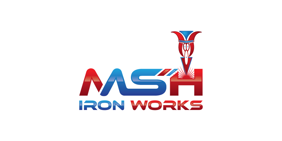
Hi, my name is Edgar I will like to know if you can help me by polishing my rough design. I will want to make this look more professional and clean looking. THE ORIGINAL ICON MUST REMAIN THE SAME. I want to keep the colors in the icon on top of the letter "M" but I'm open to change the colors of the fonts. My business deals with steel structure erections as well as fabrication and welding. To explain the logo I send to be used as a foundation, the icon on top of the letter "M" is striking an electric arc there for creating a weld and depositing welding material inside the letter "M". the red lines resemble sparks coming out of the material being welded. I will like to aim the look of the logo towards the "steel structure, welding, iron works" theme making it tuff looking yet keeping it clean and professional.Best regards EDGAR.
Target Market(s)
Construction and manufacturing
Industry/Entity Type
It Professional
Logo Text
MSH Iron Works
Logo styles of interest
Abstract Logo
Conceptual / symbolic (optional text)
Lettermark Logo
Acronym or letter based logo (text only)
Font styles to use
Look and feel
Each slider illustrates characteristics of the customer's brand and the style your logo design should communicate.
Elegant
Bold
Playful
Serious
Traditional
Modern
Personable
Professional
Feminine
Masculine
Colorful
Conservative
Economical
Upmarket
Requirements
Must have
- MUST KEEP ORIGINAL ICON BUT MOVE ORIGINAL ICON FROM ON TOP OF LETTER "M" TO ON TOP OF LETTER "H" & PLAY WITH COLORS OF FONT AND LETTERING STILES
Nice to have
- Structural look
Should not have
- Caricatures such cartoons pics