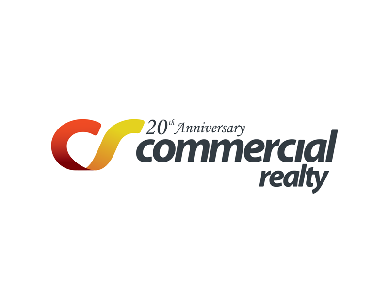
20th anniversary logo
Want to win a job like this?
This customer received 31 logo designs from 15 designers. They chose this logo design from H4R5Z as the winning design.
Join for free Find Design Jobs-
 A$160
A$160
-
 31 designs
-
 15 designers
Logo Design Brief
Commercial Realty is a company that has been operating for 20 years and specialises in selling and leasing commercial properties such as retail, industrial, shopping centres etc. The company is looking to create a complementary logo to their existing company logo that will mark this 20th anniversary. The symbol can extend or fit into the existing logo to create a sense of cohesion. It is to reflect the same colour focus/theme as the existing logo. The new logo element needs to reflect a sense of achievement, flourish.
Target Market(s)
Business people who hold property portfolios - we want them to feel that this has a sense of flourish, achievement
Industry/Entity Type
Shopping
Logo Text
20th anniversary, 1994-2014, 20 years - anuthing along these lines which identifies 20th anniversary
Logo styles of interest
Lettermark Logo
Acronym or letter based logo (text only)
Look and feel
Each slider illustrates characteristics of the customer's brand and the style your logo design should communicate.
Elegant
Bold
Playful
Serious
Traditional
Modern
Personable
Professional
Feminine
Masculine
Colorful
Conservative
Economical
Upmarket
Requirements
Must have
- fit in with the current logo, clearly demonstrate celebrating 20 years of success