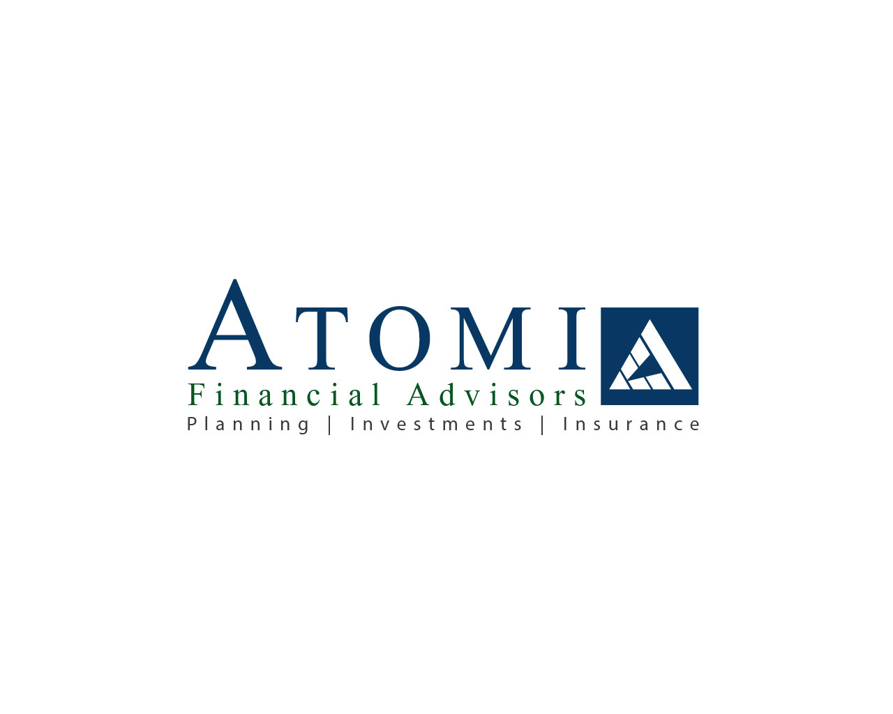
Logo Design - Atomi Financial Advisors - Guaranteed
Want to win a job like this?
This customer received 125 logo designs from 32 designers. They chose this logo design from HLGCreativeTeam as the winning design.
Join for free Find Design Jobs- Guaranteed
-
 US$300
-
 125 designs
-
 32 designers
Logo Design Brief
We need a logo design for a new full-service financial services firm based in Newport Beach, California called "Atomi Financial Advisors".
"Atomi" is a play on the word "Atom". The idea is that an atom is the smallest detail. "Atomi" then conjures up many little details, which is what this firm is about, attending to all the little details that ultimately help create a successful financial plan.
Atomi Financial Advisors has the following core offerings:
* Financial Planning
* Investment Management
* Risk Management
Atomi Financial Advisors has the following value-added solutions:
* Advisor-Managed Trust Services
* Donor-Advised Fund Services
* Impact Investing
* Family Governance Services
Atomi Financial Advisors has created robust service segments based on age group (Gen X, Early Boomer, Baby Boomer) and by total assets under management AUM ($5MM AUM).
Atomi Financial Advisors' corporate culture is based on the following principles:
* Act with integrity and honesty in all dealings
* Serve as a fiduciary with clients' assets and trust
* Treat others with the utmost respect
We're looking for a corporate logo that communicates:
* The firm's core principles (values)
* The firm's expansive solution set (scale)
* The firm's focus on the little things (details)
Updates
Hi Everyone,
First of all, thank you for the submissions so far. All of your designs have been very creative and have helped me gain clarity in terms of what I want. Here are a few thoughts:
- The logo must have the full name "Atomi Financial Advisors"
- When using fonts and colors, either all of it should be the same, or "Atomi" can be separated from the rest, but the "Financial Advisors" should always be the same color and font
- The logo must have the tag line "Planning | Investments | Insurance" in it. However, it does not need to be in a horizontal line. These three words can be stacked
- I do not want the initials "AFA" nor a singular "A" as part of the logo
- So far, I haven't seen a logo submission which has a a graphic element to the word "Atomi" that I've like yet. I'm not saying there isn't a solution out there, but I'm just not sure it works in this situation
- I do not want any atomic symbolism in the logo. It's just too literal. I think the logo should convey an "attention to details", which was my original purpose for creating the name
- The spatial layout of the text does not have to be uniform or blocky. In fact, a little offset can add some visual interest
The second design, Atomi Design B (click the name to see), moves the logo to the right-hand side and offsets the tag line a bit.
The third design, Atomi Design C (click the name to see), is very similar to Design B, but the text is lined up and the logo component is larger.
In all three designs, I made the "A" in "Atomi" a bit larger than the rest of the text. I like how this subtly stands out without being too obvious.
If possible, I'd like to see some designs that build off of these examples. Clearly, I'm not an expert on fonts or colors, so this is where I'd like to see your expertise. I will say, though, that I like the combination of blue and green, which some of you designers have used. Finally, if your design include a graphic, please make it very original.
To make up for any re-work, I have increased the budget for this project by $50. Thanks again.
Added Sunday, December 16, 2012
Project Deadline Extended
Reason: Hello designers,
Thank you so much for all the submissions. I want to give everyone at least one round of feedback, but, because of the holidays, I confess I am a little behind schedule. I am extending the deadline by just one week. Have a Merry Christmas!
Added Tuesday, December 25, 2012
Hi all,
Thank you so much for the really terrific, very creative designs. After seeing so many, I think I've narrowed down the structure of my logo and am now looking to perfect it. Please take a look at the mock ups I've created:
Atomi Mock Up A
Atomi Mock Up B
Atomi Mock Up C
So, at this point, I'm looking for:
- The perfect graphic to complement the company name, vision, values
- The perfect set of fonts. Feel free to improve what I did, but please use a serif small caps for "Atomi", a serif lower case for "Financial Advisors", and a sans-serif lower case for the "Planning | Investments | Insurance". By the way, for the mock ups, I used:
- California FB small caps for "Atomi". Note I made the "A" extra large
- California FB for "Financial Advisors"
- Calibri for "Planning | Investments | Insurance"
- The perfect color combination. For the mock ups, I used a dark blue, a dark green, and black. However, please feel free to use what you think works best.
Thanks again.
Added Thursday, December 27, 2012
Target Market(s)
Our market is individuals and families ranging from age 40 to 70 with varying AUM levels
Industry/Entity Type
Financial
Logo Text
Atomi Financial Advisors
Logo styles of interest
Pictorial/Combination Logo
A real-world object (optional text)
Wordmark Logo
Word or name based logo (text only)
Look and feel
Each slider illustrates characteristics of the customer's brand and the style your logo design should communicate.
Elegant
Bold
Playful
Serious
Traditional
Modern
Personable
Professional
Feminine
Masculine
Colorful
Conservative
Economical
Upmarket
Requirements
Must have
- The logo must have the company's name, Atomi Financial Advisors, prominently displayed. It must be able to stand alone as well as have one of the following two catch phrases. The first is "Planning | Investments | Insurance". The other catch phrase is "Every Detail". In other words, we're looking for a logo that can be presented three ways:
1) Stand alone. Just "Atomi Financial Advisors"
2) With catch phrase "Planning | Investments | Insurance"
3) With catch phrase "Every Detail"
The logo must be available in .JPG and .PNG format, and in both full color and gray-scale.
Should not have
- The use of an atomic element may seem an obvious choice for a corresponding logo. However, I think a very literal element is just too obvious and may actually confuse prospects into thinking we've got a scientific slant. If you're going to use the atomic element, it should be very abstract and try to tie it back to financial services.