Fine Line Retail Logo
Want to win a job like this?
This customer received 59 logo designs from 24 designers. They chose this logo design from tavi as the winning design.
Join for free Find Design Jobs- Guaranteed
-
 US$200
-
 59 designs
-
 24 designers
Logo Design Brief
'Fine Line Retail' is an e-commerce company based in Philadelphia, PA that sells a plethora of merchandise globally through it's proprietary sales platform. Because we sell merchandise across a variety of categories, we are unable to designate a specific theme that would apply to the logo from the merchandise perspective. Perhaps some 'lines' can be incorporated into the logo, however this is not necessary. We like squares, striped lines, cursive, lighter colors, green, gray, black... The aforementioned isn't by any means required and we encourage deviation. Please don't include any '$' signs... Originality is highly sought after :)
Thanks!
Updates
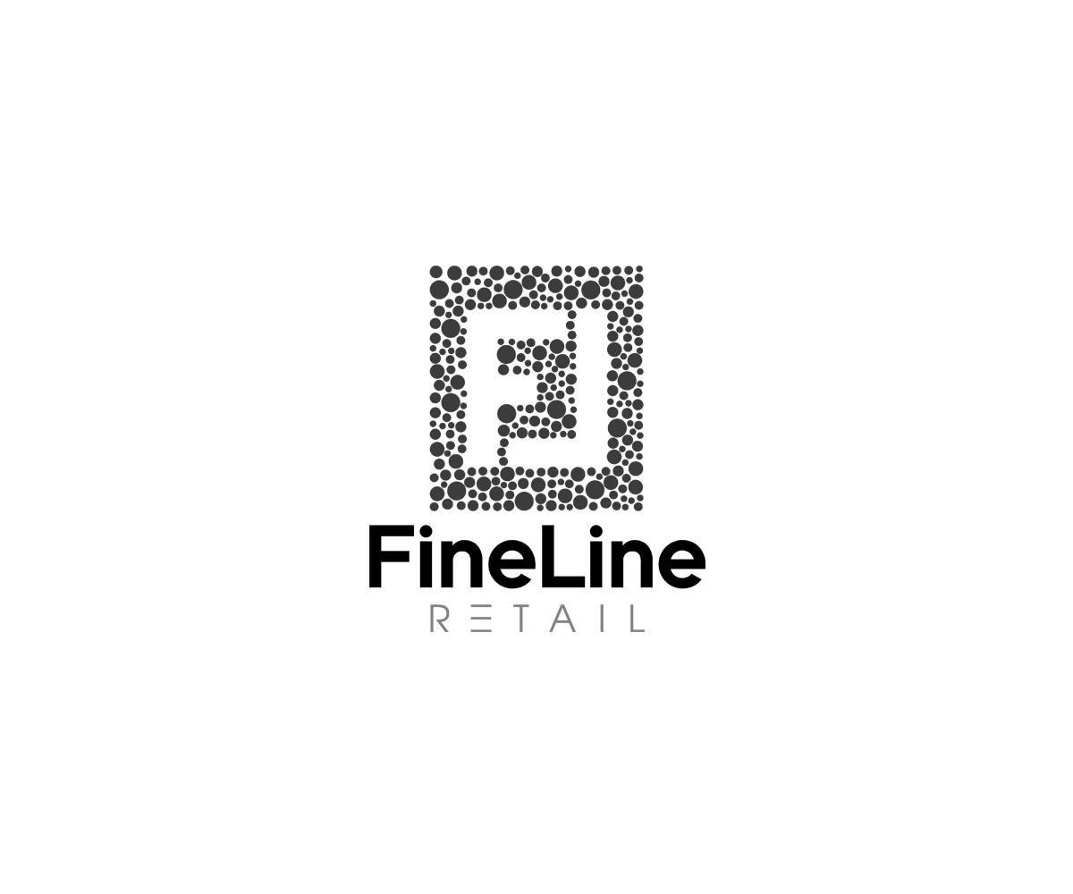
We want to try a negative space logo. Above 'Fine Line' we want a logo that is 'F' 'L' derived from negative white space surrounded by polka dots. Below is an image of what we mean. The dots should all be grey and perfectly round (not paint splatter). Dots should be different sizes.
http://4.bp.blogspot.com/-Dfuu-Yk2DgA/UnLwmG-BWdI/AAAAAAAAAfo/jPuQMQJzmfI/s1600/Example.jpg
The white space 'F' 'L' of the negative space should resemble this:
http://3.bp.blogspot.com/-nqGisw2FbmM/U3C4HhS2zEI/AAAAAAAAAic/ddIVvyrm97g/s1600/fendi_d2012101118710.png
Basically the 'F' as regular negative space font, the 'L' is mirrored (FL) to complete the rectangle.
Added Saturday, August 30, 2014
Industry/Entity Type
E-Commerce
Logo Text
Fine Line Retail
Logo styles of interest
Lettermark Logo
Acronym or letter based logo (text only)