Infographic ranking standards for countries
Want to win a job like this?
This customer received 7 infographic designs from 2 designers. They chose this infographic design from Oliver.Ryg as the winning design.
Join for free Find Design Jobs- Guaranteed
-
 C$260
C$260
-
 7 designs
-
 2 designers
Infographic Design Brief
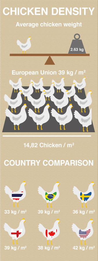
I have collected various rearing standards for animal welfare from various countries - such as How Much Space Animals Are Given (stocking density); Rest Hours per day; Permissible slaughter methods; Air quality limits (ammonia %), etc. I want to show how each country ranks in comparison in a visual interesting way. Graphs in excel or Smart Art are too boring. Information needs to be clear for those people looking for it and presented in a new appealing way. I was thinking stocking density could be presented by the Pigs able to turn around (vs. too crowded) or being degree to which hens could spread wings. Dark period as the size of a moon vs. sun to indicate rest opportunity. These might be terrible ideas so I am very open. Just want a way to visualize the differences. Open to using flags of countries too and some specific Animal Welfare logos would need to be added. I am looking for a mock up for style and then I can give you the data. Overall, I would need information for about 5 standards for chickens done fairly quickly (4 days) but afterwords, this would be an on-going project for all species and all standards. Here is an example of stocking density for meat chickens.
Sweden - 20kg/m2 to 36 kg/m2 depending on welfare program results. Most rearing at 36kg/m2.
Switzerland - 30 kg/m2
Thailand - 33kg/m2
Scotland - 34kg/m2
Canada - 31-38kg/m2
USA - 36kg to 42kg/m2 depends on bird market weight
Brazil - 30-38(39)kg/m2 (study showed relative to climate - 30low, 34mid, 38high)
European Union - 33kg/m2 up to 39kg/m2 (or 42kg/m2) after meeting certain conditions
England - 33kg/m2 up to 39kg/m2 (or 42kg/m2) after meeting certain conditions
South Africa - 40kg/m2