Hospital Logo Refresh
Want to win a job like this?
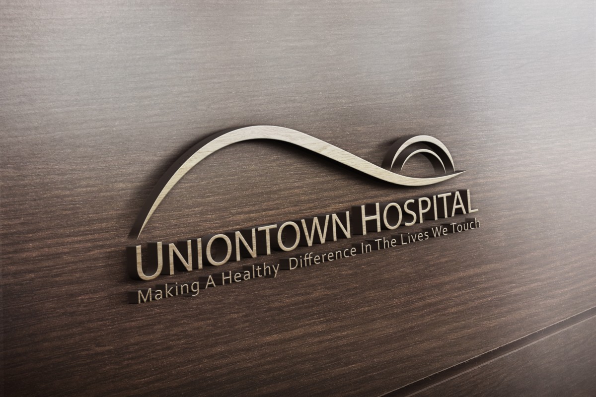
This customer received 142 logo designs from 35 designers. They chose this logo design from (bboy) as the winning design.
Join for free Find Design Jobs- Guaranteed
-
 US$160
-
 142 designs
-
 35 designers
Logo Design Brief
We have a hospital logo that is somewhat outdated, but we cannot change it significantly. Recently significant budget has been invested in new signs, carpets, mugs, stationery, pens, etc -- all with the existing logo. However, we would like a "refreshed" version of the logo for the new website.
Therefore, the new logo should appear "refreshed" but NOT so different that it appears inconsistent with the current logo.
* It must have the symbolic "mountain" swish, and two "sunrise" curves.
* It must include the hospital name.
* Please show one version with the tagline, so that we can see how the tagline would be oriented on print materials.
We would like the shape and spacing of the curves, as well as the size and placement of the text, to be more elegant and modern -- so that the overall logo looks professional and polished.
The typeface used for the logo does not have to be the exact font used in the current logo. We leave this to the designer's judgement.
We would like to see one version of the logo that uses two shades of brown in the logo mark, and blue for the text, as the current logo uses. Exact shades may be altered slightly to make the color scheme more attractive.
Another version should be presented for use in Black & White contexts.
Please consider these articles on logo redesign for examples of brand updates.
http://www.adweek.com/adfreak/look-30-other-corporate-logo-redesigns-12115
http://designreviver.com/inspiration/20-great-and-20-not-so-great-logo-redesigns/
Again, we would like to see something fairly consistent with the current logo, but fresher and more modern.
Updates
Hi Designers,
Please keep in mind the requirement that the logo mark must basically match the elements in the current logo. It CANNOT be a large departure from the design, because the current logo will stay on the hospital signs for a long time. We want to see a more refined, beautiful, professional looking version of the current logo. But, not a major departure in the elements of the logo. Please see additional logo-shape.jpg file uploaded today.
Added Monday, September 08, 2014
Attention all designers --
Please make sure you read the brief and the updates... The designs MUST MUST MUST include -- a mountain swoosh, 2 "sunrise" curves, AND NO OTHER THINGS. No pointy sunrays, no birds fluttering. No clouds. No sheep in a meadow. No mountains shaped like breasts. No pictures of Jesus' face in the side of the mountain.
JUST ONE (1) mountain SWOOSH, and 2 sunrise curves.
We know that doesn't allow you much room for creativity... we wish we could let you do more to change the logo, but we have to honor the request of the hospital, which is that they will not have to spend thousands of dollars on new signs, and new carpets. Instead, they want to spend their money on keeping people breathing.
SO!! Let's all just make a logo that sort of looks like the old logo, but BETTER. You are great designers. You can do it !!
Added Thursday, September 11, 2014
Regarding the shape of the "curves" --
What we DON'T like about the current logo is that the curves look like bended pieces of paper. They have weird tips to the lines, that seem to have been drawn with a caligraphy pen. That seems arbitrary and awkward, and not very "clean" or "elegant." They just look kind of haphazard and accidental.
SO! When you make your designs, we would love it if your curves were more beautiful. What does that mean to us?
1. Get rid of those weird chopped-off ends, first of all.
2. Try to make the slopes of the curves echo each other. Everything should hold together and seem intentional.
Added Thursday, September 11, 2014
Project Deadline Extended
Reason: waiting for revisions
Added Thursday, September 11, 2014
Project Deadline Extended
Reason: We have narrowed down to finalists and are gathering feedback from hospital administrators. Thank you for your patience while we make our final decision.
Added Thursday, September 18, 2014
Project Deadline Extended
Reason: Hi designers -- we simply hit a snag this week with the various decision makers on this project and have not been able to assess the recent submissions. We will be making a decision tomorrow. Thanks for your patience.
Added Thursday, September 25, 2014
Industry/Entity Type
Hospital
Logo Text
Uniontown Hospital
Logo styles of interest
Abstract Logo
Conceptual / symbolic (optional text)
Colors
Colors selected by the customer to be used in the logo design:
Look and feel
Each slider illustrates characteristics of the customer's brand and the style your logo design should communicate.
Elegant
Bold
Playful
Serious
Traditional
Modern
Personable
Professional
Feminine
Masculine
Colorful
Conservative
Economical
Upmarket
Requirements
Must have
- Must include the current logo's design elements:
* Symbolic "mountain" swish
* Symbolic "sunrise" curves
* Uniontown Hospital text
Must use the current color scheme of browns and blue (but can alter the shades somewhat, for a more modern/beautiful color scheme)
Should not have
- Should not make the current logo look TOO outdated, as it will still be on all of the hospital SIGNS and STATIONERY for a long time. The new logo should blend well with the old logo, so that people know it is an updated version of the old logo.
_brief022753.jpg?AWSAccessKeyId=ASIARQT47ZIUQ5YQDL6F&Expires=1785306886&response-content-disposition=attachment%3Bfilename%3D%22logo%20%281%29%20Tuesday%2C%2002%20September%202014%2015_27_53.jpg%22&x-amz-security-token=IQoJb3JpZ2luX2VjEJf%2F%2F%2F%2F%2F%2F%2F%2F%2F%2FwEaCXVzLWVhc3QtMSJHMEUCIEI2Xa%2BtzQo%2FITb3MtLVAjpBeVdPJD1hBh9OulqfSZ1mAiEA4xrlZU7dyr4T8pt4gdU%2FJtTfmsgJ328a0D003whcQC0q6wMIXxAAGgwxMDQ0MTUwODcxNDUiDPsbO3oivn0nkHeQjirIA9yV9ePnpRzKG5wWZLIw%2F87W%2FjO8IqtD8jJkDJxOSsXtLS4PkyCro26H4obouiHen8ldoRJxSODmtbgj6lXUUnOCd3hXW7hft3L8Wjre8ZbOITcn4Ii2Cp95HkYwgO%2F%2Bhb0rl6VBpDPffkfO0A2ghf866ghIKsUOGo5J4xR7eXIL2ERamske2Hckh91piFpMn5z%2Bui%2B23ghrB3%2Baa5qfuXYWzJggT1bG6Q6CZduBaOCOpO5spyoUzoJHceYgOYHQNYn3BDQpbk8TRi2WIK8nSxK8ecoancacU%2BBCZfiu1YobH3Dx9SLxG19qdoisHMGcv%2BkKJkYwJDuK7O%2Boc%2BsXEY4YU4rFlrsogwOcMBSO%2FFfv4NrfXhH%2FdaVIqgPPbTKXapwnBUl3l7NzLgsxnHbmQh5U4mNJjESkXm1JAvL0%2FVIEMmL9gRQHschnonr%2FoakFBTeJi0Dv%2BuJIXxzeeq17KemXrUYkQOE3hRgtNa3KQ0KEgLBuZ8Kb%2By3LIOuCV0anT3VpK2VkoZG%2F%2BzQ%2FJafTx3NkWr84SW7upyHrGXQ6%2Fy7j7bV4Z4xWW6mbAkodCE7s54I7xhfF8atQ7l0OxeQEDeT4bZ4WnkLINTCBkKHTBjqlAfVblmEw6DsEzhniEoTx8IkwACI7fNrG66PQGRbX%2FH39E%2FB4zt%2Fbd1V2AwJQis1hiAknjJ%2B8TOUH6p%2FMCjLMS9RtyYq0okgqQc75cTg%2BDVpJHov0kS6VLS3d5ZeEIG4dRMlOVO6xvHLrRbnYy6sk87x4qiSyUKywJOct8qYlzzjJfu0PMCqHkDYJrhOziVSt819ubCiz1FO%2BL1GkT0%2B%2BTaHvjbFU2g%3D%3D&Signature=6iEz4rm5RDco4AMyecvzv24iJ6A%3D)