App Design Project
Want to win a job like this?
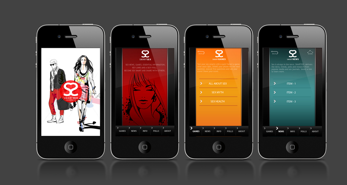
This customer received 14 app designs from 5 designers. They chose this app design from Svetlin Angelov as the winning design.
Join for free Find Design Jobs- Guaranteed
-
 US$500
-
 14 designs
-
 5 designers
App Design Brief
OVERVIEW: I want to re-style an iPhone app that is lifestyle orientated for young adults – aged 18-35, male AND female. – to make it more hip, slick, playful with a more dramatic home page and some added styling for other key pages. There is a splash page that users first see, a home page, and about 6-7 other pages for the rest of the app. As well, I want to re-do my app icon that is a memorable design in the icon box shape.
STYLING OF APP PAGES: I am refining a pre-built iPhone application It needs to be hip, stylish, a bit playful, and have a bit of slickness to it. It should be a bit SENSUAL and elegant – but NOT erotic in tone. It already has all pages generally done – the background colors are close and general button positions are completed. The buttons could change in style. The “home” page for the app could have just the bottom buttons- not the 3 in the middle that choose games, news, info. and a dramatic illustration for the rest of the page – with some copy here and there. Now it needs some styling to make it more cool looking and relate to young adults, aged 18-35. It looks nice but a bit flat and plain and, I want to style it more. I want to create a dramatic style with more of a signature to the look.
For the app pages, I would like to:
Backgrounds: See if we can give them a bit more drama, gloss.
Home page: Create an illustrated style - perhaps using silouettes, or line drawaings or high-con imagery in a color – want to be stylish, elegant. It is a a lifestyle app for young adults, so it should speak to socially active, in the know, young adults.
Other key pages: This can play off the home page styling. All buttons on the other pages stay where they are. The backgrounds can be given a bit more gloss – if you like. The tops of the pages can echo the home page with some design related to young adults.
But am open to other styling that can help make it more elegant, edgy, and appealing to young adults. The background colors are nice but maybe a bit flat – may need more of a sense of highlights / gloss to make them pop more.
The SmartSex logo at the top middle could change, though, if something better comes along. If it stays the same, that’s OK too.
APP ICON: Finally, I want to also create a companion iPhone icon for the app that reflects what is done to style the app itself. I have a dimensional background for the icon and an idea to create a strong, simple element using dual letter S’s – representing the name of the app. The name of the app is two words, each starting with S. The icon should be dramatic, simple, and dimensional in visual tone. It could be as simple as 2 S’s kissing – but it has to be memorable.
ASSETS: I am including about 4 - app frames, including the home page, that could benefit from added styling. Some pages have some opening copy that is in the art.. that will stay in most cases. But they could use some added styling and highlighting. It could be young men’s and women’s faces, graphic elements, or even some aspect of the double S logo/icon look.
Updates
On this project I am looking for the use of the backgrounds I uploaded - especially the home page - but without the three center buttons - easy to take off in the PSD file. Then, I'd like to see some representation of young adult faces or face body in a stylized, abstract way. Not as a realistic image. So, they may be line drawings in a complementary color - or a high-con of the image in a complementary color. The home page needs to set the style for young adults for the rest of the app. I've uploaded images of young adult people / faces and even some silhouettes that could be used to do a styling of the home page - where the page has buttons top and bottom but a center space with some stylized hip young adult imagery. Not too busy but elegant/edgy.
Added Tuesday, November 13, 2012
Project Deadline Extended
Reason: I both want more designers to have a chance to participate and I have added more refined instructions for everyone.
Added Tuesday, November 13, 2012
Project Deadline Extended
Reason: Had to be out of town for the holiday and thought it was the 27th. Oops. I'll be going through the new designs in detail - communicating with a few of the designers and selecting one of the designers by no later than this coming Friday. Pardon the mistake. I'm new to this.
Also, I'm going to up the price a bit about $100.
Paul Froehlich (917.414.8374)
Added Saturday, November 24, 2012
Project Deadline Extended
Reason: I have to be out of town and just got back and need to review new designs. Thank you.
Paul
Added Thursday, November 29, 2012
Target Market(s)
Socially active, hip young adults 18-35.
Industry/Entity Type
Games
Look and feel
Each slider illustrates characteristics of the customer's brand and the style your logo design should communicate.
Elegant
Bold
Playful
Serious
Traditional
Modern
Personable
Professional
Feminine
Masculine
Colorful
Conservative
Economical
Upmarket
Requirements
Must have
- Should appeal to socially active young adults and have a strong, elegant design geared toboth male and female users.
Should not have
- This is a fun, educational app – so, it should not be erotic – only stylish, a bit edgy, and a bit sensual.