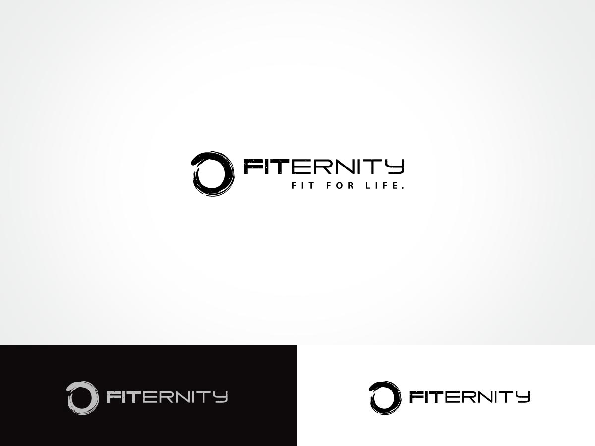
Logo Design Project | Fitness Company

Want to win a job like this?
This customer received 201 logo designs from 41 designers. They chose this logo design from ArtTank as the winning design.
Join for free Find Design Jobs- Guaranteed
Logo Design Brief
My company is called "Fiternity" - we've combined the word "fit" with "eternity" and will be selling fitness apparel targeting people who love fitness, exercise and crossfit. The logo should represent eternal fitness, eternal strength for those that will forever make fitness an important part of their life. We'll also be sponsoring and outfitting high level elite athletes to wear Fiternity apparel and gear. We need a logo that represents eternal fitness, strength, discipline, courage with a modern edge and feel.
Tagline. -> fit for life.
We'd like to see versions of the logo with a tagline, and without.
this can mean fit for the rest of time, and fit for "life" itself for those that we help with the donations we make to charities.
A few of the companies that we are competing with in this market just to give you an idea of our audience. We expect our brand to be better and more elite:
http://www.redefinefit.com/
http://www.htfu.com/
Target Market(s)
athletes, crossfitters, runners, gym rats, athletic coaches, etc
Industry/Entity Type
Fitness
Logo Text
fit for life. (versions WITH and WITHOUT text)
Logo styles of interest
Emblem Logo
Logo enclosed in a shape
Pictorial/Combination Logo
A real-world object (optional text)
Abstract Logo
Conceptual / symbolic (optional text)
Wordmark Logo
Word or name based logo (text only)
Look and feel
Each slider illustrates characteristics of the customer's brand and the style your logo design should communicate.
Elegant
Bold
Playful
Serious
Traditional
Modern
Personable
Professional
Feminine
Masculine
Colorful
Conservative
Economical
Upmarket
Requirements
Must have
- The O we have attached. It's a version of the celtic symbol of "eternity" - a never ending continuous circle which represents "forever" ... this was a basic concept we created ourselves so you'll see the word "fit" in the O... you don't have to do that, but we DO want to use the O in some way shape or form as a focal point of the logo.