Stationery Design Project - John Antonios
Want to win a job like this?
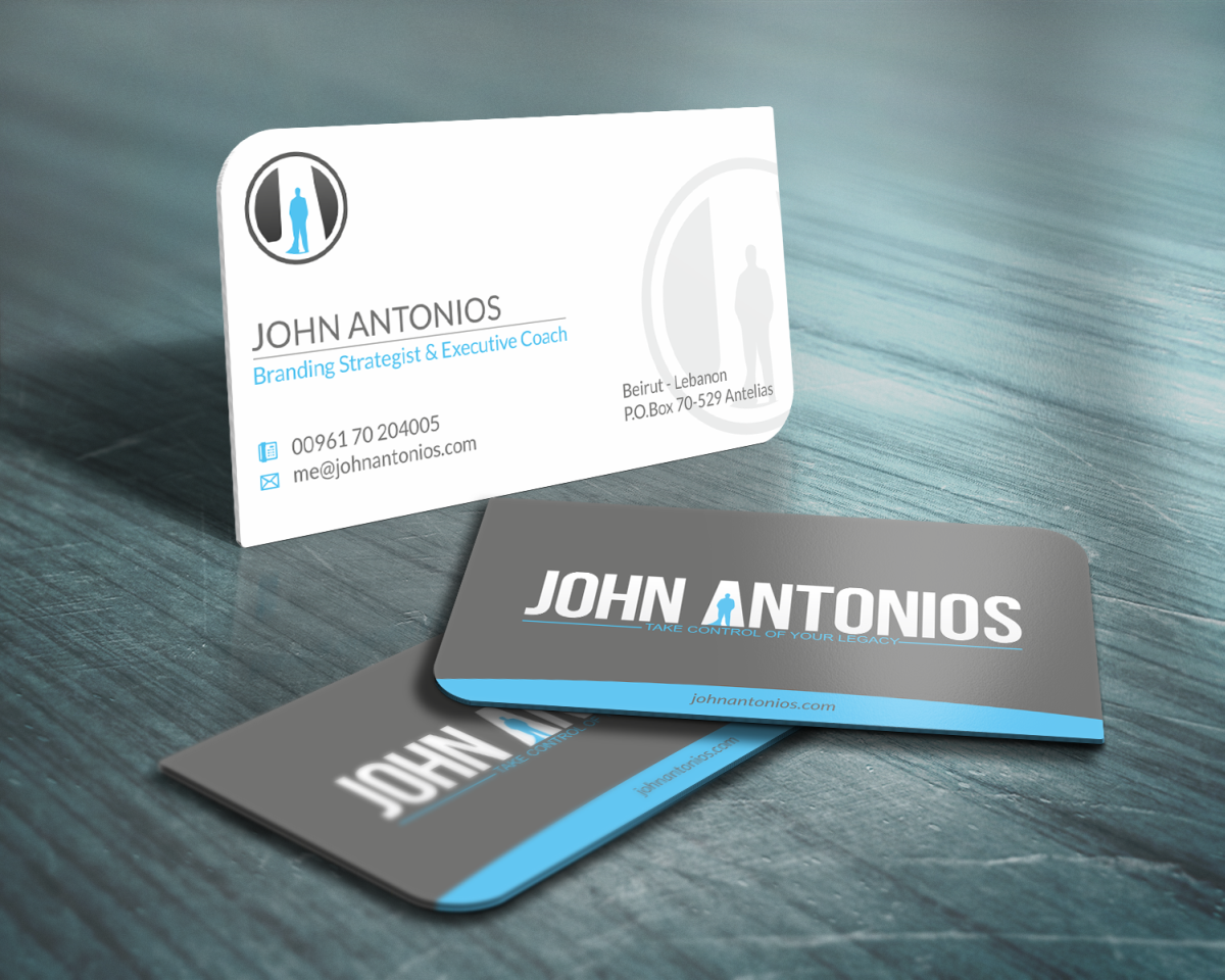
This customer received 163 stationery designs from 6 designers. They chose this stationery design from HYPdesign as the winning design.
Join for free Find Design Jobs- Guaranteed
-
 US$260
-
 163 designs
-
 6 designers
Stationery Design Brief
I have recently designed my personal logo - John Antonios (here on designcrowd.com) and now i'm looking to complete my corporate identity, with adding:
- Business Card
- Letter Head
- Envelope
- Brochure template (that will be used to promote any of the workshops or other services I provide along with a short summary about my credentials, and testimonials) - you can take your pick from the website: http://johnantonios.com
Refer to website for more insight into the brand and the look & feel
PS.
- PLEASE REFER TO ATTACHED FILE AND READ THE "SHOULD NOT HAVE SECTION OF THIS BRIEF"
- I have attached two vector files, displaying the logo alteration on two different backgrounds (dark & light)
Updates
ONLY 2 DAYS LEFT ON DEADLINE. KEEP THOSE DESIGNS COMING.
Added Sunday, October 14, 2012
Target Market(s)
1) One-on-one Business Executive 2) Companies requesting my workshops for mid management teams & public speaking events like TED Talks
Industry/Entity Type
Business
Look and feel
Each slider illustrates characteristics of the customer's brand and the style your logo design should communicate.
Elegant
Bold
Playful
Serious
Traditional
Modern
Personable
Professional
Feminine
Masculine
Colorful
Conservative
Economical
Upmarket
Requirements
Must have
- - must fit the look and feel of the logo (notice that I have attached the logo, and an emblem)
- the final files should be ready for printing - with info on colours, sizes, bleed area, margins, UV spot (if applicable), suggested material to print on (applies to business cards in particular)
- brand guide lines should be laid out too (font, colour, etc ...)
Nice to have
- It would be nice to produce something different that your standard sizes & di-cut in terms of business card, and letter head ...
Should not have
- THE EMBLEM (JA) AND THE LOGO (JOHN ANTONIOS) SHOULD NOT BE LAYED OUT AS PER THE ATTACHED FILE - THEY SHOULD BE SEPARATED - THE EMBLEM (JA) CAN BE USED IN PARTIAL OR AS WATERMARK - BUT NOT THE LOGO (JOHN ANTONIOS)