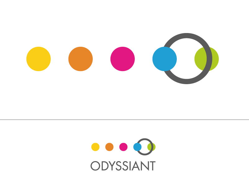
Logo for a new company

Want to win a job like this?
This customer received 106 logo designs from 41 designers. They chose this logo design from hoch2wo as the winning design.
Join for free Find Design Jobs- Guaranteed
Logo Design Brief
Odyssiant is a new software company. The software will allow the user to map audience journeys and then manage them for content marketing. The company name can be used in the logo, but we would like a symbol that represents the following: journey, odyssey, plan, engagement, trust.
Our corporate colours are the following RGB codes:
Grey: 91,91,91
Yellow: 251,206,0
Pink: 227,9,129
Green: 175,203,30
Light Blue: 0,161,226
Brown: 231,133,42
Our current fonts are Nexa & Nexa Bold, but it is not mandatory to stick to this. The font should be clear and bold. No shadows, underscores or other "treatment" of the text itself. The symbol should not overlap the text and vice versa, but can be joined to the text.
Updates
Project Deadline Extended
Reason: Haven't quiet seen what we are looking for yet.
Added Saturday, July 05, 2014
We use the font Nexa and Nexa Bold with our other brands. We are not stuck on this, but please try this font with your designs. Thanks.
Added Saturday, July 05, 2014
The brief now has some further detail. We haven't seen what we are looking for yet so have provided so more description to help refine or develop the designs.
Added Monday, July 07, 2014
Industry/Entity Type
Software
Logo styles of interest
Pictorial/Combination Logo
A real-world object (optional text)
Abstract Logo
Conceptual / symbolic (optional text)
Font styles to use
Other font styles liked:
- nexa, nexa bold
Look and feel
Each slider illustrates characteristics of the customer's brand and the style your logo design should communicate.
Elegant
Bold
Playful
Serious
Traditional
Modern
Personable
Professional
Feminine
Masculine
Colorful
Conservative
Economical
Upmarket
Requirements
Must have
- Strong colours, use as many of the colours as makes sense for your design and use them to make the design "pop"
We need the ability to reuse logo in different formats within presentations etc – i.e. flexibility of design
There needs to be a strategic sense of joining things together; interconnection and removal of silos
A sense of journey and movement
Professionalism, maturity and not .com
Shapes should be simple, elegant and connected with the brand name and not just a random stamp alongside and certainly not symbols that can be see anywhere else.