NEW SEASON FLYER
Want to win a job like this?
This customer received 11 flyer designs from 4 designers. They chose this flyer design from Ari Qinkqink as the winning design.
Join for free Find Design Jobs-
 US$140
-
 11 designs
-
 4 designers
Flyer Design Brief
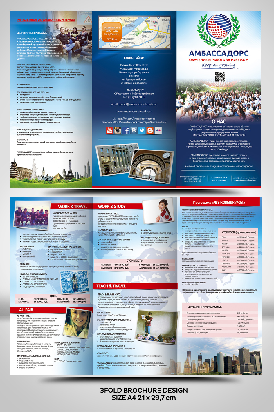
WHO ARE WE?
We are an International Exchange Center based in Saint Petersburg, Russia, sending students abroad for educational and professional programs.
THE OLD FLYER:
Last year we came up with this flyer attached. As you will notice: the attached flyer is structured like this:
- Front Page is regarding the company's profile
- The flyer inside is dedicated to our programs: inside left part dedicated to "WORK & TRAVEL" program, the middle inside "WORK AND STUDY", the right inside page to "EDUCATIONAL PROGRAMS"
-The backside is dedicated to our programs and services prices.
PURPOSE:
We would like to keep the same structure regarding the pages, logo, flash code, map, but make a new flyer with:
- A MORE ATTRACTIVE BACKGROUND: this one is too white
- MORE EYE-CATHING
- MOST OF ALL: PERSONAL, you will notice in our website, we have many pictures from our staff, events, presentations, opendays on top of people abroad. The message through the images is to tell the potential clients that they will be well taken care of because they are dealing with people focused staff whose passion is to provide international programs.
The next season we have 2 more programs and many more destinations.
RECOMMENDATION:
USE THE PICTURES I ATTACHED
We strongly advise you to have a clear understanding of our activity, to look at our animation contents: photos, videos, but also our social medias
http://www.ambassadors-abroad.com/ru/
http://vk.com/ambassadorsabroad
http://instagram.com/ambassadors_abroad
http://www.ambassadors-abroad.com/ru/gallery
https://www.youtube.com/user/AmbassadorsAbroad/playlists
We will provide you the russian text in due time
TO AVOID:
We don't want standard backgrounds taken from internet of cliche images or tasteless or deja vu work, if so, this concourse is not for you
Updates
Project Deadline Extended
Added Monday, July 07, 2014
Target Market(s)
Students aged 17-26 years old
Industry/Entity Type
Internet
Font styles to use
Look and feel
Each slider illustrates characteristics of the customer's brand and the style your logo design should communicate.
_brief300035.png?AWSAccessKeyId=ASIARQT47ZIU2B73EVJB&Expires=1772870835&response-content-disposition=attachment%3Bfilename%3D%22flashcode%20%281%29%20Monday%2C%2030%20June%202014%2011_00_35.png%22&x-amz-security-token=IQoJb3JpZ2luX2VjEBcaCXVzLWVhc3QtMSJGMEQCIDNPG%2BZO60Pd%2FToYYfV6MIONchNnfY3RtJX7NZmBG7uhAiAjl6eXHECIBvUfpwr4ywBMoZsulVTPfyftpJKxdsVLXCr0Awjg%2F%2F%2F%2F%2F%2F%2F%2F%2F%2F8BEAAaDDEwNDQxNTA4NzE0NSIMisaR3Ar7aPrUhpC%2BKsgDEN37hGaJuBy1w7Itinf7VezuAZA4j9cNS7db0c4lE4ZAy6n4HyMSDVjB6Q0kXwUb14QR1GGqQpzg5TTlbMdQPkIN9d23ZaBlTU8aP92Xq2KQPjZ4YDT6LsQJrLRqb3vocSrU0Sv5kB6thBlBfldgnGNNldXTqy7DyfewZulhcphB3Z2GLKm88WeNMrWGqspv%2Fbg8UflhFLfw6hjCd4qaY4HUhSRRBWba7tjVqriu8aadRq1SJ2h0MHsTsDs2RhSryRji4aoUWNkfhtRhSHWAdsB3YyJersVfs37VZyR3HyCYMFqh7u1r%2B8LkkbF9yOLMgksNJqCTduhZhckN2pXAhfNUofbzICRr9fRIFltY1iWYMcWRUY5J5WErIZ5nwD3n8CNhk6bWIJzNFWiEawAdCYSNlwGD2uBw12tPuFLy5Rul8Skad1Y85iUS67Zp2hDuRxShoRyO8BRv5iaGwmib9xlneuGTjxpoYg91X3L8fDNln42wgN%2FcJlhMoLZA2RC7%2BkVMbI74Z93Aai0rn4IytCyFlmql4OMEkVe54rGE6910BSdpFlDMzIQnifxKw22Hgk5cY7SnpBqDAx%2Bloz86BO%2B4%2FzYd%2BDYLMIzpqc0GOqYBRSekWh8%2FQr2AphJnQKz1xPj%2FWhOnEuYyLFd0XVitKM%2Ft32ABzFaaz73YpSchf9ZjINi9AE%2Bj4XAFXS5fRfXsYgwxnYz7ZkLMvqWNMIDILGPMpX40fomrN2azOimA6PrNQ4FUNLGRKS8Vt%2BOj8IUz7XqZhvTP5iyu%2BcLQz8ON6OvBsHjJForXiQp4yC7ASq8Jx5445Tc%2B3%2B6EiSs%2Fw7XVo22MaPtQ8Q%3D%3D&Signature=BnYvEmc3M9PF1KFwoAEB9MyUvho%3D)