Unitrends Corporate Brochure (First of Several Projects That Will Be Based on This)
Want to win a job like this?
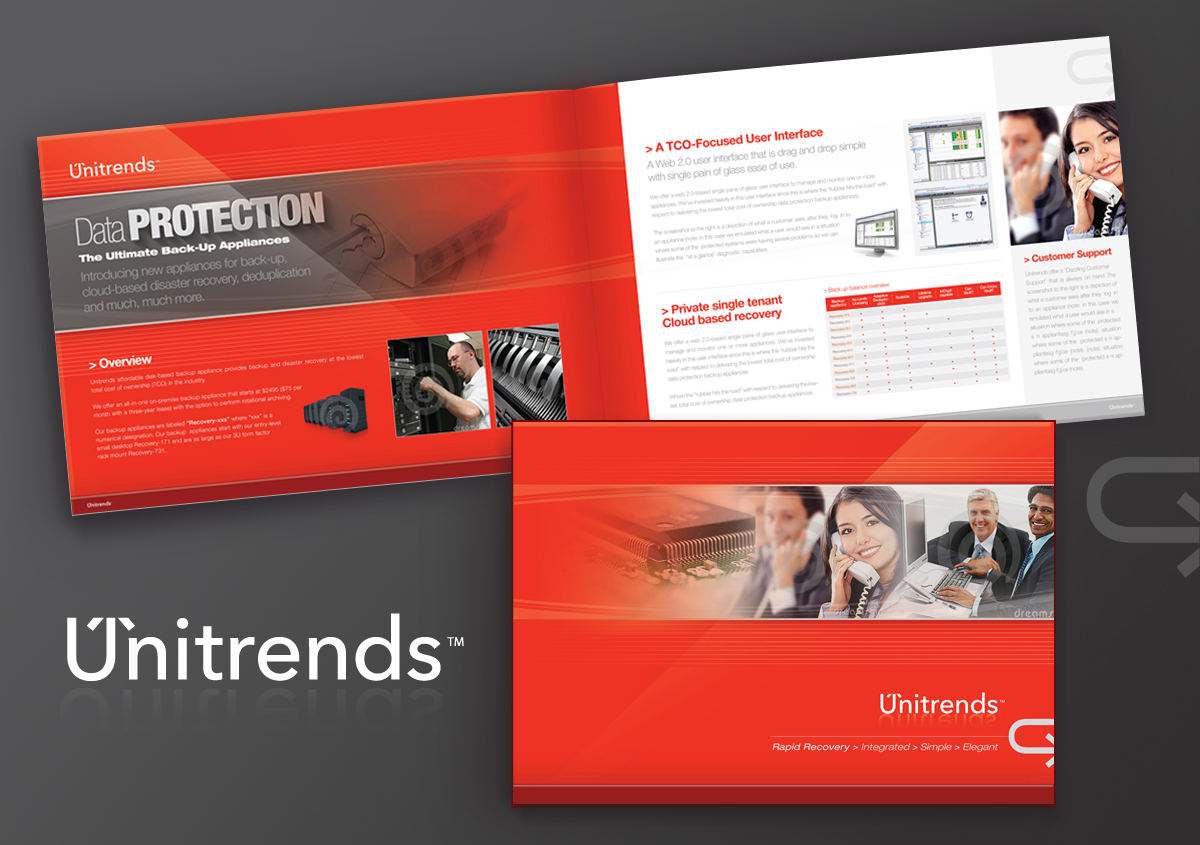
This customer received 61 brochure designs from 9 designers. They chose this brochure design from C23design Company as the winning design.
Join for free Find Design Jobs- Guaranteed
-
 US$1030
-
 61 designs
-
 9 designers
Brochure Design Brief
We need a new corporate brochure. Web site is at http://www.unitrends.com - describes pretty well what we do. We're an all-in-one scalable data protection solution company that builds and sells backup, archiving, and disaster recovery appliances. The key attributes of our company include:
- Dazzling customer support
- No Limits (TM) Licensing - no nickel and diming customers, no "backup tax"
- Supports over 100 versions of operating systems, applications, computer platforms, and storage platforms
- D2D2x: Disk-to-disk-to-any (cloud, disk, tape)
- Private single tenant cloud-based disaster recovery
- Public multiple tenant cloud-based disaster recovery
- Storage and in-flight deduplication
- Advanced virtual and physical dissimilar bare metal backup and recovery
- Single pane of glass management for one to hundreds of our appliances
We're looking for a design that meets the Seth Godin kind of criteria, to wit:
Q: What do you think of my brochure
A: The thing you must remember about just about every corporate or organizational brochure is this:
People won't read it.
I didn't say it wasn't important. I just said it wasn't going to get read.
People will consider its heft. They might glance at the photos. They will certainly notice the layout. And, if you're lucky, they'll read a few captions or testimonials.
At its best, a brochure is begging for someone to judge you. It says, "assume that because we could hire really good printers and photographers and designers and writers, we are talented [surgeons, real estate developers, whatever]" And more often than not, people do just that.
At its worst, a brochure solves a prospect's problem (the problem of: what should I do about this opportunity?) by giving them an easy way to say "no." "No," she thinks, "I don't need to talk with you... I've reviewed the brochure."
So, the strategies of your brochure might be:
• overinvest in paper and design. Spend twice or even ten times more than you planned. If you can't afford to do that, don't have a brochure. Especially if your competition does.
• use less copy. Half as much.
• use testimonials. With photos. Short captions. It's hard to have too many of the good ones.
• make it funny enough or interesting enough or, hey, remarkable enough that people will want to show it to their friends.
• show, don't tell. Don't say you have a tranquil setting... I won't believe you.
• and most important, make sure you leave several obvious things out... so that people need to talk to you.
Target Market(s)
Business: 20-2000 employees
Industry/Entity Type
Real Estate
Look and feel
Each slider illustrates characteristics of the customer's brand and the style your logo design should communicate.
Elegant
Bold
Playful
Serious
Traditional
Modern
Personable
Professional
Feminine
Masculine
Colorful
Conservative
Economical
Upmarket
Requirements
Must have
- (See description.)
- This needs to be remarkable enough that people want to show it to other people.
- Must be implemented via InDesign or another technology that allows us to edit copy.
Nice to have
- We use Avenir Next Font for most marketing; am open to complimentary font treatments