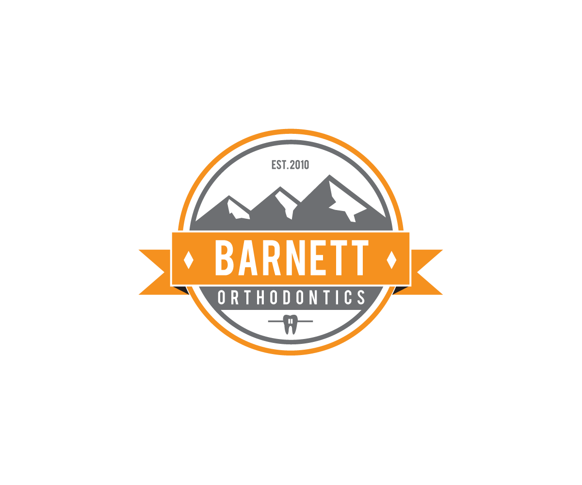
Orthodontic Office Logo - Ski/Mountain theme
Want to win a job like this?
This customer received 93 logo designs from 27 designers. They chose this logo design from Luc1ano as the winning design.
Join for free Find Design Jobs- Guaranteed
-
 C$340
C$340
-
 93 designs
-
 27 designers
Logo Design Brief
We are an orthodontic office located in a smaller city in Alberta, Canada. We are close to the Rocky Mountains, and there is a "ski lodge" theme throughout the office. Our current colours are orange and grey. I'd like to keep a tie-in to our current logo (three mountains, see attached jpg) if possible. I like the idea of a classic ski patrol-type logo (again, see attached). While I want it to be reminiscent of these kinds of emblems, I also don't want someone to see the logo and assume we are a ski shop, etc. If you could incorporate a tooth, that could work, but is not mandatory. The will be on our sign, but also business cards, letterhead, etc.
Updates
I like a lot of these. One suggestion would be to make the mountains "ascending to the right", more as they are in the current logo, rather than the tallest mountain in the middle, as some of these show.
Added Friday, May 09, 2014
Project Deadline Extended
Added Thursday, May 22, 2014
Industry/Entity Type
Office
Logo Text
Barnett Orthodontics