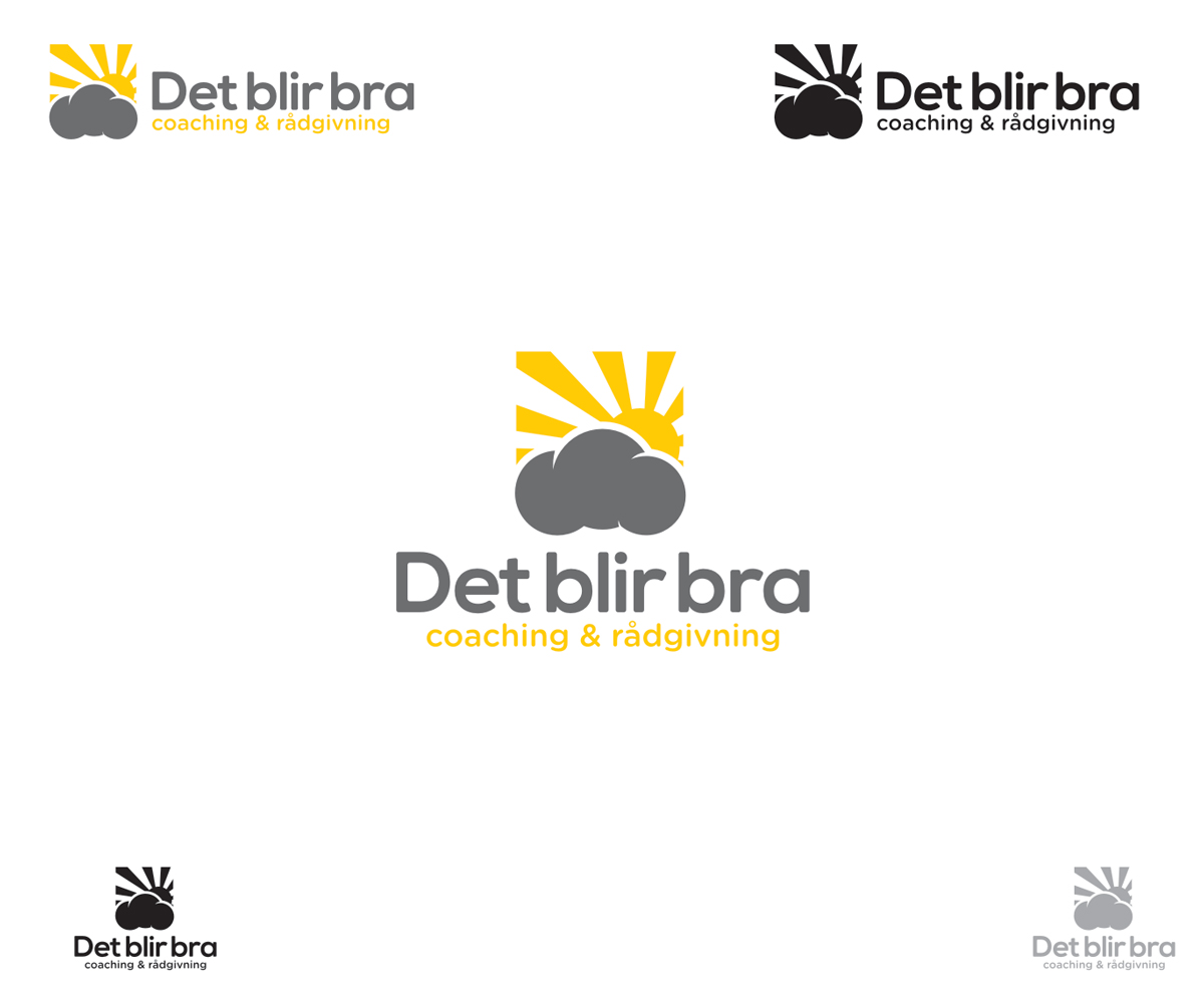
Personal development / Risk-management logo

Want to win a job like this?
This customer received 74 graphic designs from 17 designers. They chose this graphic design from chesta as the winning design.
Join for free Find Design Jobs- Guaranteed
Graphic Design Brief
We are a small company that works with professional coaching and consulting for individuals and companies. We are also experts in crisis situations, both for persons and companies.
Our name is (n swedish) Det blir bra - which means "it´s going to be allright".
Our paying customers are mainly bigger companies that send their staff to us. The staff are mainly around 35-50 years old.
We see ourselves as a modern company that is more a "communication agency focusing on personal internal communication", than traditional psychologists.
The feel of the logo should be:
Simple
Modern (think web agency more than psychologists)
Smart
Positive
colors: white, black, and ... give us suggestions.
WE LIKE THE SIMPLENESS IN THE ICON WE HAVE SENT. MAYBYE YOU CAN USE THAT IDEA AND JUST MAKE IT ...BETTER? (PERSONAL?)
You are the experts but we want you to create around our idea: after rain comes sunshine. we don´t know if it should be a hand drawns feeling, or more slick.
See the attached icon, that we like very much.
The graphic elements are:
1 The cloud with the sun behind.
(maybye the rain under it...)
2 Det Blir Bra (our brandname)
If we like your logo, we could be interested in business cards as well.
PLEASE FEEL FREE TO ASK ANY QUESTIONS!
UPGRADED BRIEF2
MY SKETCH IS REALLY UGLY; JUST SEE IT AS AN IDEA, DON´T FOLLOW IT TO HARD :-
Hi!
I hope you are well!
I send you this email because I think this maybye is more effective.
I like what you have done so far in the competition but I have an idea.
1 I would like to variations of the swedish sentence written both
Det blir bra (first letter big, words separated)
Det Blir Bra (three letters big, words separated
The font you are using is OK, but I would like to see more variations. You are the professional but could you try something classical or modern? I want it to feel serious and elegant
Feel free to experimente
I like these fonts,, just as inspiration, you are better
http://www.myfonts.com/search/AG+Book+Rounded/fonts/
http://www.myfonts.com/fonts/bitstream/franklin-gothic/
http://www.aatype.net/product.php?productID=35
2 I want the cloud and the sun, to be at the right of the sentence (as your example above) I WANT THE CLOUD TO BEHIND THE WORD "bra" , so that the font becomes white instead of black (or grey)
DON´T LET THE CLOUD RAIN, JUST LET IT BE PLAIN, BUT I WANT THE SUN TO SHINE (MAYBYE BE INSPIRED BY MY JAPANESE PICTURE, BUT IT DOESN´T HAVE TO BE SQUARE.
3 Work with black or grey with the cloud and the words (I think) BUT I WOULD LIKE THE SUN IN COLOR. COULD YOU TEST RED, ORANGE AND YELLOW?
4 Could you be "inspired" by a kind of japanese style for the sun? You see it in the picture.
5 I don´t want the cloud or the sun to feel too childish or "cartoon".
I made a really ugly scetch in PowerPoint:
Take care!
Ola
See my files in the draft!
Thank you!
Target Market(s)
We sell to bigger companies, that send some of their staff when they have in-the-middle- of-the-life-crisis, like divorce, cancer in the family, and so on.
So the big companies must see as as serious, but with a human touch.
Industry/Entity Type
Business
Font styles to use
Colors
Colors selected by the customer to be used in the logo design:
Look and feel
Each slider illustrates characteristics of the customer's brand and the style your logo design should communicate.