Meu Mercato
Want to win a job like this?
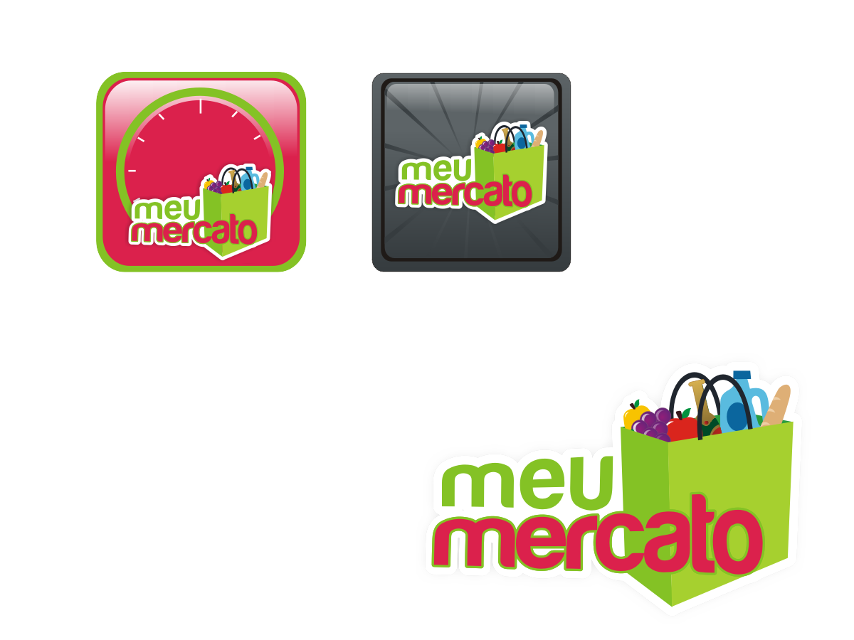
This customer received 32 graphic designs from 5 designers. They chose this graphic design from Blueberry as the winning design.
Join for free Find Design Jobs-
 US$140
-
 32 designs
-
 5 designers
Graphic Design Brief
It is a convenience store that will delivery 24 hours 7 days a week. It will be mainly used by APP. We are a CONVENIENCE STORE that sells all kind of products exclusively thru an APP for Apple, Android and W8. We have no Physical Store, just by APP. The logo we want to design will also be used as the APP ICON.
Updates
Project Deadline Extended
Added Thursday, April 03, 2014
We want to make sure that 24/7 Conveniência must be in evidence in our logo.
Added Friday, April 04, 2014
Project Deadline Extended
Reason: We are going to TRY once again with another name and another IDEA. Please, check our needs once again. Thanks!
Added Friday, April 11, 2014
Target Market(s)
We focus on people that, first of all, have a smart phone (In Brazil not many has yet), everyone that needs to buy things online or by APP 7 days a week, and specially young people.
Industry/Entity Type
Convenience Store
Logo Text
24/7 conveniência
Font styles to use
Other font styles liked:
- CHUCK NOON REGULAR
Colors
Colors selected by the customer to be used in the logo design:
Look and feel
Each slider illustrates characteristics of the customer's brand and the style your logo design should communicate.
Elegant
Bold
Playful
Serious
Traditional
Modern
Personable
Professional
Feminine
Masculine
Colorful
Conservative
Economical
Upmarket
Requirements
Must have
- Just use ur criativite, keep it clean and smart. Easy for people to understand what it is just by reading the name.
Nice to have
- We tought about the logo a SUPERMARCKET CART, BASKET or SHOPPING BAG. Any of those are acceptable.
You could also try to put the word "meu" inside the choosen icon, and Mercato right after it with a thinner font.
MEU MERCATO means MY MARKET
Should not have
- Nothing to say