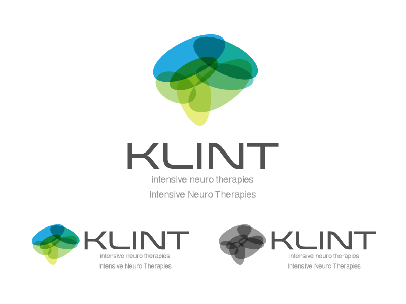
Neurological Physiotherapy service requires a logo design

Want to win a job like this?
This customer received 69 logo designs from 30 designers. They chose this logo design from Stobart Creative as the winning design.
Join for free Find Design Jobs- Guaranteed
Logo Design Brief
Logo needs to communicate trustworthiness, hope, professionalism and the premium nature of our physiotherapy service. We develop innovative packages of care that are tailored to the individual, which is completely client-focussed as it is their goals and aspirations that drive the journey of their therapy. We aim to deliver 100% satisfaction and promote life long relationships to these clients, who have neurological conditions which often take a long time to treat and are chronic in nature.
In terms of colour scheme, please check out http://www.colorhexa.com/color-names
We like Asparagus, Arylide Yellow the most,followed by Golden Rod and Jungle Green.
Updates
Hi everyone,
Added Monday, March 10, 2014
Hi Everyone,
Added Saturday, March 15, 2014
Target Market(s)
Adult clients and families of clients between aged 30 to 70 years old with neurological injury. Also other health professionals eg. neurologists, general practitioners, hospitals. Expect premium service. Willingness to spend for quality.
Industry/Entity Type
It Service
Logo Text
KLINT
Logo styles of interest
Pictorial/Combination Logo
A real-world object (optional text)
Abstract Logo
Conceptual / symbolic (optional text)
Font styles to use
Other font styles liked:
- ADAM
Colors
Colors selected by the customer to be used in the logo design:
Look and feel
Each slider illustrates characteristics of the customer's brand and the style your logo design should communicate.
Elegant
Bold
Playful
Serious
Traditional
Modern
Personable
Professional
Feminine
Masculine
Colorful
Conservative
Economical
Upmarket
Requirements
Must have
- Logo must be able to be put into business card, letterhead and other promotional products such as brochures/banners etc.
Most importantly we want the logo to be graphically strong enough to have into in black and white/grayscale.
Nice to have
- We like this to be paired with sharp typographical font for the word KLINT.
Should not have
- Do not use more than 2 colours.