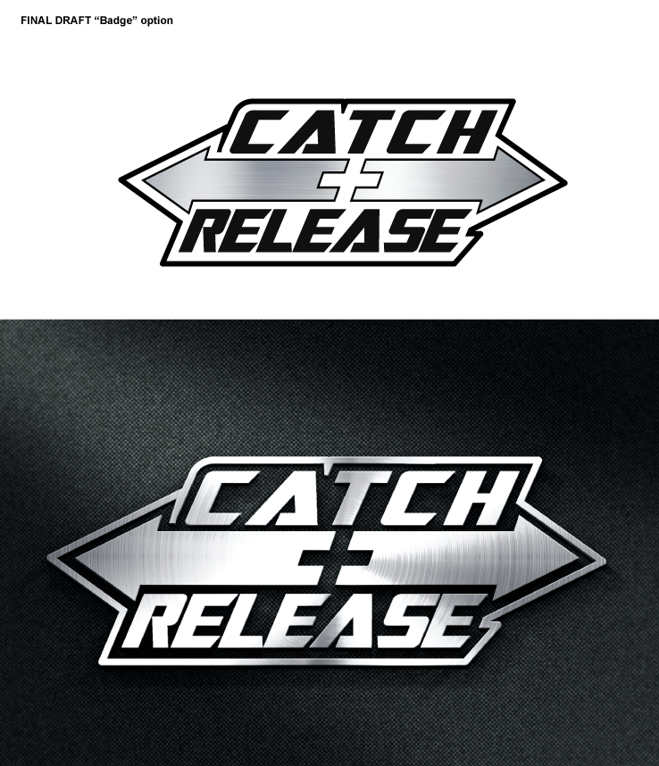
Catch & Release Trailer Retrieval Logo
Want to win a job like this?
This customer received 34 logo designs from 15 designers. They chose this logo design from designgreen as the winning design.
Join for free Find Design Jobs-
 A$200
A$200
-
 34 designs
-
 15 designers
Logo Design Brief
Design a logo/icon for our new "Catch & Release" trailer retrieval system. It makes it easier and quicker for you to drive your boat on and off the trailer when at the boat ramp.
The logo will be used on the actual trailer mechanism and for other marketing purposes.
The Catch+Release mechanism will be featured on trailers for all of Telwater's boat brands (see www.telwater.com) Therefore the colour/design should not be oriented towards one brand over another (EG: Quintrex's colours are predominantly Blue while Stacer colours are red and grey). This logo needs to be universal so it wont be out of place on a Quintrex boat/trailer package ora Stacer boat/trailer package.
Target Market(s)
- Male, 40+,
- have invested over 60,000 in a large fishing boat and would call themselves "serious fishermen"
- choose a boat/trailer based on practical yet advanced design that delivers performance and durability
Industry/Entity Type
Marketing
Logo Text
Catch & Release OR Catch + Release
Logo styles of interest
Emblem Logo
Logo enclosed in a shape
Pictorial/Combination Logo
A real-world object (optional text)
Wordmark Logo
Word or name based logo (text only)
Lettermark Logo
Acronym or letter based logo (text only)
Font styles to use
Other font styles liked:
- a stencil font will be required for the lazer cut version of the logo on the trailer hitch
Look and feel
Each slider illustrates characteristics of the customer's brand and the style your logo design should communicate.
Elegant
Bold
Playful
Serious
Traditional
Modern
Personable
Professional
Feminine
Masculine
Colorful
Conservative
Economical
Upmarket
Requirements
Must have
- File formats:
- .eps .jpg .ai .pdf (if the .eps is a vector file then that should be sufficient) with a clear background
- font names or files
- colour numbers in CMYK and RGB
Design considerations:
- a version of the logo with a white/solid outline or badge surrounding it so it can be used over various backgrounds.
- The words "Catch & Release" or "Catch + Release" in the logo. Am open to an "&" symbol or a "+" symbol.
- In addition to using the logo in our brochures/advertising, we intend to lazer cut the logo onto the actual 'catch+Release' mechanism. For this we will need a slight variation of the logo in a long, rectangular shape to these dimensions: 63mm wide x 20mm high. Note: the letters will need to be converted into some sort of "stensil" font so it can be laser cut without losing inner elements of the letters. See attached PDF for initial example.
Nice to have
- Stick to masculine, boating colours. Avoid pinks, purples etc.
Good Colours:
- blues
- greys (most trailers are a grey steel or aluminium)
- black
- masculine textures like brushed aluminium, checkerplate aluminium, carbon fibre etc
Average colours
- green doesnt have much to do with boating
Should not have
- Bad Colours
- feminine pinks or purples
- yellow/orange might be a bit irrelevant and slightly too feminine