COUNTERPOSE PRESS
Want to win a job like this?
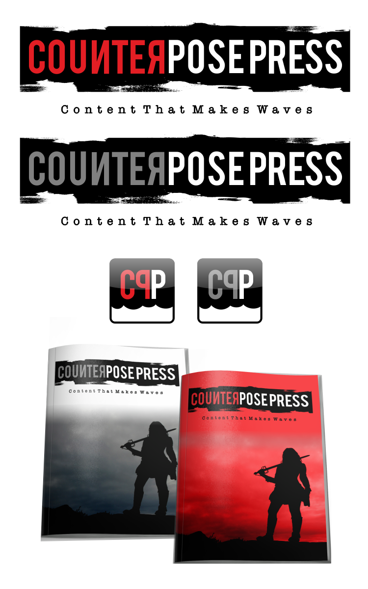
This customer received 34 logo designs from 10 designers. They chose this logo design from prascovic as the winning design.
Join for free Find Design Jobs- Guaranteed
-
 C$400
C$400
-
 34 designs
-
 10 designers
Logo Design Brief
We need a logo and an icon developed for an alternative press enterprise called Counterpose Press. We publish, market and distribute hard copy zines and microsites which focus on hyperlocal perspectives, entrepreneurship, emerging forms of capitalism, politics and sustainability. We will have an online presence as well. We are looking for a logo that uses red, black and perhaps taupe. The logo should be professional looking but also reflect our alternative to mainstream online/offline publishing positioning. The logo should include tagline "content you can feel".
The word counterpose means to offer or place in opposition, response, or contrast.
Zines are most commonly a small circulation self-published work of original or appropriated texts and images usually reproduced via photocopier (B & White)
A popular definition includes that circulation must be 1,000 or less, although in practice the significant majority are produced in editions of less than 100, and profit is not the primary intent of publication.
Zines are written in a variety of formats, from computer-printed text to comics to handwritten text. Print remains the most popular zine format, usually photo-copied with a small circulation. Topics covered are broad, including fanfiction, politics, art and design, ephemera, personal journals, social theory, single topic obsession, or sexual content far enough outside of the mainstream to be prohibitive of inclusion in more traditional media. The time and materials necessary to create a zine are seldom matched by revenue from sale of zines.
The logo should look good on business card and large sign.
Prefer simple impactful design. The icon can't be too cute or fussy. Perhaps a play on what word counter pose means.
I have posted a cop[y of one of our covers so you can get a sense of what the publications look like. They are only available in hard copy but we do promote them online.
Updates
I have a few designs in! A few look good so far and capture the spirit in general....FYI, I have decided to change byline to "content that makes waves" .....
Added Tuesday, February 11, 2014
Logo Text
COUNTERPOSE PRESS (...content you can feel)