

 Refresh
NAYO VIBE Support co ordination and aged care coordination
- Guaranteed
-
 A$150
A$150
-
 5 days left
-
 81 designs
-
 41 designers
Logo Design Brief
I have attached all the our design elements that we currently have. i wanted to overhaul the whole thing. We aim to remove the tagline completely. as it has received certain negative connotations. Our business currently provides Support coordination services for people in the NDIS and we are also on track to offer Aged Care Coordination. Ideally we are looking for something that stands out with color yet remains simple and elegant.
The people who mainly see our branding is health professionals working at government hospitals and other allied health professionals. We were also thinking of getting rid of the icon because it doesn't align well with the industry and requires explanation. If an icon is considered, we don't want wheelchairs or human emoticons. As from experience it becomes condescending. we would like something, l than can be appealing to government organizations like DHS, DCP, OPA. Our operations are currently based in South Australia. But we would like to expand all over Australia
Target Market(s)
Goverment health care systems, NDIS, complex multidisciplinary team management
Industry/Entity Type
HUMAN services ( NDIS AND AGED CARE )
Logo Text
NAYO VIBE
Logo styles of interest
Emblem Logo
Logo enclosed in a shape



Abstract Logo
Conceptual / symbolic (optional text)



Wordmark Logo
Word or name based logo (text only)


Font styles to use


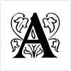
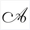
Other font styles liked:
- CUSTOM
Colors
Colors selected by the customer to be used in the logo design:
Look and feel
Each slider illustrates characteristics of the customer's brand and the style your logo design should communicate.
Elegant
Bold
Playful
Serious
Traditional
Modern
Personable
Professional
Feminine
Masculine
Colorful
Conservative
Economical
Upmarket
Requirements
Must have
- elegance
Nice to have
- custom font. Unique icon for the logo. And custom colour scheme
Should not have
- Boring human interface. Repeated AI icons

