4 Wheel Fitness - Logo Design contest for a fitness company in a small town Saskatchewan
Want to win a job like this?
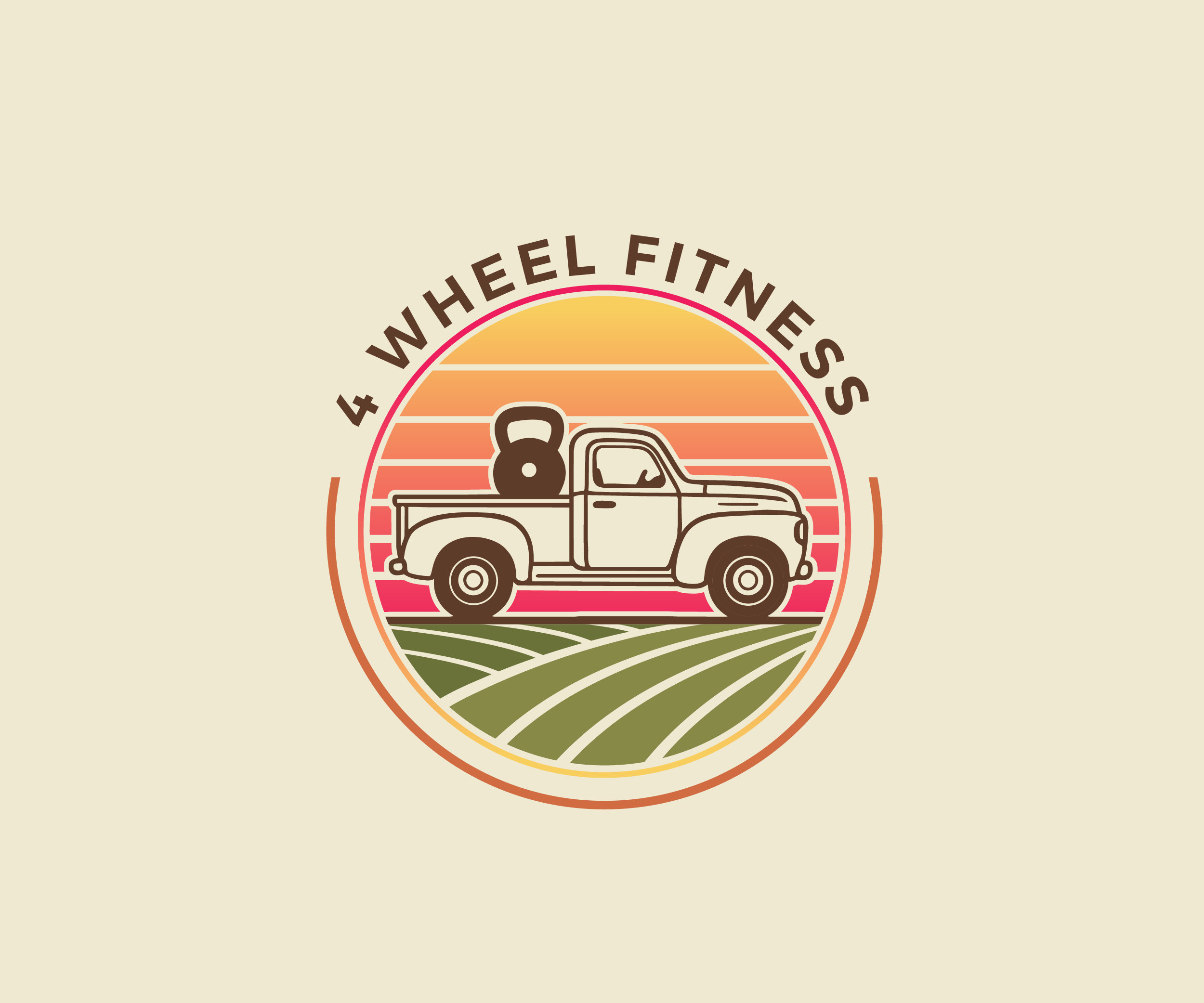
This customer received 9 logo designs from 3 designers. They chose this logo design from James J. as the winning design.
Join for free Find Design Jobs- Guaranteed
-
 C$120
C$120
-
 9 designs
-
 3 designers
Logo Design Brief
Hi! I am a Fitness trainer from a small town in Saskatchewan, Canada . I run group fitness classes outdoors. I haul all my fitness equipment in the back of my white truck (hence the name 4 Wheel Fitness). We use dumbbells, kettlebells, pull tires, jump on boxes etc.
I really would love a logo with an old school, vintage feel. Some symbols that could be used include a truck, or tractor , maybe tires or tread marks and they could be combined with fitness equipment . I would also like a hint of the prairies in it (maybe a sunset in the back or touches of wheat). I like warm colors and no harsh fonts. I would love a pretty, friendly, vintage logo!
Target Market(s)
Small town Saskatchewan farm country (mostly females though)
Industry/Entity Type
Fitness classes
Logo Text
4 Wheel Fitness
Logo styles of interest
Pictorial/Combination Logo
A real-world object (optional text)
Font styles to use
Other font styles liked:
- Not specific font but vintage old school feel
Look and feel
Each slider illustrates characteristics of the customer's brand and the style your logo design should communicate.
Elegant
Bold
Playful
Serious
Traditional
Modern
Personable
Professional
Feminine
Masculine
Colorful
Conservative
Economical
Upmarket
Requirements
Must have
- Truck or tire symbolism. Fitness symbolism. I want it warm, welcoming and vintage feels. I need three variations (1) Full Logo, (2) Text-only Logo and (3) Icon-only or Image-only Logo.
Nice to have
- A hint of the prairies (wheat or field or sunset/ sunrise) .
Should not have
- I don’t want it to be harsh or aggressive looking . I would rather artistic and warm than bold and harsh. We are a mostly all female and female run class . So I don’t want too “manly” of a gym logo