Logo design for candles inspired by sacred sites
Want to win a job like this?
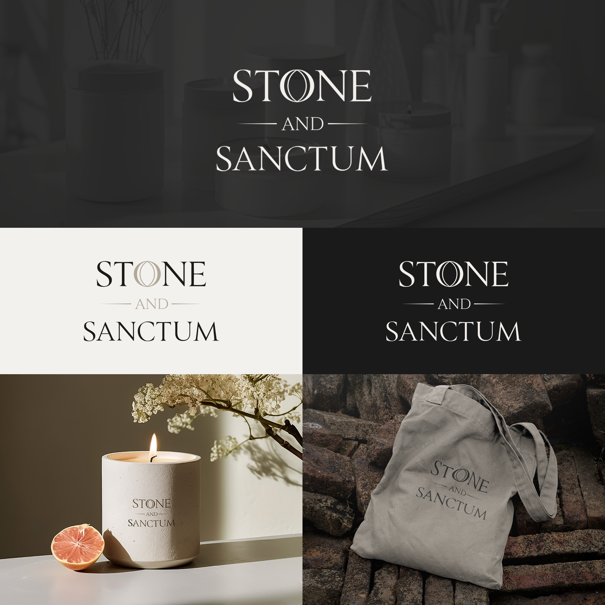
This customer received 258 logo designs from 97 designers. They chose this logo design from MH91 as the winning design.
Join for free Find Design Jobs- Guaranteed
-
 £110
£110
-
 258 designs
-
 97 designers
Logo Design Brief
Core Brand Essence:
Stone and Sanctum creates hand-crafted candles that evoke the presence of real sacred sites.
Each candle acts as a quiet threshold and physical anchor — a way to bring the presence of a sacred site into everyday life.
The brand is effectively a sensory experience rooted in real, recognisable sacred sites. It should be quietly powerful rather than expressive.
What the Brand Is NOT:
Not religious, but mystical
Not a meditation brand
Not a ritual product
Not a wellness product
Not instructional or prescriptive
NOT corporate, industrial, or aggressive
The logo should feel:
Timeless and grounded
Still, contained, and intentional
Symbolic rather than illustrative
Serious without being austere
Sacred without religious reference
The logo and visual system should not “explain” the candles. They should frame an experience.
Sacred sites reveal themselves in a subtle way. The brand should be subtle, with any appropriate symbols ideally imbedded within in the text.
When you consider a symbol, I’d like you to think about the Hermetic principle of “as above, so below”. The word “STONE” represents the physical realm. And the word “SANCTUM”‘represents the spiritual realm,
Note: : Do not write the “and” as “&”. The logo requires the full spelling as shown below (and the words should be stacked):
Stone
and
Sanctum
NOT “Stone & Sanctum”.
Please use all capitals, calm spacing, and use a subtle weight contrast for words “STONE” and “SANCTUM”. As I said, the stone represents the material / earthly realm, whilst the sanctum represents the spiritual realm. Consider also the letter “O” in the word “STONE”. Could the “O” be subtly stylised, such as with a slightly thicker outer edge? Just a thought.
Lastly, the logo should feel at home:
In a historic library
In a gallery shop
In a sacred site visitor centre
On a stone plinth, not a lifestyle shelf
The logo must convey solidity, timelessness, and spiritual resonance. Perhaps consider using classical Roman Serif, or similar appropriate text style. Think along the lines of a museum label. Think about how sacred sites have meaning inscribed in stone.
The target audience are NOT:
New Age consumers looking for rituals or affirmations
Wellness shoppers chasing self-optimisation
Trend-driven candle buyers
People who want spiritual instruction, spells, or manifestation tools
If the brand appeals strongly to these people, something has gone wrong!
VERY IMPORTANT:
This is a candle brand, but it behaves more like a cultural object than a wellness product. The inspiration comes from sacred sites and the hermetic philosophy (“as above, so below”), not from self-help or spirituality. Please fee free to ask any questions. Thank you
Target Market(s)
Spiritually attuned, value depth, restraint & meaning
Industry/Entity Type
Luxury home fragrance / artisanal candles / heritage / cultural
Logo Text
Stone and Sanctum
Logo styles of interest
Abstract Logo
Conceptual / symbolic (optional text)
Wordmark Logo
Word or name based logo (text only)
Font styles to use
Colors
Designer to choose colors to be used in the design.
Look and feel
Each slider illustrates characteristics of the customer's brand and the style your logo design should communicate.
Elegant
Bold
Playful
Serious
Traditional
Modern
Personable
Professional
Feminine
Masculine
Colorful
Conservative
Economical
Upmarket
Requirements
Must have
- Use an image only if it can be subtly embedded in the logo text (e.g.Vesica Piscis circle (spirit/sanctum) and square (matter/stone)
Nice to have
- Mineral neutral colours preferable. The logo should feel like an inscription — something that belongs on stone, paper, or wax — not a modern graphic mark
Should not have
- No bright colours, no obvious images (eg, candle, arches)