Exiro Nickel - Critical Minerals Exploration Company
Want to win a job like this?
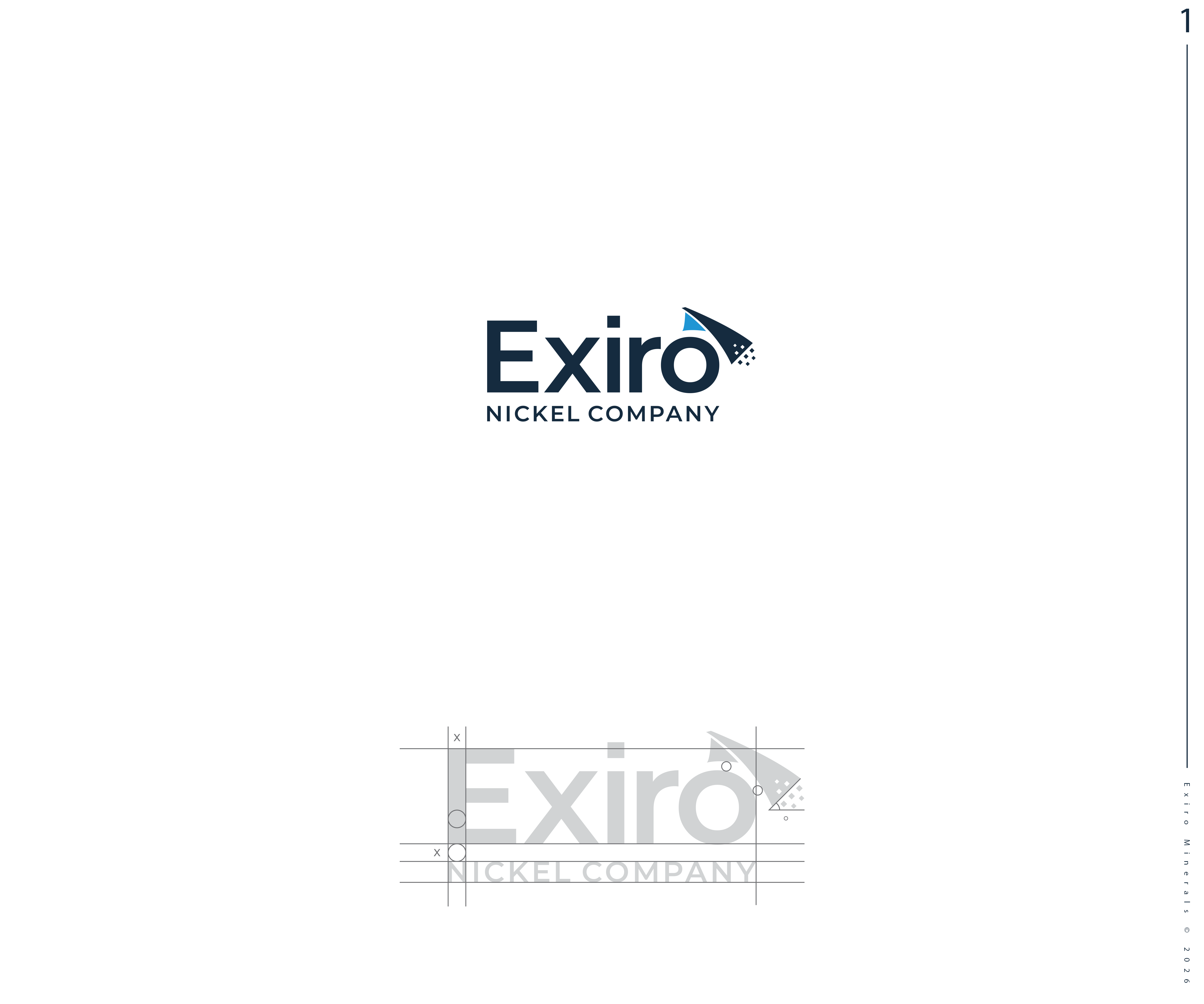
This customer received 379 logo designs from 118 designers. They chose this logo design from GBDESIGN as the winning design.
Join for free Find Design Jobs- Guaranteed
-
 US$300
-
 379 designs
-
 118 designers
Logo Design Brief
SLIGHT UPDATES to existing logo.
Have attached existing logo and notes for improvement:
1. Strengthen the Symbol (Corner Fold + Pixel Scatter): simplify the pixel cluster: reduce the number of squares and/or group them more clearly to avoid visual noise. Balance weight with the font: The symbol feels lighter/thinner than the heavy wordmark: match stroke weight or adding more visual mass
2. Improve Alignment and Spacing: symbol feels slightly detached from the word “Exiro.” - Bring the symbol closer to the “o” or align it with the full height of the text. Or, integrate the symbol from the “i” or “r” for cohesion. Alternately, see #6.
3. Typography: could be refined. Could reduce the boldness slightly so the letters don’t feel overly heavy compared to the airy symbol or, consider a more geometric sans serif (e.g. Montserrat, Proxima Nova) to match the angular motif of the icon. Improve tracking on “MINERALS” (currently a bit loose on the dark version, tight on the light version).
4. Color Optimization: the light-blue gradient but could be more impactful: flatten or simplify the gradient for better printing.
5. Scalability and Small-Format : for small sizes (favicon, label, social): create a simplified icon version (just the fold, without pixels) - ie logo for 16 px, 32 px, and 64 px sizes.
6. Symbol–Wordmark: the symbol sits disconnected above the wordmark. Could consider attaching the symbol to the “E” or moving the symbol to the left of the wordmark (stronger brand block, more balanced).
Industry/Entity Type
Nickel Mining
Logo Text
Exiro Nickel
Colors
Colors selected by the customer to be used in the logo design:
Look and feel
Each slider illustrates characteristics of the customer's brand and the style your logo design should communicate.
Elegant
Bold
Playful
Serious
Traditional
Modern
Personable
Professional
Feminine
Masculine
Colorful
Conservative
Economical
Upmarket
Requirements
Must have
- 1. Strengthen the Symbol (Corner Fold + Pixel Scatter): simplify the pixel cluster: reduce the number of squares and/or group them more clearly to avoid visual noise. Balance weight with the font: The symbol feels lighter/thinner than the heavy wordmark: match stroke weight or adding more visual mass 2. Improve Alignment and Spacing: symbol feels slightly detached from the word “Exiro.” - Bring the symbol closer to the “o” or align it with the full height of the text. Or, integrate the symbol from the “i” or “r” for cohesion. Alternately, see #6. 3. Typography: could be refined. Could reduce the boldness slightly so the letters don’t feel overly heavy compared to the airy symbol or, consider a more geometric sans serif (e.g. Montserrat, Proxima Nova) to match the angular motif of the icon. Improve tracking on “MINERALS” (currently a bit loose on the dark version, tight on the light version). 4. Color Optimization: the light-blue gradient but could be more impactful: flatten or simplify the gradient for better printing. 5. Scalability and Small-Format : for small sizes (favicon, label, social): create a simplified icon version (just the fold, without pixels) - ie logo for 16 px, 32 px, and 64 px sizes. 6. Symbol–Wordmark: the symbol sits disconnected above the wordmark. Could consider attaching the symbol to the “E” or moving the symbol to the left of the wordmark (stronger brand block, more balanced).