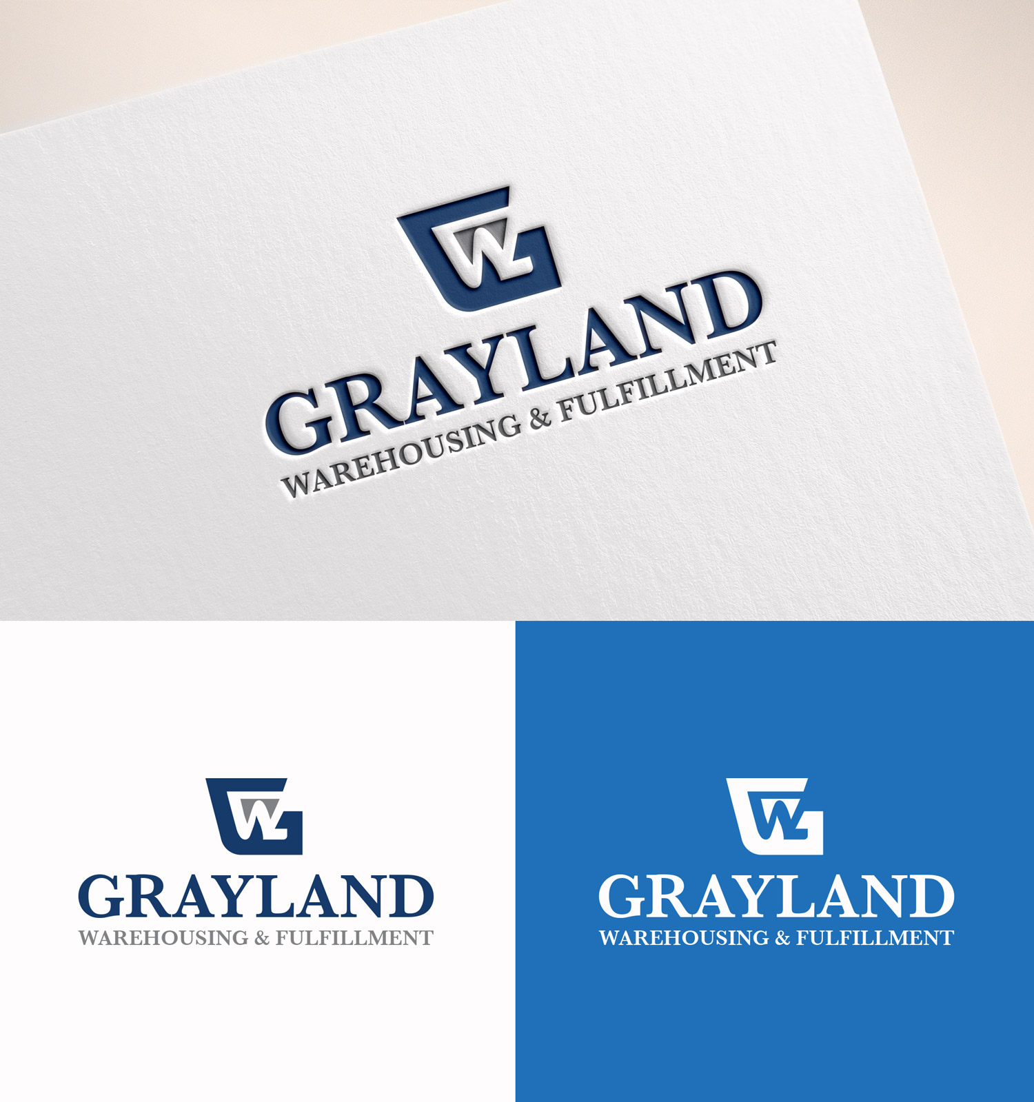
Update / create my business logo

Want to win a job like this?
This customer received 234 logo designs from 114 designers. They chose this logo design from M Art & Design as the winning design.
Join for free Find Design Jobs- Guaranteed
Logo Design Brief
Grayland should feel like the high-end warehouse—the one discerning brands choose when they care deeply about their inventory, customer experience, and reputation.
Think:
Premium, boutique fulfillment
High-touch, white-glove service
Operationally excellent, emotionally steady
Professional, established, and credible
We want the brand to communicate that we are:
Serious
Experienced
Well-run
Worth a premium
Logo & Visual Identity Direction
Our current logo feels generic and clip-art-like. We are looking for the opposite.
We want a logo and identity that looks expensive.
As if it came from a top-tier branding firm.
Desired Feel
Clean, modern, and timeless
Confident, not flashy
Minimal, intentional, and refined
Corporate in the best sense — polished and professional
Target Market(s)
Grayland is a high-touch, boutique fulfillment and warehousing company. We serve established and premium brands that value accuracy, care, and proactive partnership—not volume at all costs. We are not a commodity warehouse. Our clients choose us because we act as an extension of their business, with exceptional communication, precision, and accountability. Our internal culture is detail-driven, calm under pressure, kind, and solutions-oriented. Externally, we want to signal trust, capability, and sophistication the moment someone sees our brand.
Industry/Entity Type
Warehousing & Fulfillment
Logo Text
Grayland Warehousing & Fulfillment
Logo styles of interest
Pictorial/Combination Logo
A real-world object (optional text)
Abstract Logo
Conceptual / symbolic (optional text)
Font styles to use
Look and feel
Each slider illustrates characteristics of the customer's brand and the style your logo design should communicate.
Elegant
Bold
Playful
Serious
Traditional
Modern
Personable
Professional
Feminine
Masculine
Colorful
Conservative
Economical
Upmarket
Requirements
Must have
- Look expensive and established — as if the brand invested significantly in professional design Feel high-end, corporate, and polished, not trendy or playful Use clean, timeless typography (strong, confident fonts that will age well) Emphasize simplicity and restraint — minimal elements, intentional spacing Convey trust, precision, and competence at first glance Feel calm, confident, and serious (quietly powerful, not loud) Be scalable and versatile (signage, warehouse exterior, website, software, invoices, uniforms) Differentiate us from mass-market fulfillment centers Appeal to premium, detail-oriented brands who expect white-glove service Feel appropriate alongside finance, logistics, or architecture firms Prioritize legibility and clarity over cleverness
Should not have
- No clipart or literal warehouse imagery (boxes, pallets, forklifts, trucks, arrows, swooshes) No playful, quirky, or cartoon-style design elements No “startup” or tech-bro aesthetic No trendy fonts or short-lived design fads No busy, over-designed marks No obvious stock icons or templated logo styles No bubbly, friendly-for-the-sake-of-friendly branding No mass-market or budget-warehouse look No logos that rely on color alone to feel premium No forced cleverness at the expense of professionalism