"Aim Up" Media - Logo Design
Want to win a job like this?
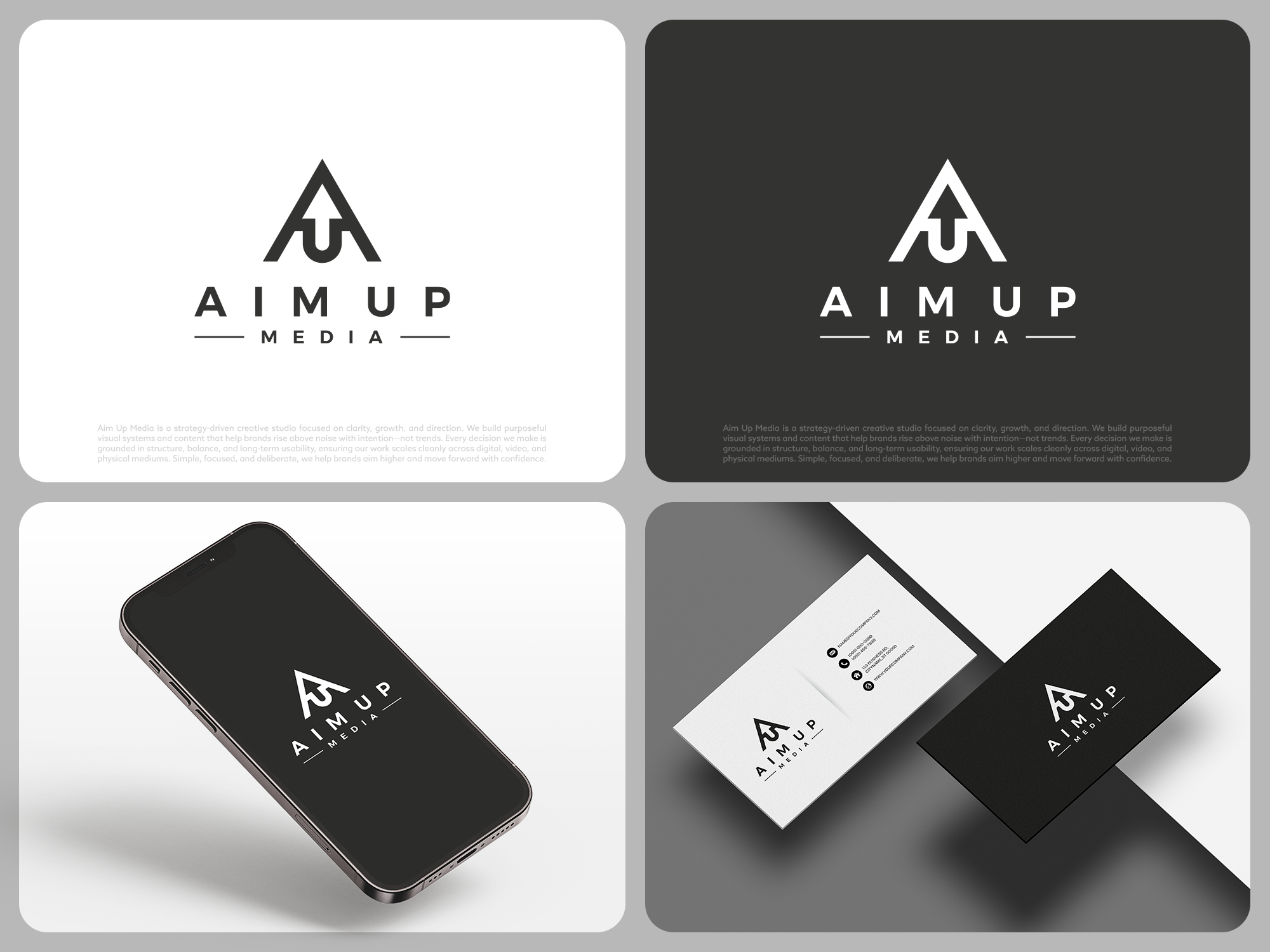
This customer received 485 logo designs from 161 designers. They chose this logo design from COLOUR CREATIVE as the winning design.
Join for free Find Design Jobs-
 US$150
-
 485 designs
-
 161 designers
Logo Design Brief
Design a clean, symmetrical logo mark for “AimUp.”
The logo should integrate the letters A and U and possibly an upward arrow. The style must be minimal, geometric, and balanced, with strong symmetry and intentional line weight. Prefer a self‑contained mark (circular/square or unified shape).
The U must clearly read as a U (no ambiguous curves).
The arrow (if incorporated) must clearly read as an arrow (not an extra letter).
A subtle line separation is acceptable if it improves clarity.
Black on white.
I have uploaded a few designs i already have and that I do like, one with the A on top with a U below it and an arrow coming up from the U into the A. The other I like is the word A I M spelled vertically that looks like an arrow. I do like these but they aren't perfect but I am interested in perhaps seeing other concepts that are similar.
Avoid trends, gradients, shadows, textures, decorative fonts, or over‑abstract concepts. This should feel timeless, grounded, and finished, not clever.
The logo will be used for web, video, apparel, embroidery, and social media—so it must scale cleanly and remain legible at small sizes.
Deliver vector files (SVG/AI/EPS) plus black and white versions.
Simple. Symmetrical. Clear. Purposeful.
Logo Text
No words required, mainly just a logo mark. But a wordmark of "AIM UP" below the logo is fine, especially if its using the fonts utilized in the logo itself.
Logo styles of interest
Lettermark Logo
Acronym or letter based logo (text only)
Font styles to use
Look and feel
Each slider illustrates characteristics of the customer's brand and the style your logo design should communicate.