White Rhino Logo Family Development
Want to win a job like this?
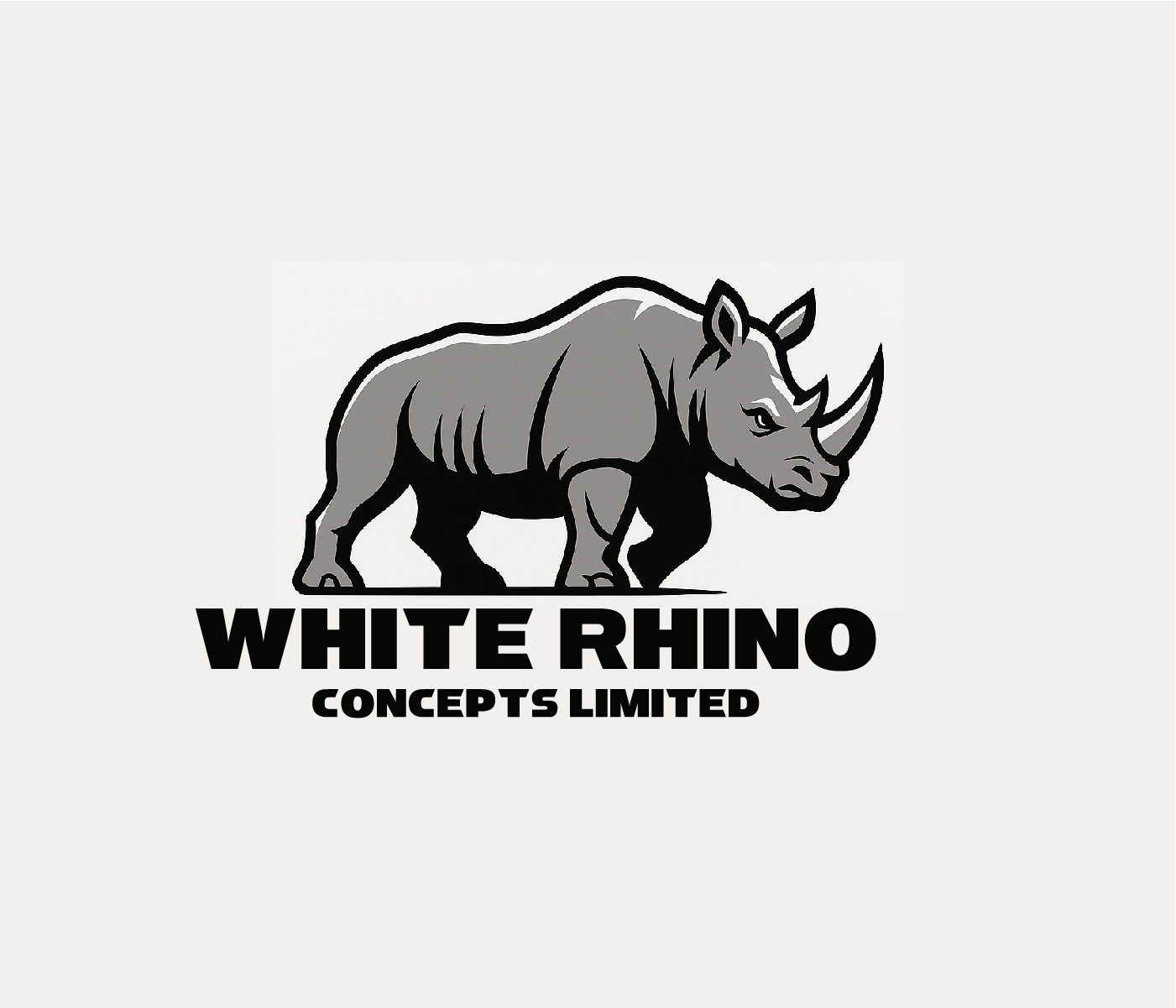
This customer received 185 logo designs from 83 designers. They chose this logo design from AlphaDezin3 as the winning design.
Join for free Find Design Jobs- Guaranteed
-
 £110
£110
-
 185 designs
-
 83 designers
Logo Design Brief
PROJECT BRIEF
White Rhino Logo Family Development
1. Purpose
Create a coherent, versatile, future-proof logo family for the White Rhino group of companies. The goal is to visually unify all divisions under a single parent identity while allowing enough variation for each sector to stand independently in investor-facing, government-facing and consumer-facing environments.
This brand system needs to reflect strength, stability, African heritage, modernity and technical competence. No cartoon rhinos. No corporate clip-art. Something that looks like it belongs on the side of an aircraft, a diagnostic lab report, a refinery gate and a hospitality brochure without embarrassing anyone.
2. Brand Architecture
The system follows a branded house structure:
Parent Brand:
White Rhino Concepts Limited
Represents governance, holding structure and strategic direction.
Divisions (as per approved naming concepts from the file):
• White Rhino Grow – Agriculture & value chains
• Rhino Air / Rhino SkyLink – Aviation
• RhinoForge – Manufacturing
• Rhino Retreats – Tourism & hospitality
• Rhino Renew – Waste & environment
• Rhino One Health– Medical, diagnostics, One Health
• White Rhino Extract – Extraction & mining
Each division gets a harmonised logo variant derived from the master mark.
3. Deliverables
The design team will produce:
3.1 Master Logo System
• Primary White Rhino parent symbol
• Wordmark and lock-ups
• Full colour, mono, and inverted versions
• Scalable vector formats
3.2 Division Logo Family
• Tailored wordmarks for each division
• Sub-identity colour suggestions
• Optional secondary icons (only where necessary)
3.3 Brand Usage Toolkit
• Clear-space and sizing rules
• Typography and colour palette
• Recommended imagery style
• Do/Don’t sheets (to prevent the usual crimes)
3.4 Application Mockups
• Stationery
• Aircraft livery for Rhino Air
• Factory and facility signage
• Hospitality material
• One Health lab templates
• Waste facility branding
• Mining helmets/equipment
4. Design Direction
Tone: Strong, clean, premium African industrial identity with global recognisability.
Core Attributes:
• Strength (rhino silhouette or abstracted geometric form)
• Stability (balanced proportions, wide stance)
• Modernity (minimal lines, not tribal pastiche)
• Scalability (works at 12mm on a certificate and 12m on an aircraft hangar)
Symbol Style Options:
1. Geometric Rhino Head – angular, iconic, scalable
2. Full Rhino Silhouette – simplified, forward-leaning, momentum
3. Horn-Based Minimal Mark – abstract, elegant, subtle
4. Shield-Incorporated Rhino – authority and protection
The team will present three full concept systems for review, each with division adaptations.
5. Practical Requirements
• Must reproduce cleanly on embroidery, signage and regulatory documents
• Must work in single-colour for industrial applications
• Divisions must share consistent grid proportions
• Parent logo should feel “presidential,” not decorative
• Style must accommodate future divisions without visual chaos
6. Constraints
• No overly aggressive or violent imagery. This is a rhino brand, not a UFC poster.
• No literal photo-tracing.
• Divisions cannot drift stylistically; coherence is mandatory.
• Must remain neutral enough to be accepted by government bodies, lenders and investors.
Target Market(s)
Corporate Uganda, Tourism, Environmental, etc
Logo Text
as per description
Logo styles of interest
Pictorial/Combination Logo
A real-world object (optional text)
Font styles to use
Other font styles liked:
- Arial, Aptos
Look and feel
Each slider illustrates characteristics of the customer's brand and the style your logo design should communicate.
Elegant
Bold
Playful
Serious
Traditional
Modern
Personable
Professional
Feminine
Masculine
Colorful
Conservative
Economical
Upmarket
Requirements
Nice to have
- clean yet memorable image, whereby the Rhino is prominant, as a symbol of Uganda