Cold ON – Electrolyzed Refresh Drink Can Design
Want to win a job like this?
This customer received 68 packaging designs from 19 designers. They chose this packaging design from HT Graphic as the winning design.
Join for free Find Design Jobs-
 €170
€170
-
 68 designs
-
 19 designers
Packaging Design Brief
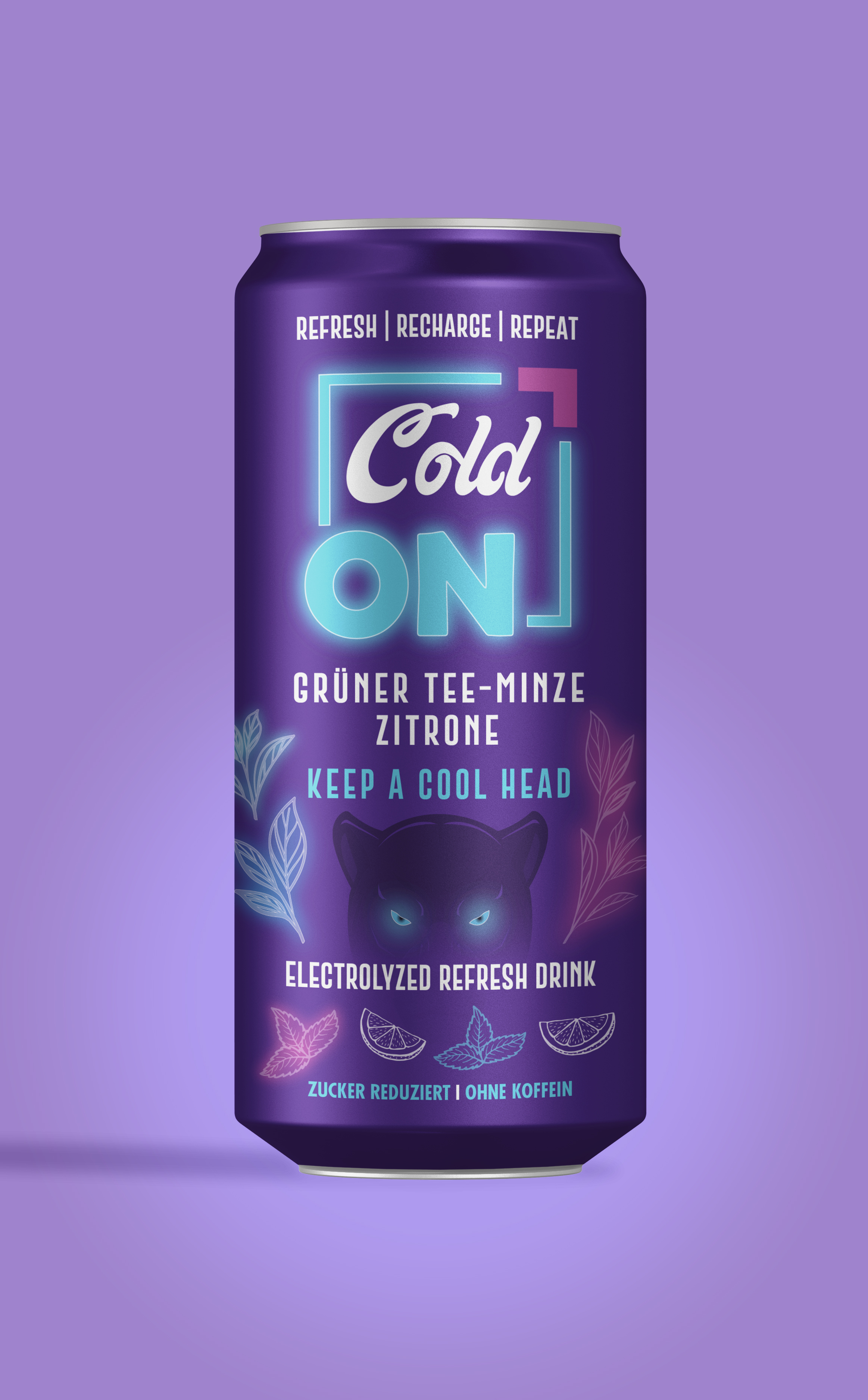
Please create a premium and refreshing can design for Cold ON, an innovative electrolyzed drink from Austria.
The design should convey freshness, clarity, and balance — not physical coldness, but mental coolness and energy.
We want something modern, minimalistic, and internationally appealing that fits a 250 ml aluminum can.
Design Direction:
• Style: Modern • Clean • Premium • Fresh
• Colors: White (#FFFFFF), Electric Blue (#00F0FF), Pink (#d539cc), Black (#000000)
• Effects: Glossy or matte finish, optional metallic/chrome gradient
• Main Elements: Lemon 🍋, mint leaves, ice cube motifs (optional), polar bear or frost textures
• Text bands (top & bottom):
• Keep a Cool Head
• Refresh – Recharge – Repeat
• Electrolyzed Refresh Drink
• Important: Do not use a power button symbol or ON/OFF icon.
• The logo “Cold ON” should be a dynamic wordmark — smooth, flowing, and confident.
Technical Specs:
• Can size: 250 ml (175 × 134.94 mm + 3 mm bleed)
• Resolution: 300 dpi / CMYK
• Deliverables: 3–5 concepts + 3D mockups + source files (.AI / .EPS / .PDF)
Target Audience:
Young and adult consumers aged 6–36 who value refreshment, health and style.
Active people who appreciate design, clarity and a balanced lifestyle.
Cold ON represents clarity and vitality — refreshing in every season, summer or winter alike.
Look and feel
Each slider illustrates characteristics of the customer's brand and the style your logo design should communicate.