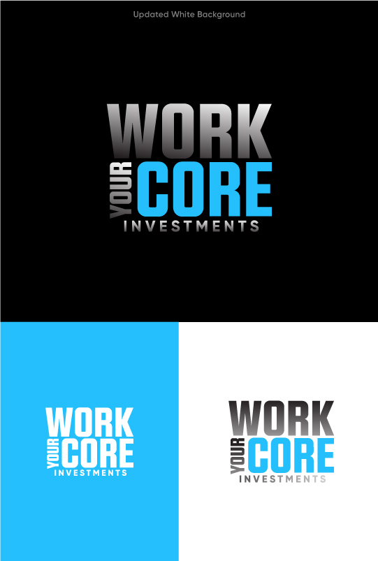
Work Your Core Investments - Logo for Body Strength Investment company

Want to win a job like this?
This customer received 131 logo designs from 62 designers. They chose this logo design from apik. as the winning design.
Join for free Find Design JobsLogo Design Brief
A logo for a brand focused on "core fitness," particularly abdominal strength, should visually communicate power, stability, and precision. The design should evoke a sense of strength and focus while remaining sleek and modern, appealing to a broad audience interested in achieving a strong core and improving overall fitness.
Shape and Symbolism:
To emphasize abdominal strength, the logo could incorporate elements that suggest the body’s midsection or the core. A stylized silhouette of the human torso, especially highlighting the abdomen area, could form the central motif. This might be paired with abstract lines or curves that suggest muscles or movement, implying dynamism and physicality. The use of circular or semi-circular shapes would symbolize stability and balance, both key components of a strong core. A spiral or geometric design could also represent the body’s inner strength and the progressive journey of strengthening one’s core.
Typography:
The font used in the logo should be bold, clean, and modern to reflect strength and reliability. A sans-serif font with strong, geometric lines would convey a sense of power, making it look both contemporary and professional. The typography could be slightly condensed or squared to reinforce the idea of structure and endurance. The typeface should be legible, even at smaller sizes, to ensure the brand’s message is always clear.
Color Palette:
The color palette should lean towards strong, earthy tones like deep blacks, grays, and metallics such as silver or chrome, which suggest durability and sophistication. Alternatively, incorporating vibrant accent colors like electric blue or fiery red could symbolize energy and motivation. These colors can also reflect the intensity of core workouts, often associated with focus and effort. A darker color base with bright accents ensures that the logo stands out, remaining impactful without being overly aggressive.
Overall Style:
The design should strike a balance between being minimalist and dynamic. The goal is to create a logo that feels modern and refined but still communicates energy and commitment. It should be versatile enough to work across various media, from fitness apps to gym gear, and scalable for both small and large formats.
In summary, the logo should symbolize strength, movement, and the focus required to develop a powerful core. Its shapes, typography, and color choices should all be crafted to inspire confidence in the journey toward achieving abdominal strength and fitness.
Target Market(s)
Investors
Industry/Entity Type
Fitness
Logo Text
Work Your Core Investments
Logo styles of interest
Emblem Logo
Logo enclosed in a shape
Character Logo
Logo with illustration or character
Colors
Colors selected by the customer to be used in the logo design:
Look and feel
Each slider illustrates characteristics of the customer's brand and the style your logo design should communicate.
Elegant
Bold
Playful
Serious
Traditional
Modern
Personable
Professional
Feminine
Masculine
Colorful
Conservative
Economical
Upmarket
Requirements
Must have
- unique design in relation to one's core (abdomen and other rmuscles)
Nice to have
- Body Strength and positivity
Should not have
- All words and no image creation