Book Cover Design for The G.A.P.S: Healing the Voids Brothers Carry in Silence
Want to win a job like this?
This customer received 14 book cover designs from 6 designers. They chose this book cover design from negrorichi as the winning design.
Join for free Find Design Jobs- Guaranteed
-
 US$120
-
 14 designs
-
 6 designers
Book Cover Design Brief
Book Cover Design Brief
Title: THE G.A.P.S:
Subtitle: Healing the Voids Brothers Carry in Silence
Author: Ken Cheadle
⸻
Concept Direction
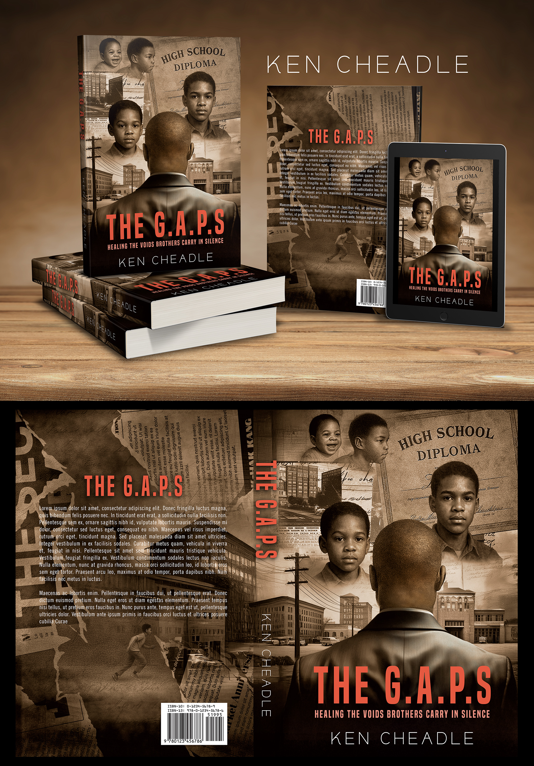
I want this cover to merge two existing design concepts:
1. Man Facing Away (Reflection Theme)
• A Black man (around 40 years old) shown from the back, symbolizing reflection.
• He should be facing younger versions of himself, representing different stages of childhood.
2. Realism & Collage of Memories
• Use the realism and layered texture approach from the second cover.
• Multiple realistic portraits of the boy at different ages (not stylized, but raw, soulful, and true-to-life).
• Background should incorporate layered old photographs, handwritten letters, sepia-toned city buildings, and historical paper textures.
⸻
Key Required Elements
• High School Diploma: Must be present in the upper right of the design (faded, background element).
• Multiple Child Versions: Realistic portraits at different ages, integrated into the collage.
• Mood & Tone: Cinematic, gritty, authentic, emotionally raw.
• Colors: Warm earthy tones, sepia, muted with strong contrast for depth.
⸻
Text Layout
• Title: THE G.A.P.S: (bold, prominent)
• Subtitle: Healing the Voids Brothers Carry in Silence (under title)
• Author: Ken Cheadle (at the bottom)
⸻
References attached:
• Cover 1: Man facing away (reflection theme)
• Cover 2: Realistic child portraits and layered collage feel
Target Market(s)
Men and women ages 18–55, especially readers interested in personal growth, fatherhood, healing, mental health, and African American cultural experiences. Targeting both general nonfiction readers and the Black community specifically.
Industry/Entity Type
Books / Publishing / Non-Fiction / Memoir Colors Brown, Red-Orange, Yellow-Orange, and Earthy Neutrals. (Skip blues/greens — keep it warm and historical feeling.)
Font styles to use
Colors
Designer to choose colors to be used in the design.
Look and feel
Each slider illustrates characteristics of the customer's brand and the style your logo design should communicate.
Elegant
Bold
Playful
Serious
Traditional
Modern
Personable
Professional
Feminine
Masculine
Colorful
Conservative
Economical
Upmarket
Requirements
Must have
- Must Haves • A Black man (around 40 years old) shown from the back, symbolizing reflection. • Multiple realistic child portraits (the same man at different ages). • High school diploma in the upper right corner of the design. • Layered collage background with old photos, handwritten letters, sepia-toned city buildings, and historical textures. • Title, subtitle, and author’s name laid out cleanly and prominently.
Nice to have
- Nice to Haves • Cinematic lighting and shadows for a dramatic, reflective mood. • Warm earthy tones, sepia, with a touch of contrast for depth. • Subtle symbolic layering (e.g., power lines, school buildings, or handwritten notes). ⸻
Should not have
- • Cartoonish or overly stylized children. • Bright neon or playful colors that take away from the serious theme. • Overly cluttered composition that makes the text hard to read.