Design a Sigil of Sovereignty: Luxury Logo for a Sacred Women’s Society
Want to win a job like this?
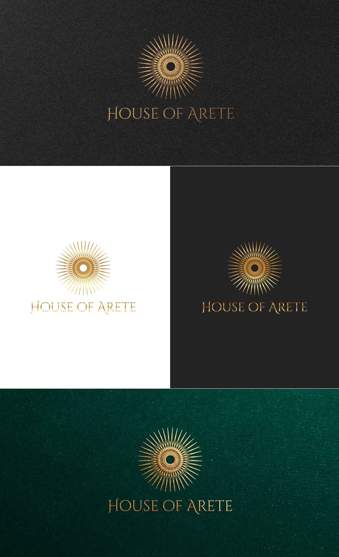
This customer received 134 logo designs from 62 designers. They chose this logo design from GLDesigns as the winning design.
Join for free Find Design Jobs- Guaranteed
-
 US$150
-
 134 designs
-
 62 designers
Logo Design Brief
Pinterest moodboard has been uploaded, please reference for visual direction and inspiration!
🎯 Logo Goal:
Create a luxury, emblem-style icon + wordmark system that:
--Feels like a symbol of initiation into a sacred order
--Hints at geometry, cosmology, and sacred pattern
--Balances feminine mystique with bold sovereign power
--Can sit next to luxury brands like Chanel, Hermès, or Aman
--Feels like it could be etched into stone or wax-sealed on a letter
🖼️ Visual Style Inspiration:
Refer to the attached mood board. Core themes:
--Gold foil / metallic finishes
--Deep navy, obsidian, and stone backdrops
--Sunbursts, spirals, concentric rings, sacred geometry
--Editorial elegance (like VOGUE or architectural luxury branding)
--A feeling of being inside a modern sanctuary or ancient order
🔮 Symbolism to Explore (Optional):
These are optional symbolic references, but only if they feel aligned:
--The Golden Ratio (Phi spiral — harmony and divine proportion)
--Sun or eclipse symbolism (illumination, cyclicality, feminine power)
--Vesica Piscis or sacred geometry forms
--Hellenistic or Greek-inspired motifs — subtle, not literal
--The temple as metaphor — columns, arches, doorways
🔠 Typography:
--Serif or clean editorial fonts
--Mix of refined elegance with slight spiritual flair (think not woo, but wonder/mystique)
--Needs to feel timeless and not trend-based
--Possible juxtaposition of bold uppercase with flowing curves
🌟 Color Palette:
Primary: Gold (metallic finish preferred, not yellow flat)
Secondary (background/brand): Deep navy, obsidian black, aged marble, or ancient teal
Logo must also work in black & white, and emboss/deboss applications
🧱 Usage Contexts:
Website + social media content
Event and retreat signage
Embossed on journals and physical materials
Digital and print use — should feel equally iconic on a plaque or an iPhone screen
✨ Brand Essence Words:
Whole. Holy. Wild.
Sovereignty
Transcendence
Sacred Wealth
Feminine Genius
Invisible Order
Creation-as-devotion
📐 Deliverables:
Primary logo (icon + wordmark)
Icon-only version
Horizontal + vertical lockups
Black, white, and gold foil versions
Target Market(s)
Ultra-High-Level Women Visionaries --Successful entrepreneurs, investors, and founders Spiritually trained and deeply resourced Not chasing success — they've already achieved it Seeking community rooted in excellence, evolution, and sacred embodiment Tired of bro-marketing and hyper-masculine hustle brands Craving a space where capital meets consciousness, creation meets ceremony They want to belong to something iconic, intimate, and rare.
Industry/Entity Type
Coaching and Mentorship
Logo Text
House of Arete
Logo styles of interest
Wordmark Logo
Word or name based logo (text only)
Font styles to use
Colors
Colors selected by the customer to be used in the logo design:
Look and feel
Each slider illustrates characteristics of the customer's brand and the style your logo design should communicate.
Elegant
Bold
Playful
Serious
Traditional
Modern
Personable
Professional
Feminine
Masculine
Colorful
Conservative
Economical
Upmarket
Requirements
Must have
- Must Haves: Gold foil/metallic finishes. A luxurious, timeless logo mark that feels like a modern feminine order or ancient society Gold/metallic detailing with premium finish aesthetics Symbolic design (sun, spiral, geometry, eclipse, etc.) with restraint and subtlety Scalable icon + wordmark system Emboss/deboss-ready formats (no excessive details) Feels editorial (think: Aman, VOGUE, Hermès, MoMA) — not digital-first or techy A clear sense of feminine sovereignty, spiritual elegance, and grounded luxury
Nice to have
- Nice to Haves: Nod to sacred geometry (Vesica Piscis, Golden Ratio spiral, sunburst) Embodied references to initiation, gates, or temple-like structures Serif wordmark that evokes both tradition and edge
Should not have
- Should Not Haves: No overly “feminine” tropes (flowers, cursive script, pinks, or heart symbols) No hyper-digital, techy, or startup vibes No flat or cartoonish aesthetics No overcomplication — the magic is in its restraint and resonance No trendy fonts or visual clichés from wellness/coach-space (mandalas, feathers, etc.)