Cohesive Waves
Winner
Want to win a job like this?
This customer received 286 logo designs from 115 designers. They chose this logo design from fly design as the winning design.
Join for free Find Design Jobs- Guaranteed
-
 US$150
-
 286 designs
-
 115 designers
Logo Design Brief
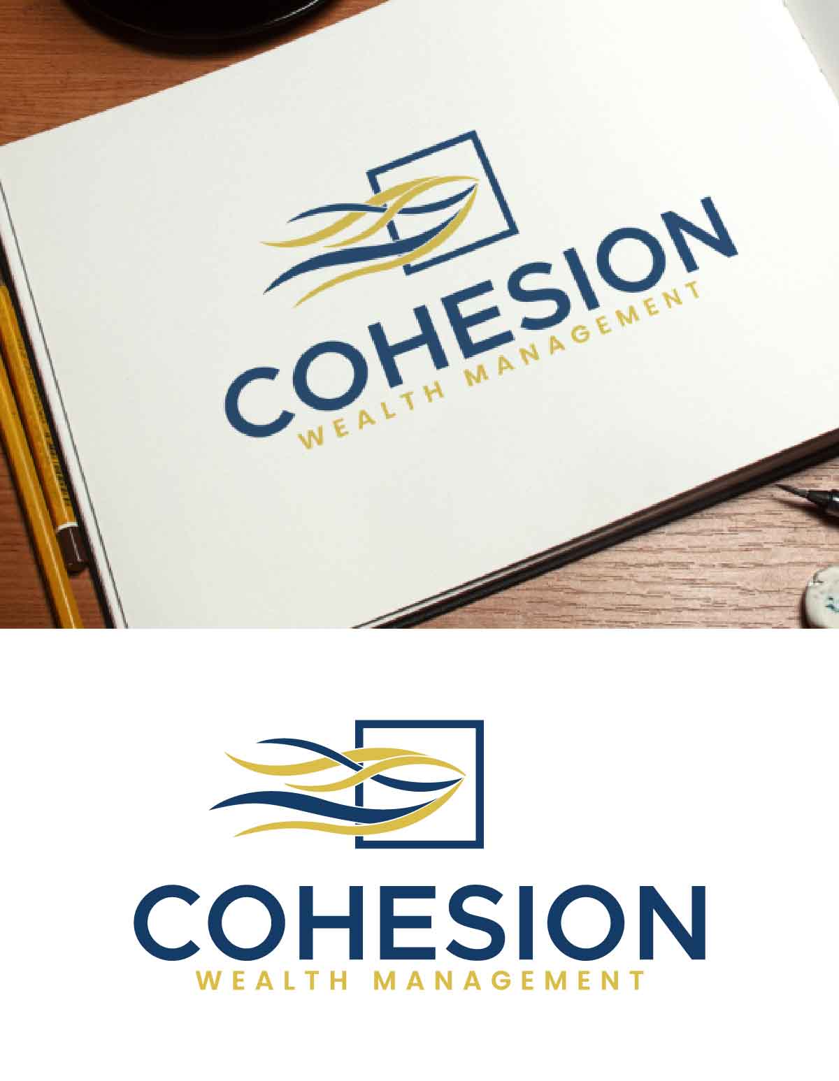
The idea behind these waves is that they start off separate—either from the left side or even from the top—and gradually come together through cohesion. That’s the core concept. The symbolism represents how, through our process, the different parts of your financial life that once felt fragmented are now integrated and aligned. I’ve attached an example to help illustrate what I have in mind. Use Gold and Navy Blue as your primary colors.
Updates
I’ve chosen a design and no longer need options
Added Thursday, 14 August 2025
Logo Text
COHESION Wealth Management (with Wealth Management underneath)
Files
PNG
Wave Logo
Friday, August 1, 2025
Payments
1st place
US$150